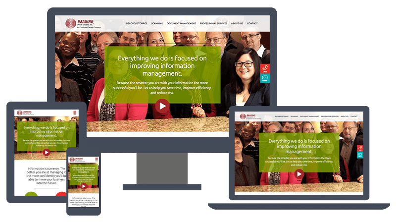
TBH Creative first worked with Imaging Office Systems to redesign their website back in 2010. The focus at that time was educating their audience on the depth and breadth of their services. The website was deep in content with lengthy descriptions of process and benefits. This year’s redesign had a much different goal in mind: to clearly describe how their work helps their clients and to do so in a much more concise and user-focused presentation.
They wanted to deliver their message with fewer words, more graphics and make better use of video on the website.
They wanted to deliver their message with fewer words, more graphics and make better use of video on the website.
“Imaging Office Systems came to us with a distinct challenge,” notes TBH Creative President & Founder, Tatum Hindman. “They knew their current site wasn’t working as well as it had in the past as a communication tool and they knew they wanted big changes but they didn’t have a clear idea of where to take it.”
TBH Creative spent a lot of time with Imaging Office Systems to prioritize key issues, look at other websites and hone in on the key elements that would guide this redesign.
Looking back on the strategic process, Tatum comments “With our long-term working relationship, we were able to easily identify places where we could add value and build on progress we’d made over the years. We helped Imaging Office Systems develop a clear vision and we were excited to bring that vision to life with strong visuals, clear content, and dynamic videos.”
New website features
The new Imaging Office Systems website is a dramatic departure from what they had before. It’s far more visual and uses graphics, pictures and videos to communicate a lot of their message. Some of the strengths of this new website are:Smarter use of video: Each main page of the new website incorporates video right at the top of the page in two ways. First, with a looping image behind the key message to instantly convey action and energy. Second, with a clear call to action to play a video that relates to that page’s topic.
We selected Wistia to power the video feed in large part for its automated option that encourages user interaction after watching the video. These videos are calls to action in and of themselves.
Here is one of the videos we created as part of the project:
Fewer words, more powerful communication: Imaging Office Systems works through some fairly complex solutions for its clients. Our challenge was to communicate those solutions without making the page too copy heavy.
The content developer and designer worked very closely on the design of each page to make sure all words had weight behind them and tied with descriptive icons, graphics and other visual elements to communicate key points. This is a website where the design and content truly work hand-in-hand.
Strategic use of case studies: Case studies or testimonials are an excellent addition to many sites. They concisely demonstrate the success of a product or service while also endorsing it.
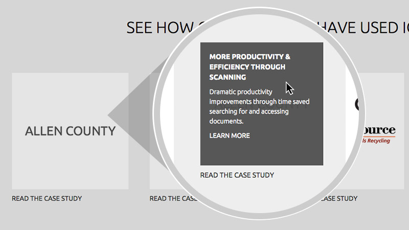
We incorporated case studies throughout the Imaging Office Systems website in graphic ways so they support key marketing statements. We also gave each case study element a rollover effect that shares one important benefit of the project and entices the reader to want to see more.

We incorporated case studies throughout the Imaging Office Systems website in graphic ways so they support key marketing statements. We also gave each case study element a rollover effect that shares one important benefit of the project and entices the reader to want to see more.

Responsive design/development: Believe it or not, this entire website overhaul started as a responsive design project. TBH Creative is always monitoring its long term clients’s websites to make sure they are up-to-date.
When we suggested Imaging Office Systems incorporate responsive design to their website, it opened the door to looking at the entire site in a fresh new way. All of the elements now communicate well across all platforms – laptop, tablet and smart phone.
When we suggested Imaging Office Systems incorporate responsive design to their website, it opened the door to looking at the entire site in a fresh new way. All of the elements now communicate well across all platforms – laptop, tablet and smart phone.
What worked best in this website redesign project?
Strong collaboration from the beginning. Thanks to the background work with TBH Creative, Imaging Office Systems came into the project kick-off meeting with a well-conceived concept for their new website. The team started brainstorming solutions immediately – prioritizing features and determining the best ways to make their ideas reality. Throughout the project, timely communication gave us a streamlined and very effective creative process.TBH Creative and Imaging Office Systems are also very excited about the integration of video throughout the website. Looping segments add an energetic feel to every page, and the videos themselves really communicate the problem-solving style that Imaging Office Systems brings to every project. The video component wasn’t just adding a gallery of videos, it was truly using the medium as a communication and design tool.Tatum and her group’s approach to design and development made the project feel doable. We were making some dramatic changes in style and they struck a nice balance between showing us what we needed to do and providing options for what we could do.
— Brian Kopack, President, Imaging Office Systems
Future plans
- Continue to expand the use of video content to help tell their message.
- Upgrade their email newsletter design to match the new website flow.
- Continual support and monitoring so that TBH Creative can help Imaging Office Systems best manage their website as a marketing tool and measure the results.
