
Well-designed healthcare websites can be hard to come by, especially when it comes to pediatric websites. Good sites effectively communicate their expertise and inspire trust in their visitors in order to convey to parents that their children will be in good hands. Therefore, both content and design should be developed strategically and according to overall goals.
In this showcase, we’ll take a look at six good pediatric websites that stand out from the crowd, whether through exceptional design or excellent content.
In this showcase, we’ll take a look at six good pediatric websites that stand out from the crowd, whether through exceptional design or excellent content.
Pediatrics East
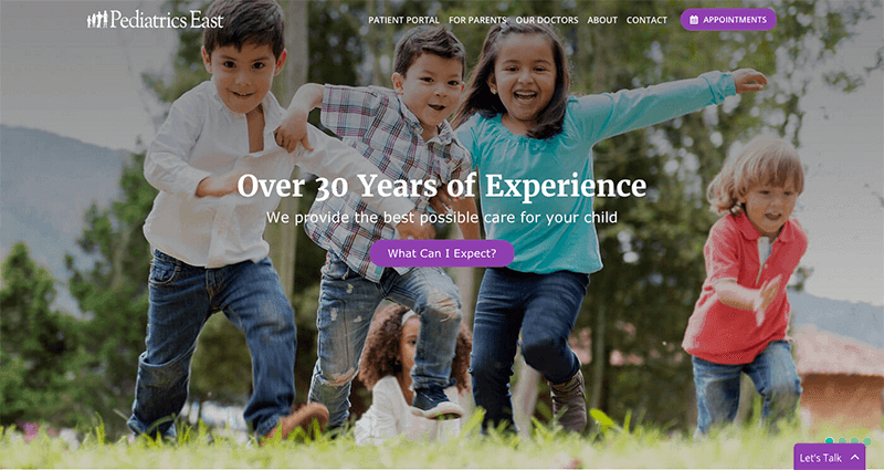
The Pediatrics East website has an effective homepage, with a large banner area highlighting important information and high-quality imagery. Appointment information is called out in the navigation to make it easy to find for visitors. Their good pediatric website also has various scroll and hover effects that make it feel more interactive.
Visit this website: https://www.pedseast.com/
The Children’s Hospital of Philadelphia
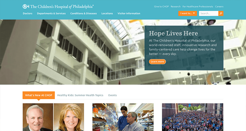
This website makes use of looping videos on the homepage that show real doctors and patients, which helps to engage visitors and create an emotional connection. It also provides a dropdown menu in the header with quick links important information that visitors are likely searching for right away. Overall, the website promotes a clean, organized design that is easy to navigate.
Visit this website: https://www.chop.edu/
Children’s National Health System
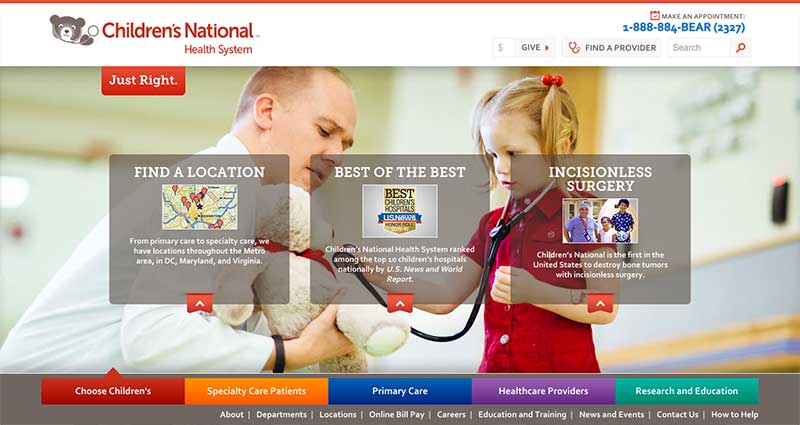
Children’s National Health System uses bright colors on its homepage, which aligns with the fact that it is a pediatrics website. It calls out it’s phone number in the header along with a “find a provider” quick link so that visitors can easily access this information. Also on the homepage is a search for conditions and treatments, which is a useful feature for visitors. The tabs at the bottom provide easy access points to the various sections of the website.
Visit this website: https://childrensnational.org/
Bean Tree Pediatric Dentistry

This pediatric dentistry website uses high-quality images on its homepage to make an impact on visitors. It prominently displays an image of its office on the homepage as well as highlights of their practice in order to make the website more personal and inviting. The navigation is easy to use and organized well so that visitors can get to the right information quickly. They also provide various social links in the footer to encourage user engagement.
Visit this website: https://beantreepediatricdentistry.com/
Boston Children’s Hospital
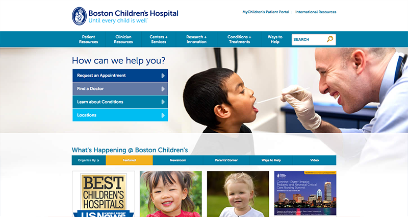
On the Boston Children’s Hospital homepage, it prominently displays important features like requesting an appointment or finding a doctor that can be quickly accessed in the banner area. It also promotes various interactive content, such as videos and news items, which help to engage users. The website has a lot of information, but it’s organized with a clear hierarchy in the navigation.
Visit this website: https://www.childrenshospital.org/
Lancaster Pediatrics Associates
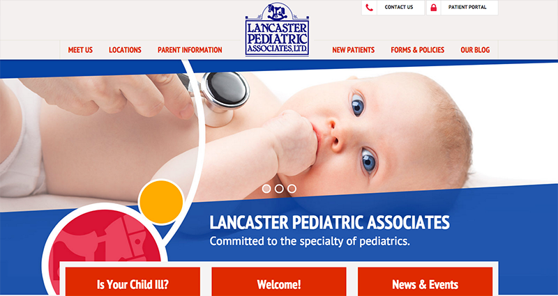
The Lancaster Pediatrics websites uses large, colorful graphics that are appropriate for a pediatrics website. The navigation is simple and organized, with quick links to contact or access the patient portal at the top of the page. Its subpages provide a clean, straightforward design that makes it easy to find the information you need.
Visit this website: https://lancped.com/
Let us help you create a good pediatric website
TBH Creative understands the unique needs of healthcare providers, and we can help you develop an online strategy to meet your goals. Our custom content management system includes features tailored towards healthcare facilities, such as searchable physician directories as well as advanced news and events components.Learn more about the variety of services we provide, and contact us today.