There are a variety of font options available these days, but how do you choose the right one? When making type decisions for your website, it’s important to consider readability, pairing, kerning, and more.
Readability
Avoid using a small font size for the main sections of website copy. Aim to keep your text between 12 to 14 pt to maximize readability. To help make scanning easier for your users, consider setting your headlines and subheads in a different typeface or style.
Pairing
If using multiple typefaces, spend time seeing how they look together as you develop your CSS. Play around with font choices. Sometimes two different serifs look great, or one serif one san serif, or two san serifs. Don’t just settle because it looks “alright.” Make sure each font compliments the other.
Unless it’s completely necessary for branding purposes, try not to use more than three different fonts on a website. Simplify your font choices to make your website seem more cohesive and thoughtfully put together. Too many typefaces on a website can make the design confusing for users.

Kerning
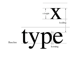
Kerning is the spacing between letters. Some fonts are kerned in a very condensed manner, and others can be spaced far apart. If you find your typeface hard to read, investigate its kerning to see if adjustments can be made to make it more legible.
Style
You need to be sure to match the design of your website. Is your website clean and contemporary? Traditional and classic? Full of character and edgy? There are fonts out there for any brand.
If you have a limited budget typefaces and Google Web Fonts aren’t meeting your needs, here are some websites where you might find some free or affordable alternatives:
Don’t let illegible fonts turn your customers away. In today’s digital world, your Internet presence can be just as important as your company website. TBH Creative specializes in web design and development. It could help you gain the competitive advantage.

