Navigation is a very important part of a successful website. After all, you can’t move around a website without one. I will discuss four aspects of creating a user-friendly and effective navigation for a website:
- Easy to find
- Minimal links
- Clear naming
- Show hierarchy
Easy to Find: Choose an obvious placement for your main navigation bar
Your navigation options need to be as easy to find as the logo. Users cannot go anywhere on your website without finding the navigation first. The two most common spaces for navigation are along the top or left side of the website. Users won’t stick around for long if they can’t make their way around your website easily.
The style and design of your main choices should also be appropriate. We recommend to use tabs, buttons, or other obvious ‘clickable’ styles.
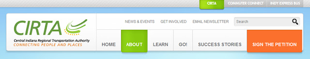
“Sign the Petition” is the organization’s main objective and was highlighted with orange for emphasis.
Minimal Clicks: How many links should you have in the main navigation bar?
There doesn’t seem to be a set “rule” on how many links you should have in the main navigation bar, and it may vary based on your company’s particular needs. Our recommendation is to keep it minimal by creating primary ‘buckets’. Additional pages can be placed below these main topics. A good range is 5-8 main buttons. If you need one or two more and the design will allow for it, that is okay. It is best to have less than 10 links in the main navigation. More than 10 is too much for the user to choose from.
Below is an example of a website with too many links in the main navigation:
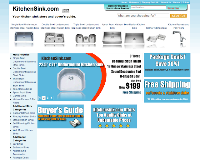
KitchenSink.com could have added some drop down menus and sub-navigation to help organize their site better. Larger websites will need sub-navigation as well, which brings us to the next topic.
Clear Naming: Use obvious names for categories
This sounds like a “no brainer”, but what you think a category should be named may confuse other users as to what that category actually contains. This is why it is important to conduct usability testing or gather input from others outside of the industry. For example, a good name for a page with map and directions is “Contact” or “Map & Directions”. The simpler, the better when it comes to page naming.
Where would a user expect to find your store’s hours? On the contact, home or about page? If you aren’t sure, you should conduct a round of usability testing with users in your target audience.
Tips:
- Shorten longer named links or buttons to simple and clear action wording. 1-3 words is optimal.
- If your company uses a lot of industry ‘jargon’, make sure the navigation wording speaks to the general public or audience, not just people who are very familiar.
Navigation Hierarchy: Are breadcrumbs needed?
It is important to identify for the user where they are on a website and within which section. This is especially important for large websites so that users do not get lost. Breadcrumbs are a great option. They are most often used in a simple form, for example: Home > Products > Bath > Towels. This shows which section the user is in and how they got there.
Below are some examples of showing hierarchy.
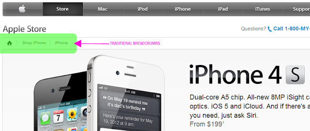
and they use very traditional breadcrumbs on deep level pages of the website.
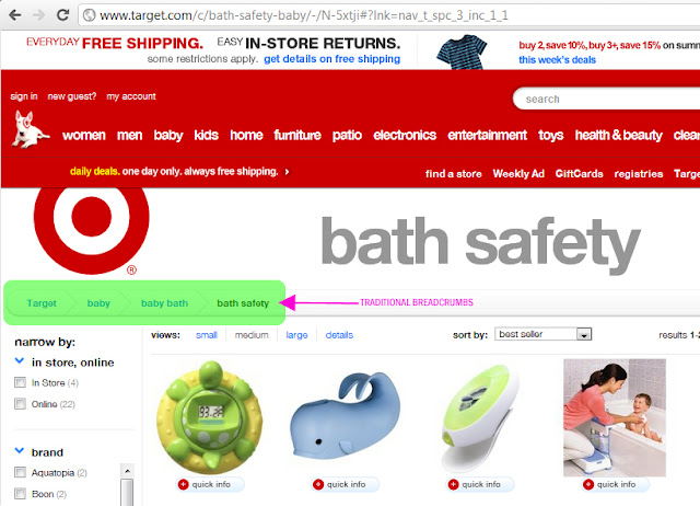
They also make it very clear which section the visitor is on using the large section title in banner bar (see ‘bath safety’).
See the active tab state, section identification on the left, and highlighted tab on the left as well.
Interested in learning more about navigation? One of our previous blog posts, 3 questions a good navigation system should answer, further discusses the importance of great navigation on a website.
Is your website difficult to use or hard to navigate? Let’s map it out together! At TBH Creative, we define your navigation structure, arrange the page information, and create appropriate graphics so that users can easily find what they need on your site quickly.