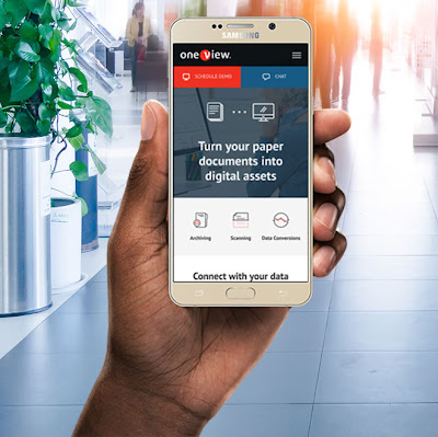
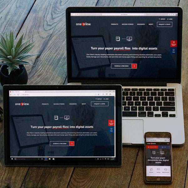
When One View’s marketing team approached us, they were in need of a complete website overhaul. They knew their website was outdated. It was difficult for their website visitors to navigate to learn more about One View’s services, and they were receiving no leads or requests for demos from the website.
Using strategy and industry research, we designed a modern and responsive website that was a significant improvement from previous to communicate their superiority in the industry. We expanded on their brand definition (with their permission) by introducing a blue overlay to photos and bright green accent, creating custom icons for services and actions, and building around the flat (more modern) version of the logo. We integrated several third-party software tools to streamline processes, and we modularized the CMS templates for easy editing by their team.
Q/A
Who is One View and what do they do?
One View believes auto dealers should own—and control—their most important asset: data. Founded in 1997 by David DeHaven, today the company is a leading provider of digital document management software solutions for scanning, archiving, and data conversion within the automotive industry.
Their solutions enable auto dealers to simplify workflows, reduce expenses, and focus on using data rather than maintaining it.
Why was One View looking for help with a new website?
Known in the industry for their product’s strong user design interface, One View wanted a customer-centric website that better reflected this business philosophy and attention to detail, and it’s why they made it a priority to improve the usability of their website.
One View needed:
- a modern, updated website. The old website was unattractive, lacked functionality, wasn’t responsive, didn’t convey to visitors how One View could help them with their document management.
- the ability to make edits/updates to the websites without having to come back through their website design agency.
- to increase leads on the website for the schedule a demo promotion.
How did One View find TBH Creative?
One View found TBH Creative from an internet search for “web design agency Indianapolis.”

What did TBH do to meet the goals of the website redesign project?
- Create a completely new design to present a stronger, more consistent corporate image
- Design a fully responsive website
- Move to a content management system for easier updates
- Train the One View team before site launch to ensure they were capable of using the CMS to make updates/edits on their own site
- Integrated forms on site to allow for demo requests directly through the website
Check out the more details of the One View website project in our portfolio.
What did One View think of the new website?
“I am BEYOND excited for the launch! Thank you for everything.”
—Jill Delaney, One View marketing manager
Compared to other projects, what worked well on this website redesign project?
One View came into the project with specifics ideas of what they liked in design. That helped inspire us to use those ideas and consider their audience and goals to then create a modern and effective design solution.
The design was such a big improvement to represent the company. One View didn’t have much defined within their brand, and they were open to ideas on how we could enhance it. That gave us design freedom while also providing some very specific ideas for movement. We were happy when the design was approved with minimal adjustments to content.”


