 |
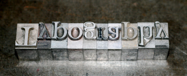
| (Photography by Relly Annett-Baker, CC BY-NC-SA 2.0) |
Is the font big enough?
Sometimes, when increased readability is the desired goal, novice designers will compromise designs by setting their type too large, thinking bigger is better.Contrary to popular belief, though, when type is too large—especially when it’s displayed in a small space—readability is hindered. Without adequate space around text blocks, readers can become fatigued and may become less likely to continue reading.
Ultimately, when it comes to sizing type, trust your eyes. They usually are the best tool for deciding what is best. This is not an exact science. Because there are variations in set width and x-heights between typefaces, some will appear bigger than others despite being set at the same size.
Here are some guidelines for judging the size of your type:
- For a distance of 1.2 feet (the typical reading distance for a book):
Most people prefer 10, 11, or 12 points type. Avoid going below the minimum, which is 8 points type.
- For a distance of 2.4 feet (the closest comfortable distance for reading posters):
Aim for no less than 16 point type for the smallest copy blocks.
- For a distance of 5 feet:
Make sure the minimum font size used is no smaller than 32 points.
- For a distance of 12 feet:
Go for no smaller than 72 points. For reference, keep in mind that 72 points = 1 inch.
- For a distance of 100 feet:
Make sure the minimum font size that you use is no smaller than 3 inches tall.
How to determine the ideal measure
The measure of a line is the length of a line of text. When setting type into a single-column, the measure should ideally be between 40 and 80 characters, with the ideal measure hitting around 65 characters. When the measure of a line is too short, the result can be awkward spacing and slowed down reading. When the measure of a line is too long, the type can cause eye strain and possibly decrease comprehension. A measure that falls too far outside the optimum range can make your layout not only ugly but difficult to read, too.All fonts are different. When it comes to measure, what works in terms of legibility for one may not work for another; however, the alphabet-and-a-half rule is an easy to use formulas to help you find an ideal measure:
- The Alphabet-and-a-Half Rule
This formula is simply 39 characters (letters, punctuation, and spaces), regardless of type size. Once you have set this copy, use this as your starting point to judge readability of your column of type by adding more characters if necessary. When using multiple columns of types that are the same width (such as those used in editorial layouts), 40–50 characters per line is often preferred measure.
Making type work online
In the ever-changing web design environment, it’s crucial to make type a priority and remember that users will access your content on a variety of platforms. Plan out type sizes carefully during the initial design process and set-up your grid to make sure your copy blocks are as legible as possible across a wide range of screen sizes.We specialize in high quality design to communicate your brand and message. Learn about our graphic design and web design services.
Need help with your digital marketing strategy? Talk to us
