It’s the New Year and that means we’re on the watch for which are the coming trends in web design. These are the ten top trends to pay attention to in 2014:
Mobile design
With continued advances in technology, it’s beneficial for businesses to have a mobile-friendly web presence. Keeping multiple device sizes in mind, usability may be difficult if your website it not mobile-friendly. By making a mobile-friendly website, your business may find unimportant information that isn’t needed.- The Christ Hospital worked with TBH Creative to develop a mobile-friendly version of its construction website.
Responsive design
- Kermans Flooring worked with TBH Creative to develop its responsive website in 2013. Visit the Kermans website.
Flat design
The days of drop shadows and making objects on a page look like real things is slowly being replaced with flat design. Skeumorphic and 3D design focuses on using fewer things to help pages load faster. Many businesses are starting to lean toward a flat design such as Windows. Apple has also updated the iPhone software to use a flat design.Retina displays
Many Apple devices have retina screens. With this development, it is going to be important for companies to have higher resolution graphics on their websites. In the years to come, higher resolution screens may become the standard on other devices. Images that aren’t in high resolution may become pixelated by the new retina displays. Designers may like the new change in screen resolution because websites will appear clearer to viewers using devices with retina displays. |
| Photography by Yukata Tsutano, CC BY NC 2.0 |
Social media
If your business doesn’t already have a social media presence, then make a goal to develop a social media strategy in 2014. Social media is a great way for businesses to expand their audience. With the ability to share posts on websites like Facebook and Twitter, your business may increase reach and support marketing goals. Social media helps allow followers to interact with your business. Follower interactions can help improve your business with comments they may post with questions or concerns.Parallax scrolling
Parallax scrolling is an animation technique that brings websites to life. A webpage with parallax scrolling will appear to have multiple layers. The background and foreground layers along with the text are animated as you scroll. Parallax scrolling is a way for your website to come to life and be interactive to the viewer.Infinite scrolling
Infinite scrolling is beginning to get rid of the idea that all information needs to be “above the fold.” With many people using mobile devices people are getting used to having to scroll up and down on a webpage. Infinite scrolling allows viewers to see more content on a single page. In 2014, web designers may need to be more thoughtful on how they design a page with infinite scrolling because if the page is cluttered with content, infinite scrolling can be overwhelming to the viewer.Simplicity
In 2014, there may be more websites using simplistic designs. A simplistic design helps minimize distractions for viewers and keeps the content you want to be seen at the forefront. As a starting point, go through your website content and get rid of any information that isn’t needed. Cleaning up your website will make it easier for viewers to find the most important content.Large images
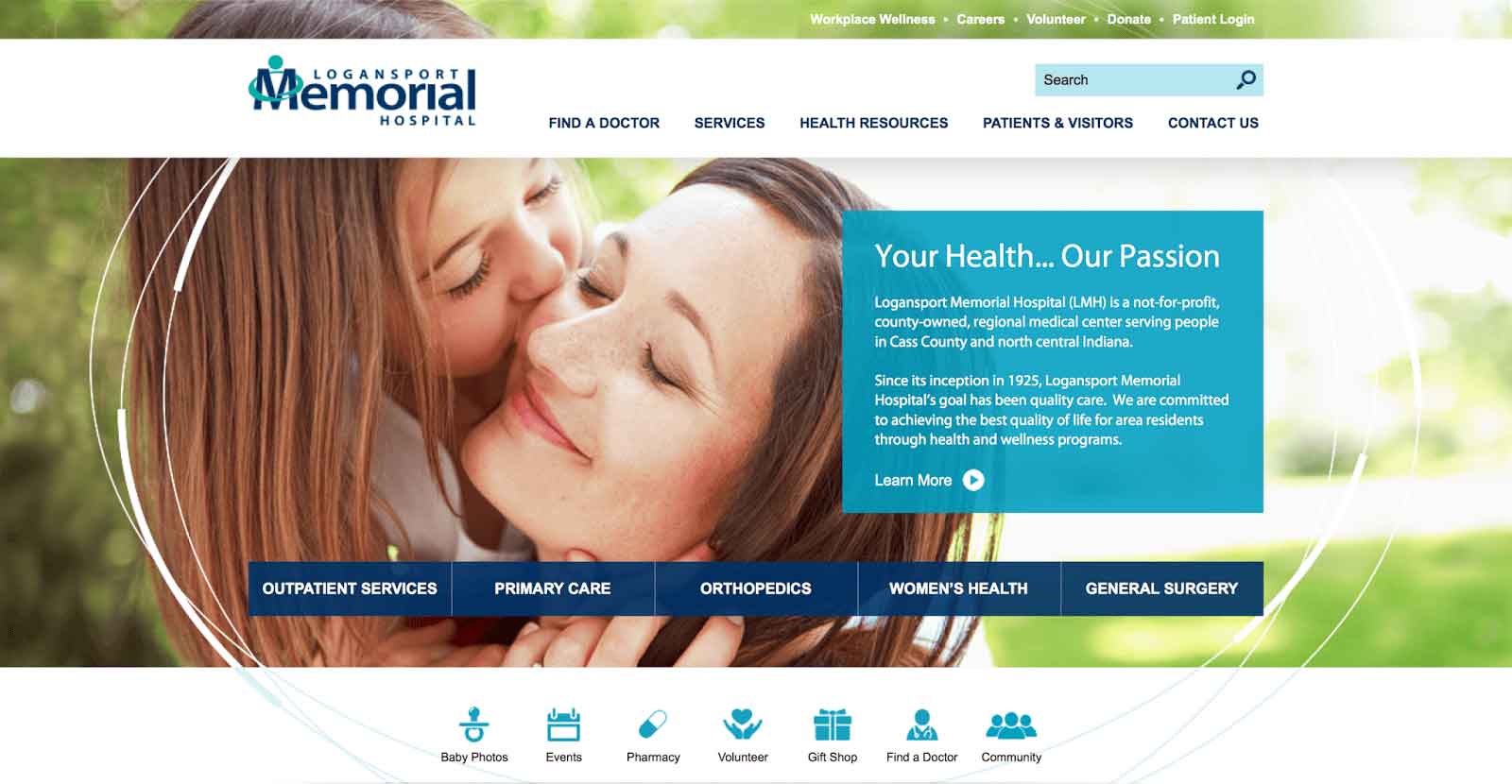
These days, web designers can incorporate large images into their designs because internet connections are much faster than they used to be. Typically large images are used as a background image to be eye catching for viewers without distractions from the most important content on the page.- Logansport Memorial Hospital worked with TBH Creative to find and incorporate large images into their new website design. Visit the LMH website.

Single page websites
If your website doesn’t have a lot of content, then a single page website format might be the best solution for your business. Instead of forcing users to click through links to bring up multiple pages with minimum content, single page website formats put all of the content on one page. Viewers can easily navigate by scrolling down through the single page of content. Single page websites are often used with parallax scrolling. This technique is a good way for a website to have a simplistic design.Want to read up on more predictions for the future of web design? Here are some websites discussing the topic.
TBH Creative designs and builds user-friendly websites that are always up-to-date on the most important web design trends. Contact us today for help keeping your website cutting edge in 2014 and beyond.
