The last thing you want is to lose is customers at this stage of the game because your website pricing page isn’t well-designed or clear.
Every buyer’s journey starts with awareness, moves on to consideration, then ends with decision-making. During this final stage, your customers are getting serious. They realize your product or service can help them solve a problem, and they have made it far enough down the funnel to consider making a purchase from your business. Thinking about pricing is now top of mind.
Read on to get tips to create a user-friendly pricing page that helps you close the deal.
Tip #1: Use tiers to organize and explain different options
If your product or service line includes a range of offerings, detail what is included at different levels on your website pricing page. Present this information clearly so that potential customers can quickly find the price for the solution, which consists of all of the features they need (and check that it fits their budget).
Pro-tip: Help your users find the best solution by highlighting the most popular option on your website pricing page. Indecisive potential customers may be swayed by this type of social proof and choose the most common option to cover their needs.
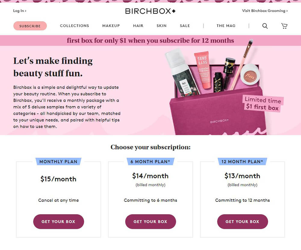
Birch Box does a great job of creating clean and simple pricing tiers. Their monthly subscription boxes, including membership length options, are easy to scan. Plus, details about each subscription option include clear CTAs that prompt the user to start the signup process.
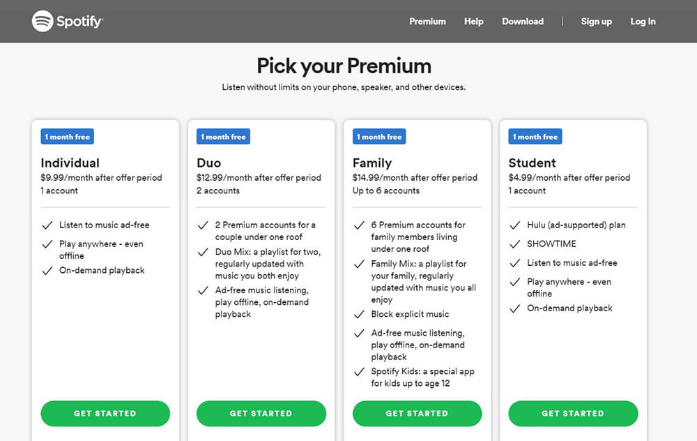
Like Birch Box, Spotify also uses tiers to tell website users about all of their options for using their music streaming service.
Tip #2: Add graphics to enhance your website pricing page
Using fun illustrations, brand colors, and/or icons on your pricing page can bring some fun and creativity while also making the shopping experience fun for customers.
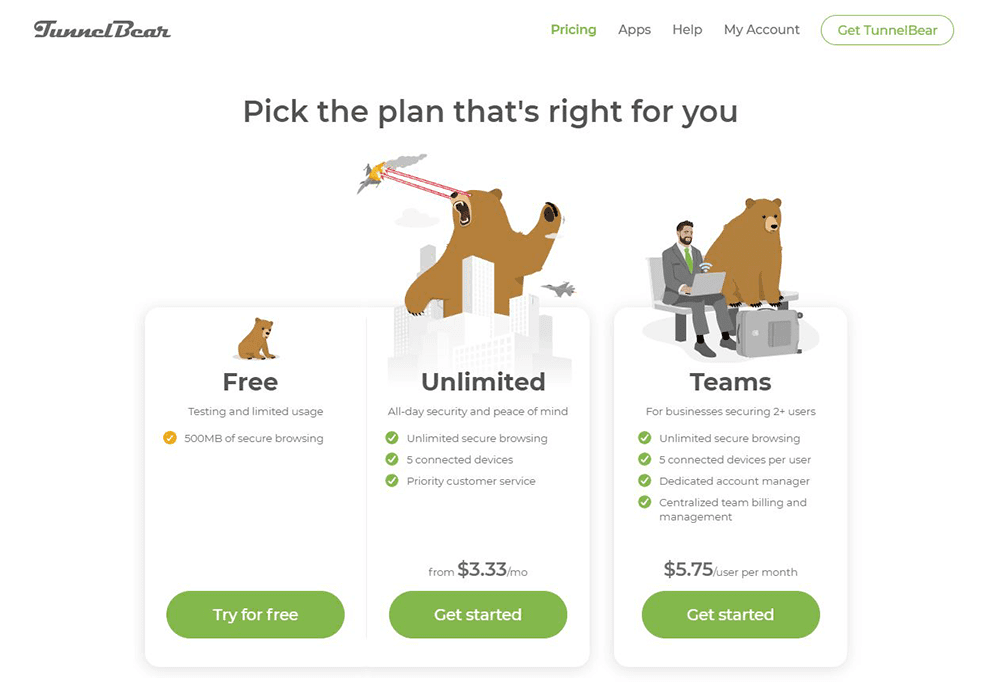
Tunnelbear, a virtual private network service, uses their cute, creative, and comical bear illustrations to bring life to their pricing page. While the images are not only entertaining for potential customers, they also clearly depict the examples of all their tier options (free, unlimited, and teams).
Tip #3: Use creative names for your website pricing page’s different tiers or packages
It’s all in a name! By creating fun and meaningful names for your packages or levels related to your industry, you can add even more creativity and spunk to your website pricing page. By going beyond the default “free,” “basic,” and “pro,” you can set yourself apart from the competition. Choose terms that make sense and match your company’s brand voice.
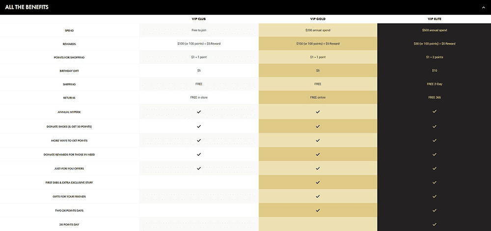
DSW (Designer Show Warehouse) follows this model with its rewards program. When you join as a VIP Club Member (for free), each time you spend, you’ll be promoted to the next tier (depending on how much you spend) to work your way up to becoming a gold, then an elite member.
Double-check that you’re free and clear of page distractions
Make sure when writing text for your website pricing page that your explanation of what’s included with each option is easy to understand and design this information so it’s clear of distractions. Removing any unnecessary clutter (including fluffy words or unnecessary visual details) will help convert “just browsers” into customers.
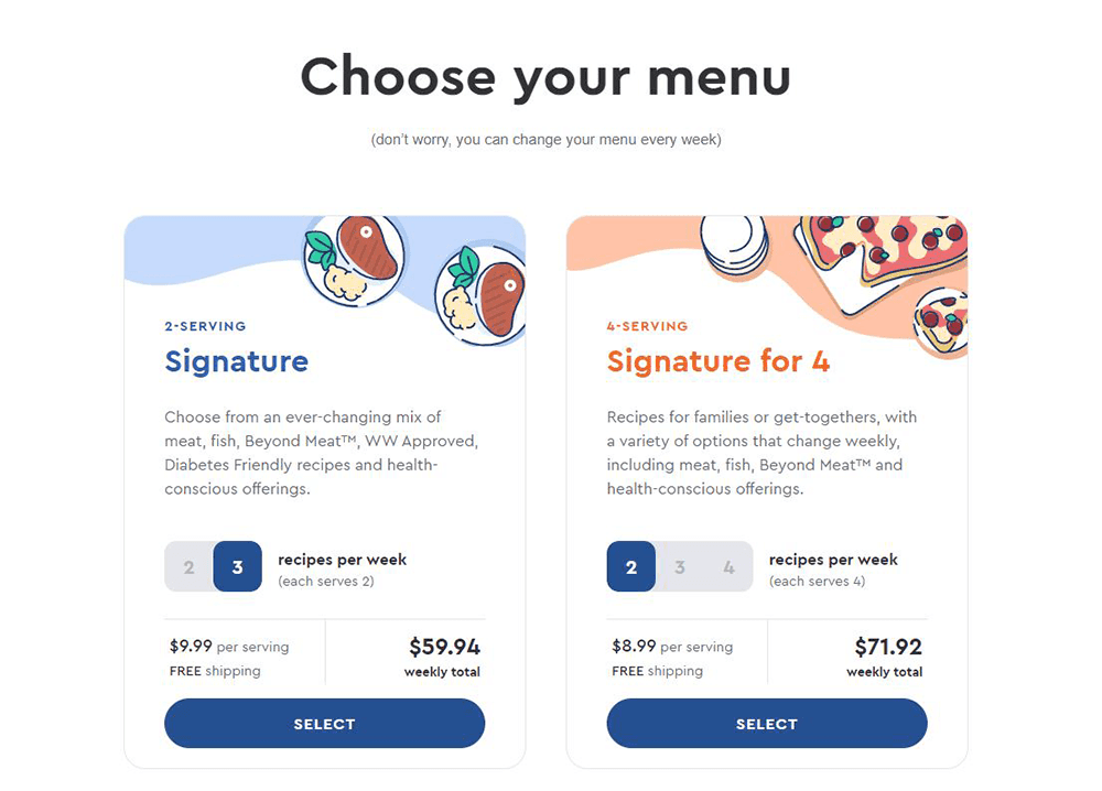
Blue Apron does this exceptionally well. With three distinct plans for people to choose from, they make it easy for potential customers to find pricing for their selection with toggle functionality used to show price differences between the number of meals sent each week.
At the end of the day, your potential customers will visit your website pricing page to find the information that best pertains to them. Help your business in converting potential customers by:
- skimmable
- straight-forward
- distractions-free

