Marketing managers or company owners may wonder if their website should be updated. The answer 95% of the time is yes. Even if your website is good, there is always room for improvement either directly on your website or through complimentary services such as email marketing, search engine optimization, or social media efforts. Successful websites are continually and routinely enhanced, changed and updated.
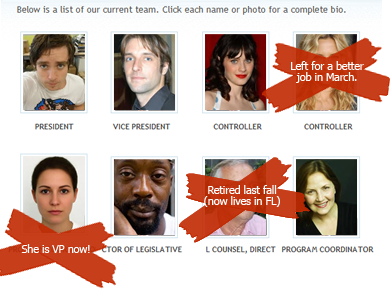
For this post, I examined obvious and must-need reasons to upgrade and update your website. If your website has the following problems, you need to upgrade now. Not tomorrow, not in a few months, but now because hundreds or thousands of visitors are (or could be) learning about your company each day.
- Information is inaccurate.
- You are embarrassed to send potential clients to your website.
- Visitors are interested, but cannot contact you via your website.
- Your website has broken links or error pages.
- Visitors cannot answer ‘who you are’ or ‘what you do’ after 10 seconds on your home page.
- Your website hasn’t been updated since it launched… over a year ago!
1. Information is inaccurate.
Outdated, incorrect or misleading information on your website will turn visitors away. This is a plain and simple fact; however is something that so many companies put on the back-burner to correct. Why is this on your backburner? Your website is a presentation of your company that continues to play all day and all night to hundreds or maybe thousands or millions of potential new clients.
Some typical examples of information problems on corporate websites include:

- Your services or products are outdated, a partial list of what you really do, or are missing photos and proper descriptions.
- You have rebranded but the website still shows your old logo and colors. If your design is good and your website works well, do not forget about the information. These things all work together to help you achieve results.
2. You are embarrassed to send potential clients to your website.
I honestly hear this often and cannot express more how this is holding your company back from potential success. If you aren’t sending people to your website because it is not “up-to-par”, do not think for one minute your potential clients are not going there anyway and judging you.
On the flip side, you may have a great salesman that closes the deal. That is great, but boy is he working hard! Why not double or triple his efforts (not to mention make his life easier) by putting your #1 marketing tool (your website) at the top of your priority list. Set a realistic timeline, find a website company who can help make it happen, and get it out there — non-embarrassing style. You will be amazed at the what a web strategy can do.
3. Visitors are interested, but cannot contact you via your website.
Seriously, you spent all this money (or maybe you didn’t and that is part of the problem) and you have potential new clients on your website…but they cannot reach you, they do not know how to buy your products, or they have questions but no one is available to answer. What do most users do in this scenario? They click away. Quickly and without a second thought. You just lost potential business.
Your website should:
- Have a clear call to action on each page.
- Provide a phone number or an online form – that is easy and obvious to find.
Another big mistake is to have a contact form, but it doesn’t work! You have now frustrated your user or made them believe someone will be contacting them (but in fact you aren’t sure who receives those messages – do they go off into cyberspace?).
Adding a call to action and clear method for contact is a fairly quick and easy addition to make that will have a significant impact to visitors on your website and for your company ROI.
4. Your website has broken links or error pages.
If you were trying to impress a new client over a lunch, would you be late? Would you take them to Taco Bell or spring for something a bit nicer? Would you belch at the end of the meal? You surely answered no. Well, at least not on purpose, right?
Broken links on your website are similar to the above. They leave a bad impression, do not show off your strengths, and are simply lazy.

5. Visitors cannot answer ‘who you are’ or ‘what you do’ after 10 seconds on your home page.
This puzzles me, but so many website simply do not state what they do or who they are right up front. Your website should not be a game or riddle for these basic questions. Everyone is busy and people use the Internet to find important information… quickly. If you do not say what you do, users will go somewhere else or leave your site wondering: “what?”.
A few examples:
- If you are business furniture store, show them some furniture. That is great that you are involved in the community and are a cool company, but tell them what you sell!
- If you are a service company, show samples of your work or the products you work on.

Do not leave your users guessing why they should be interested in your company. You are good at XYZ, so just answer the question: What do you do or who are you?
6. Your website hasn’t been updated (or thought about much) since it launched… over a year ago!
If you launched your website a few months ago or over a year ago, your job is not done. This was the thinking 5 years ago, but not anymore. Your website is not just a brochure. It is an interactive tool that is easy to change to reflect new ideas and directly speak to your customers. If you are not taking the lead, your competition is going to.
Are you measuring your website or online success? Do you know how your visitors are behaving on your beautiful new site? Are you directing people to your site and giving them a reason to come back? Creating a website is only step one.
The next steps you should plan on include ongoing analytics review, making changes based on user trends and company goals, and strategizing techniques on how to use your website as a tool to achieve results.
If you need help with these items, TBH Creative is a website strategy company located in Indianapolis. We help companies realize and achieve their online potential. Contact us today for more information about our website services and recommendations for your corporate website. Indianapolis web design at https://www.tbhcreative.com/
