Online annual reports are a trend that is here to stay, and if your company hasn’t made the switch yet, it’s the perfect time to reconsider. By developing your annual report in an online format as opposed to print, you’ll have more options and greater flexibility when it comes to how you can present data. When done right, your online annual report can be a useful marketing tool that reinforces your brand.
Benefits of online annual reports:
- Added interest. By creating an online version of your annual report, you can display data in a unique and interesting way. An online format allows you make use of elements such as animation, scrolling effects, or other advanced functionality to make your report an interactive experience for viewers.
- Greater content variety. One of the biggest benefits of an online annual report format is that you have a wider range of content options. For example, you can link out to relevant information or add videos, which helps increase viewer engagement.
- Increased shareability. Sending your online annual report out to stakeholders is as simple as sending them a link. Online reports also open up the opportunity for social sharing if your goal is to increase interest in your business.
- Quicker updates. With traditional printed annual reports, any updates or changes would be complicated, requiring design adjustments and reprinting. With an online report, you can update content easily if needed.
- Easier reusability. Online annual reports are easy to reuse for future reports. If you want to keep the same look and feel each year, you can simply swap out content with minimal effort.
Will your business be creating an annual report for 2016?
While it can be challenging to put together annual report data in a creative and engaging format, each year brings new online annual reports to draw inspiration from. Check out these examples from the previous year to point you in the right direction.
L’Oréal
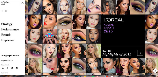
The L’Oréal annual report is designed in a clean and modern format, with lots of large imagery and movement. It incorporates a good balance of content in an easy to browse manner. View the annual report.
International Youth Foundation
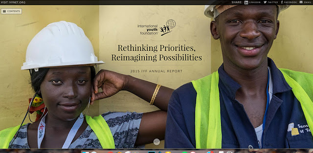
The IYF report is a simple, one-page website with clear navigation. It takes a different approach by separating the report into several sections with additional content and related information for each, including blog posts and videos. View the annual report.
Flywheel
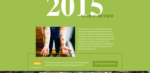
Flywheel takes a more casual approach with their annual report with a one-page website that includes photos and fun facts. The numbers count up as you scroll, adding subtle movement and interest. View the annual report.
Royal Bank of Canada
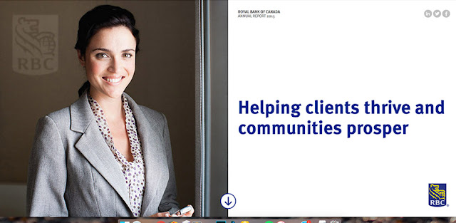
The RBC annual report takes advantage of social sharing by providing links throughout. It also provides downloadable versions of different sections of the report.
Energy Trust of Oregon
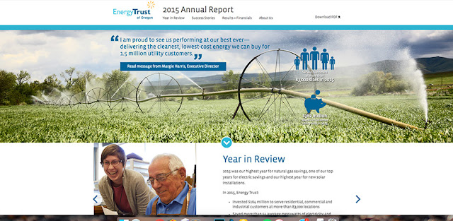
Energy Trust has a simple but clean annual report website that highlights successes. It incorporates elements like charts and graphs to display numerical data, including animation to make it more interactive. View the annual report.
See more online annual report for inspiration:
Need help with your annual report? TBH Creative has the web strategy and design experience to help you create an effective and interactive annual report that will reach a wider audience.
Let’s get started
