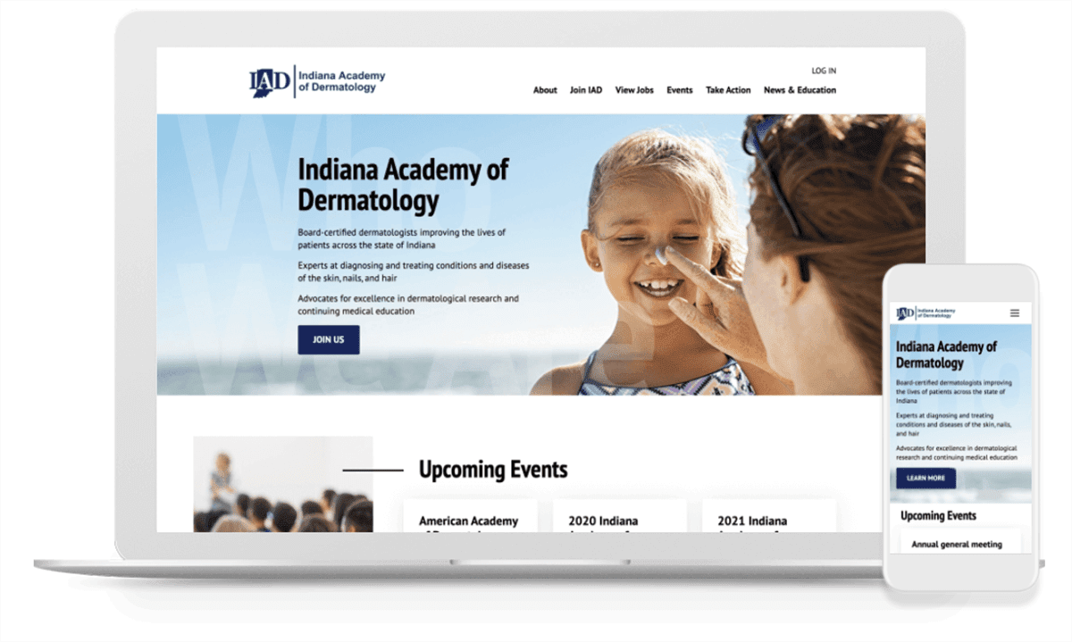
Good membership websites provide organizations with a direct way to collect dues and communicate with their members, but the very best solutions do even more. They are also designed to meet the needs of prospective members and set up to make it easy for busy organization leaders to handle administrative tasks.
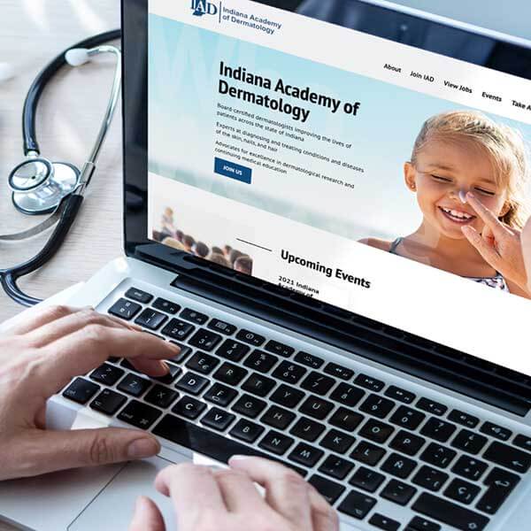
Looking to take their website to the next level, the Indiana Academy of Dermatology partnered with TBH Creative to upgrade its web presence. Their new website boosts the organization’s capacity to serve its membership and streamline organizational management work.
IAD’s primary goals for their redesigned membership website included:
- Setting up a digital, database-driven solution for online event registration, private member communications, resources sharing, and easy management
- Redesigning the homepage to showcase the organization’s mission, highlight its leadership team, and show the IAD’s work and offerings
Launch date: July 2020

Q&A
TBH Creative chatted via email about the membership website redesign project with IAD’s vice president John Stephens, MD, and TBH Creative marketing manager Sarah Matlock. Their responses—below—have been condensed.
Why did IAD decide to redesign its website?
Dr. Stephens: Our old membership website did not have the capabilities to be a useful tool for our members. We needed a website that would allow users to join the organization, pay their dues online, and manage meetings. In addition to these functionality needs, our previous site had very little character, and we wanted a more modern website that better represented IAD.
Matlock: When they came to us for this project, their old site featured a dated design that was not user-friendly. To ensure continued success, IAD needed the redesigned membership website that would serve as a real tool with upgraded functionality for taking care of day-to-day tasks of the organization and special tasks like processing dues payments online.
Why did you pick TBH creative to be your partner?
Dr. Stephens: We received several quotes from firms all over the country, and most were in the ballpark financially, but what set TBH Creative apart was that they provided clear, honest answers from the beginning. Tatum gave us a well-rounded vision for what would work instead of just offering up a cookie cutter solution. I also appreciated being able to work with a respected web design company that was local so we could have face-to-face discussions when needed.
How did TBH Creative do?
Dr. Stephens: The team at TBH Creative did a wonderful job creating a clean, sharp looking website that provided all our needed functionality. I deferred to them about what would look best and how to solve our functionality needs because I trusted their expertise and experience. They are the professionals, after all, and this turned out to be a good decision. Their web design and development suggestions resulted in a website we are proud to call our own.
Matlock: IAD made our work easier. John specifically was a great project leader, clearly identifying their primary goals upfront (expanded functionality, user management, sharing news and events, etc.), and he responsive when we had questions.
Would you recommend TBH Creative to other membership organizations or healthcare companies looking for strategic website and marketing help?
Dr. Stephens: Yes, I feel like TBH Creative is a well run, professional web design agency that has the capability to take on projects big or small and meet their customer’s needs.
Anything else you would like to add?
Dr. Stephens: Our small group was apprehensive in diving into a large, potentially costly project, but partnering with TBH Creative was an extremely pleasant experience. We are happy to have done worked with them and feel like TBH Creative delivered what we needed—and more.

