
Retina is the new buzzword around web designers and interactive marketing teams. This new technology has not only improved the way we see web content, but retina is starting to influence how developers build websites. As a strategic web company, it’s TBH Creative’s goal—and responsibility—to ensure a satisfying experience for users browsing the web, regardless of display.
What is retina display?
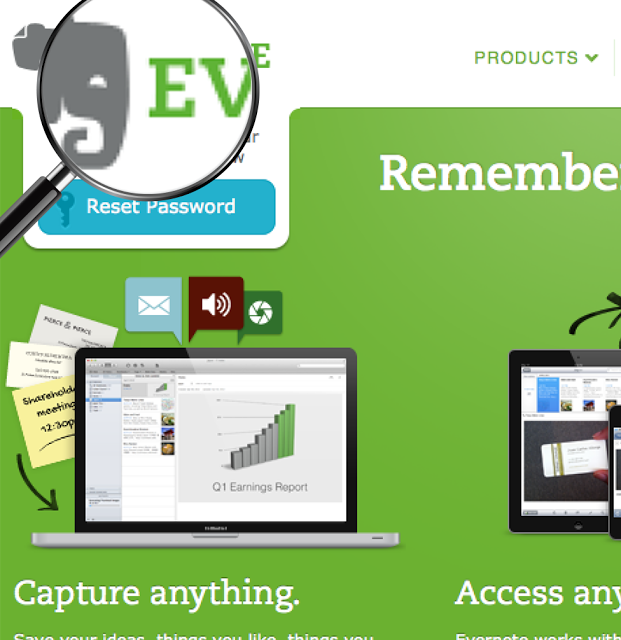
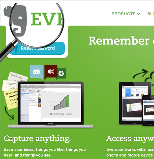
Retina is a high-density resolution display. It produces crisp images by doubling the pixel density in the same amount of space as a normal computer monitor. As you can see in the screengrabs posted below, the amount of pixels in the retina display is drastically different than the normal display on the iPhone. The retina display is sharper, displaying a more vibrant image and crisper typography.
The first example below shows a non-retina display image. When a user zooms in on the logo, the edges of the graphic are blurred and muddy, which doesn’t show the image off at its full potential. The second image is the website viewed on a device with a retina display with the logo optimized for this format. The result, when zooming, is detailed and adds to the overall beautiful experience of the website.
Solutions
There are several solutions for optimizing websites for this improvement in browsing technology. These small changes in web development can impact the way your website is viewed on a high density display.
@media queries:
This solution involves targeting images in the stylesheet for both a normal display and retina display. The regular image is loaded at first, then switches out for the higher resolution image should the device request it. This solution is good for any website or app that uses the background-image property, but does not support inline images.
Javascript
Similar to the solution above, you are able to replace images in your content with a retina-optimized counterpart. Javascript is able to detect the screen density when the page is loaded.
@font-face image fonts
This solution is specific to scenarios when there are a large amount of icons on a website. Similar to the above technique, when the webpage is loaded, the icons will automatically resize themselves.
More resources:
As with many new trends and emerging technology, it takes some time for new ways of delivering a better user experience to become the norm. Our goal at TBH Creative is to build web experiences for our clients that scale from one device to the next.
