Take advantage of Marie Kondo’s famous decluttering rules to organize your closet and grow website conversions.
My parents, who have never been minimalists, are in the midst of downsizing, slowly going through all the stuff that’s accumulated in their home over the last 30 years. (Or, to co-opt marketing jargon, you could say my mom and dad are “optimizing their retirement for maximum ROI.”)
A few years ago, I heard that the advice in Marie Kondo’s bestseller Life-Changing Magic of Tidying Up (2012) makes organizing easier so got my folks a copy of her popular self-help book.
Giving them something else for their house when they are starting a new chapter in their life probably sounds counter-intuitive, but—according to my mom—Kondo’s principles have made it easier for them to systemize, donate, and discard.
My folks aren’t the only Konverts proudly letting things go with the help of the Japanese lifestyle guru. Kondo’s popularity has grown even more ever since her hit Netflix show launched in January. Since the start of 2019 Goodwill stores have been receiving a steady 10–20% increase in donations, to which they credit to the KonMari craze.
Kondo’s simple rules and thoughtful methods are not just useful when you need a consultant (or muse!) to help you change the way you think about items piling up around your home, though.
If you have a website that isn’t delivering the results you need, now is a great time to use her tips to “tidy up” online and clear away the chaos. Keep reading to learn how her strategies will help you optimize your CTAs to start getting better results from your company website.
Commit to improving your website
Maybe your website started out great, but now its content is out-of-date or messy since business priorities shifted. Maybe no one ever really had time to think about what your target audience needs and the content reflects a product-first (or service-first) mentality.
Whatever the reasons are that you need to improve your website, the important thing is that you’re taking the first step by committing to making the changes necessary to get better results from your site.
To get inspired, take a note from Kondo and set goals about what you want to get out of your website as a result of this effort. She writes, “People cannot change their habits without first changing their way of thinking.”
Think about what your target audience needs
Nothing will ever outperform a call-to-action that focuses on your customers’ pain points. Consider the differences between these two promos:
- Read our blog post
- Learn how to write CTAs your customers can’t ignore
The top CTA is direct, but it doesn’t exactly tell you much. The second is more inviting because it promises compelling content—that solves a problem—is just one click away.
In her book, Kondo advises you to take a minimalistic approach when organizing. She writes, “The space in which we live should be for the person we are becoming now, not for the person we were in the past.”
If your website is littered with CTAs that don’t align with your current business goals and what your customers need, you’ve got some work to do.
Be reflective. Thinking about your target audience’s needs when planning your website CTAs is not only a considerate way to speak to your users, but it’s also a surefire way to ensure your value proposition resonates and raises conversions.
Evaluate your website marketing goals
The only things worse than poorly written CTAs are CTAs that don’t support your business goals and webpages so overloaded with CTAs that your customers don’t know where you want them to click.
The goal of the KonMari method is to help you eliminate the things that cause stress from your home, and you can use a variation of that strategy to curate and prioritize the content for each webpage. She writes, “The best way to find out what we really need is to get rid of what we don’t. … To get rid of what you no longer need is neither wasteful nor shameful.”
Use your customers’ needs as a guide for creating CTAs. Too often, when production starts without doing crucial strategy work, you can end up with webpages that feature odd CTAs or too many CTAs.
Before you start to optimize, take a step back and think about why your user is on the page, where they are in the customer journey (and what problem they are trying to solve), and which CTA makes the most sense to guide them—friction-free—to the next appropriate step.
Optimize your top pages first
If your website is a mess and the process of fixing up all of your website CTAs seems insurmountable, that’s okay. Harness your resources, and start small. We recommend beginning with your top pages because you don’t have to do everything all at once to start seeing meaningful improvements.
When it comes to decluttering, Kondo recommends discarding unwanted items first so that you’re only left the task of organizing the essentials. You can use the same tactic on each webpage. Think about your customers’ needs and goals, then consider questions, such as:
- What are you trying to achieve?
- Which important content is being overlooked?
Kondo also recommends tackling one category at a time to keep the task manageable. She writes, “We should be choosing what we want to keep, not what we want to get rid of.”
If you have done website persona research, phase one of your website CTA optimization project might be to clean-up all of the main pages accessed by one of your target audiences during their customer journey.
Make sure your design is pleasing
Kondo endorses following her checklist strictly to stay on track when organizing. To create effective CTAs your designers and copywriters should follow web design rules and content strategy best practices.
Following those unspoken rules and focusing 100% on what customers need is a surefire path to producing more leads. Forms should be easy to fill out, buttons should be big and bold, and copy should be direct. Make sure on each webpage, its primary CTA (if there is more than one) is designed and written to get your customers’ attention.
Keep an eye on analytics to see if your tweaks are working
Kondo’s promise in her book is that once you’ve cleaned your home following her rules, you’ll never have to do it again. Her bold claim might work for getting a handle on clutter, but it’s not the best takeaway for creating and managing website CTAs.
Instead, CTAs should always be helping you reach your digital marketing goals, and the best way to make sure you’re meeting your goals is to include reviewing each CTA’s performance as part of your regular website content audit process.
DESIGN INSPIRATION
Here are five examples of exceptional website CTAs that “spark joy”:
Apple (left) uses persuasive copy and strong visuals to get your attention. YouTube’s action-oriented CTA inspires you to think about what it would be like to view your favorite videos without the burden of having to watch disruptive ads.

The Southern Poverty Law Center creates a sense of urgency with its CTA body copy and button prompt wording.

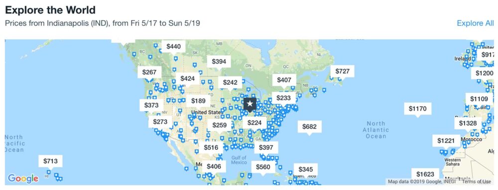
KAYAK takes a visual approach, using an interactive, map-based CTA to entice you to search their database to find your next affordable vacation.

The Indianapolis YMCA uses efficacious copy and a relatable photo to convince parents to enroll their children in the organization’s before- and after-school care programs.

Optimizing your website CTAs
No one has ever said that they regretted the effort they put into improving their website.
If you know your website needs help and you’re stuck on what you can do to improve your CTAs to start seeing better conversions, get help from an experienced partner—like TBH Creative. Ultimately, any time you spend to make your website better for your target audience will pay off and provide the quickest path to increasing conversions.

