In this article we discuss the key elements that help drive a software website to success. We also provide examples of outstanding software websites across a variety of industries, from healthcare to marketing to education.
Key elements of a successful software website
While there are many aspects that contribute to the overall success of a software website, here are some of the most essential elements to include:- High-quality design: A clean, modern design is important so that your website appears professional and reinforces your brand.
- Features and capabilities: Potential customers need to know how you can help them and why they should use your software, so make sure your website highlights its important features and emphasizes any key factors that separate your software from the competition.
- Product showcase: Provide screenshots, videos, and any other product information you can to showcase your software and what it can do.
- Calls to action: Make it clear what you want your website visitors to do on your website—whether it’s to request a demo, order a product, or contact you. Include a call to action wherever applicable to guide visitors towards that end result.
- Free trial: If you offer a free trial of your software, make sure it’s prominently displayed on your website. Offering a trial run to visitors is a great way to get them more interested in your product.
- Support information: If you provide technical support, make that clear on your website. This helps to show visitors that you will continue to be accessible even after they’ve purchased your product.
- Customer testimonials: Highlighting testimonials or high-profile customers is a great way to build trust in your product and prove its benefit to customers.
- Company information:Providing information about the company behind the software can help your website appear more personable and allow potential customers to better connect with you.
Some effective software websites—
Evernote
What this website does right:Evernote puts the primary focus on its features, providing screenshots of its software. It clearly displays its pricing information on the homepage as well.
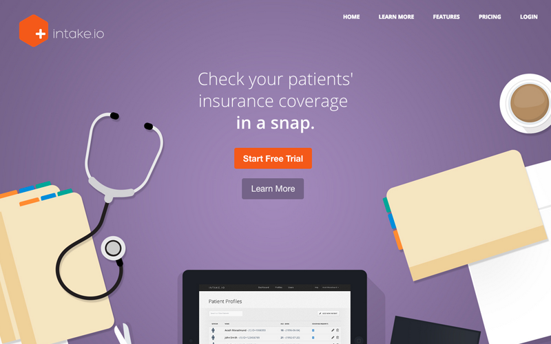
What this website does right: Intake has a clean, one-page website that highlights its features and pricing. It also prominently displays calls to action for a free trial of its software.
DoneDone
What this website does right:The DoneDone website is very graphic-driven, highlighting its features through screenshots and video. It highlights testimonials and high-profile clients on its homepage to help build trust in its product. It also includes easily accessible support and documentation.
Alma
What this website does right: Alma’s homepage features a product video at the top of the page, as well as prominent calls to action for requesting a demo. It provides information on how different markets and types of users can benefit from the software. It also includes a company page, providing background information on its mission and leadership.
Invision
What this website does right: The Invision website homepage makes use of animated GIFs displaying how to use the software, which helps users to quickly see how it works. They have an entire page dedicated to customer testimonials as well promoting the benefits of the product.
FreshBooks
What this website does right: The Freshbooks homepage focuses on guiding visitors to start a free trial, with a short form as the primary focus. It also prominently highlights its support team in several places across the website. Their minimal navigation helps push visitors to the most important content.
InfusionSoft
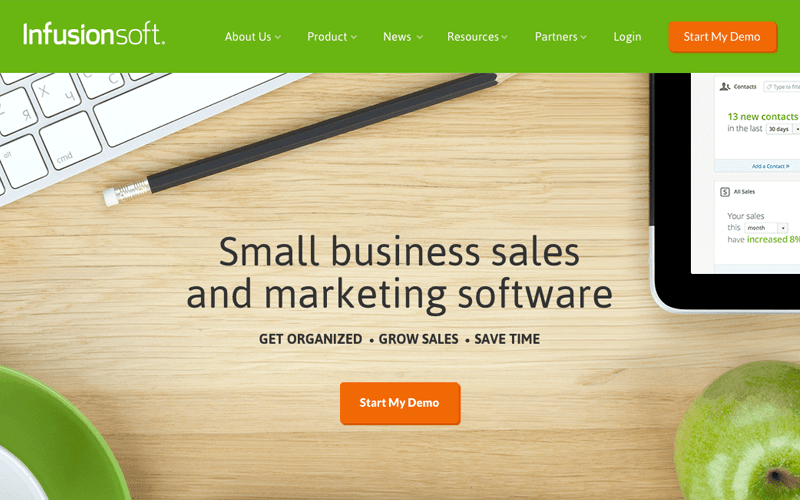
What this website does right: The InfusionSoft website is clean and well-organized. It focuses on how it can help businesses, highlight its key features on the homepage. The website includes a lot of company information, include news and awards, which helps to give a face to the company. InfusionSoft also provides helpful resources for visitors.
CareCloud
What this website does right: The CareCloud homepage features a video of someone using the software, which is a creative touch. Their website is essentially made up of landing pages that focus on solutions for specific specialities and types of practices, which helps users to narrow down on information specific to their needs. They also provide an assortment of user resources and company information.
Let us help with your software website design.
TBH Creative understands the unique needs of a software website, and we can help you develop an online strategy to meet your goals. Learn more about the variety of services we provide and contact us today.
What this website does right: Intake has a clean, one-page website that highlights its features and pricing. It also prominently displays calls to action for a free trial of its software.
DoneDone
What this website does right:The DoneDone website is very graphic-driven, highlighting its features through screenshots and video. It highlights testimonials and high-profile clients on its homepage to help build trust in its product. It also includes easily accessible support and documentation.
Alma
What this website does right: Alma’s homepage features a product video at the top of the page, as well as prominent calls to action for requesting a demo. It provides information on how different markets and types of users can benefit from the software. It also includes a company page, providing background information on its mission and leadership.
Invision
What this website does right: The Invision website homepage makes use of animated GIFs displaying how to use the software, which helps users to quickly see how it works. They have an entire page dedicated to customer testimonials as well promoting the benefits of the product.
FreshBooks
What this website does right: The Freshbooks homepage focuses on guiding visitors to start a free trial, with a short form as the primary focus. It also prominently highlights its support team in several places across the website. Their minimal navigation helps push visitors to the most important content.
InfusionSoft
What this website does right: The InfusionSoft website is clean and well-organized. It focuses on how it can help businesses, highlight its key features on the homepage. The website includes a lot of company information, include news and awards, which helps to give a face to the company. InfusionSoft also provides helpful resources for visitors.
CareCloud
What this website does right: The CareCloud homepage features a video of someone using the software, which is a creative touch. Their website is essentially made up of landing pages that focus on solutions for specific specialities and types of practices, which helps users to narrow down on information specific to their needs. They also provide an assortment of user resources and company information.


