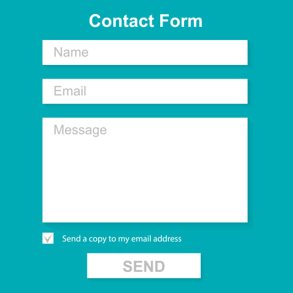
Every business must have a contact page on their website — it’s essential to help bring in business and to allow customers to contact them.
Some businesses list their contact information to let the customer contact them via phone or email, others have an interactive contact form. Often, they even have both. Having a contact form makes everything easier and organized, and makes you available 24/7. With a contact form, your visitor (potential new customer) can provide upfront information about what they need. With this information, you can best respond and determine if services are a good match (and ultimately make a sale if so).
Your website should have a contact page and form. Your interactive contact form should:
- Ask visitors for some general information (not too much, but not too little depending on your business and needs).
- Form fields should be validated for most important and required fields such as name and phone or email.
- Offer one text area for general comments and questions.
- After submission, the page should return a confirmation message with expectations of what is next (e.g. someone will call you within 1 business day).
- Include a privacy policy or statement.
- If the visitors do not wish to complete your form, they should be given the option to call or email.
The best contact forms are easy to use and styled to match your website. Regarding style, the sky is the limit these days — such as highlighted boxes, jQuery techniques, customized submit buttons, rounded corners, and drop shadows on the text boxes. Here are some examples we found that you may enjoy.
Contact Form Examples
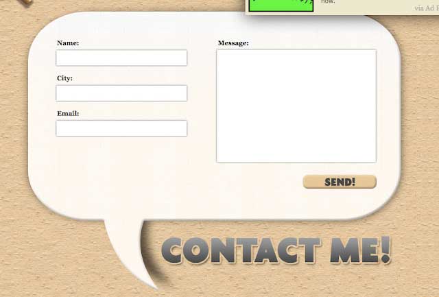
This first example is from CSSTricks, the blog post is about creating the example that he has made. He also has a live demo so you can see how the page works.
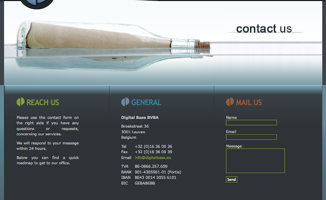
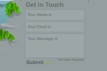
Digital Base
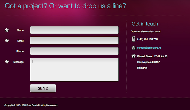
Point Zero
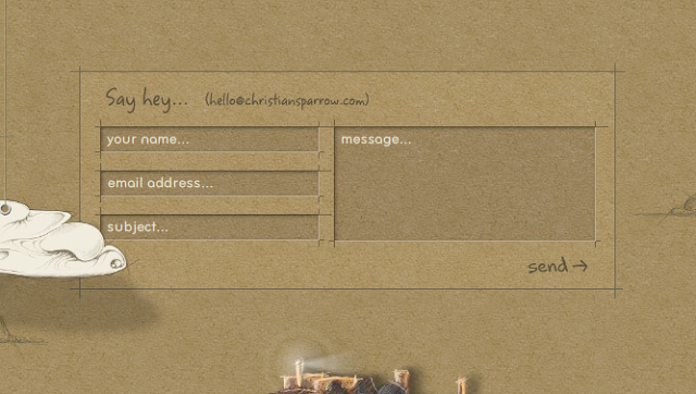
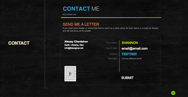
ftDesigner
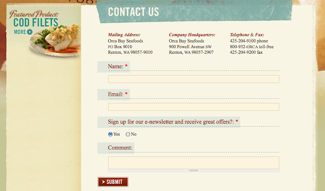
Orca Bay Seafood
Form Development
There are many different technology options to develop a contact form (from basic HTML, AJAX, PHP, ASP.NET or classic and even Flash). According to our research, PHP contact form is the most common form used.
Minervity created 5 basic contact forms based on these different options that you can download and customize to fit your needs. All of these forms can be styled to match your website using CSS.
From 1stWebDesigner there is a list of 21 easy to customize PHP forms that you can download or purchase.
The technology you use doesn’t matter as long as it works properly, has security to avoid spam and phishing links, and is validated with an appropriate response message. An expert will know all of this and can easily do this right. There is nothing worse than filling out a long form to receive an error when trying to submit. Your visitors will instantly click away.
