Fixed header benefits
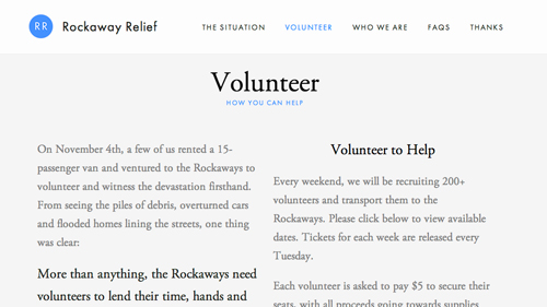
The main benefit of fixed headers becomes obvious when browsing a site that has one: navigation. Especially with lengthy pages, a fixed header makes it easier to navigate to a different page without scrolling back up to the top of the site. This is especially important on one-page sites, so users can jump from section to section more quickly and efficiently.
to easily jump from one section to the next.
Fixed headers are very easy to implement. They can be accomplished with just CSS, making them a simple addition to a site. However, many sites take it a step further and add more advanced features. For example, take a look at Daniel Filler’s portfolio site. As you scroll down, a condensed version of the site’s header fades in at the top of the page. Simple effects such as this can be added to make a fixed header function more smoothly or to add more interactivity to a site.
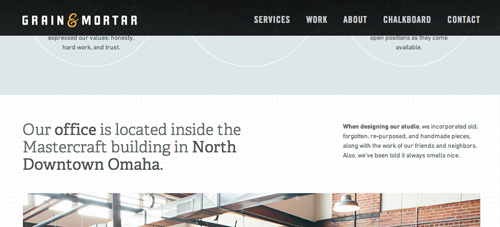
A fixed header can also be used to help draw attention to branding. On many sites with fixed headers, not only is the navigation included, but the logo is as well. As a user is browsing your site, they will be consistently associating the content with your brand. The website Grain & Mortar takes this approach, with a fixed header that always includes their logo.

Fixed header design issues
One of the biggest complications that you may run into when implementing a fixed header is screen space. It’s important to take the overall design of your site into consideration, and determine if there is adequate space for a fixed header. It’s important not to sacrifice design for a “cool” feature. If you know you want to implement a fixed header, first make sure your site will actually benefit from one, and then design your site in a way that will maximize the benefits of having a fixed header.
On some sites, fixed headers can be an intrusive feature, getting in the way of the content. You don’t want the header to distract from the overall purpose of your site. Think about what your users’ purpose may be, and what content they will be looking for on your site. Make sure your fixed header is helping them get to where they need to be instead of interfering.
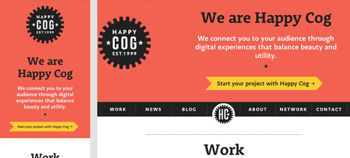
Mobile devices need special attention as well for sites with a fixed header. There is a lot less screen space on mobile, so every pixel counts. If you know users will be accessing your site from a mobile device, take that into consideration. One solution may be to only have a fixed header on the desktop version of your site.

from desktop version (right) entirely.
If you’re going to do it, do it well
If you’re planning on using a fixed header on your site, start by taking a look at some of these great examples:
- Manos Crafted
- Karma
- G’nosh
- Theory Design
- Character
If you think a fixed header would be a great addition to your site, we would be glad to help out. Contact us today to get started.
TBH Creative is a website strategy company – located in Carmel, Indiana. We research and work on websites everyday to keep up with the newest trends, latest techniques and best tricks. We offer our web design and development services in Indianapolis and the greater central Indiana area, as well as other locations remotely.
Subscribe to our marketing blog for free resources
