Check out a newer version of this post! For more recent examples, head over to our latest pediatric web design showcase.
Throughout the next few weeks, TBH Creative is going to be running a series of blog posts highlighting our favorite websites of 2012, identified by industry. Each post will also include a list of important must-haves elements for websites within each industry.
Last week we examined internal medicine websites. This week, we’re focusing on pediatric web design. We chose these three websites for their exemplary layout and organization, color schemes, and content.
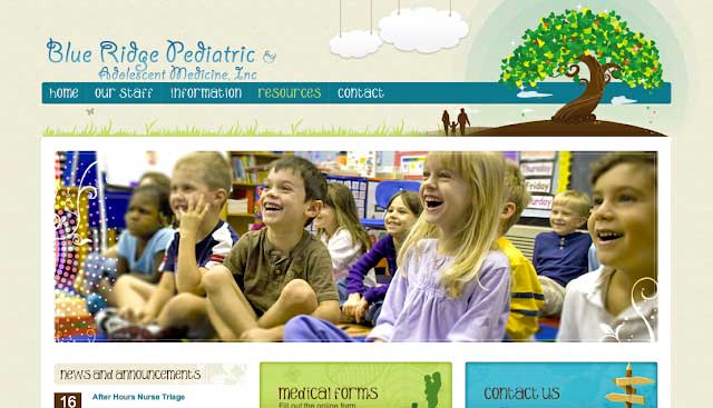
Blue Ridge Pediatric & Adolescent Medicine, Inc.
Blue Ridge Pediatric & Adolescent Medicine, Inc.’s website features a clean and attractive layout. It uses playful fonts and subdued colors. The navigation is easy to understand and their homepage makes commonly used pages easy to find. News, medical forms, and the contact page are prominently displayed so that users don’t get lost in the navigation.
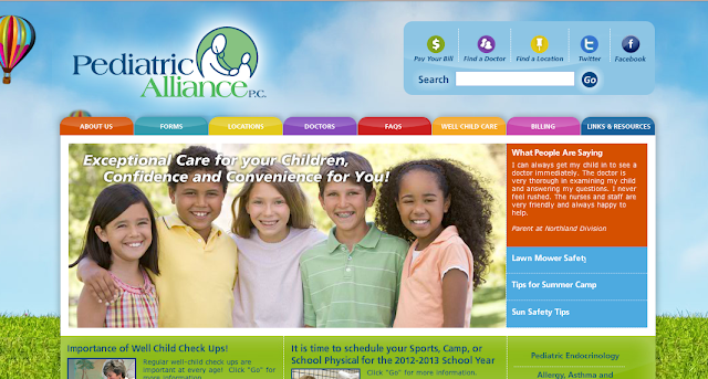
Pediatric Alliance P.C.
Pediatric Alliance’s website is bright and cheery. The whimsy of the website is perhaps best exemplified by the playful, animated air balloon in the background. Since their website is so large, they have included a search bar in addition to the straight-forward navigation. The bright color scheme is friendly and not overpowering.
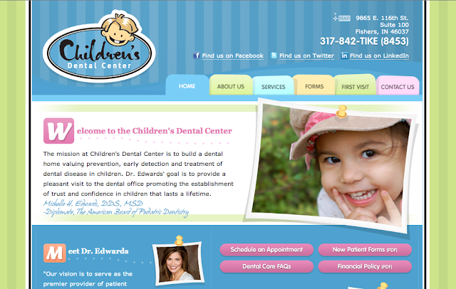
Children’s Dental Center
Children’s Dental Center’s website is organized nicely and uses an attractive color scheme. The contact information is easy to find, right at the top of the page. The provided virtual office tour for parents is a useful addition.
Top 5 Must Haves for Pediatric Websites
- Staff or team page: Parents want to know more about who they are taking their children to for their healthcare and dental care needs. Include photos and bio details for key staff.
- Forms: Parents are very busy. Help them save time by letting them print off and fill out the forms at home (or submit them online).
- News, event listing, or blog: Make it easy for patients keep up to date with the latest issues and trends in pediatric healthcare and dental care. Some offices have events for children with autism or other disabilities. Make sure you use your website to let patients know when you hosting special events.
- FAQs: Every parent wants to make sure their child has the best caregivers. Include an FAQ page with answers to their questions.
- Facts and tips on keeping children safe and healthy: What are some of the best ways to help keep kids cool in the summer heat? How much exercise should children daily? Common questions like these can be answered in blog posts or on a tips page.
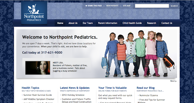
TBH Creative Example Website
Northpoint Pediatrics by TBH Creative

Does your pediatric office’s website need a facelift? TBH Creative is a web development company located in Indianapolis, Indiana. Specializing in online strategy, web design, social media, and search engine optimization: let us help you with your company’s Internet needs.


