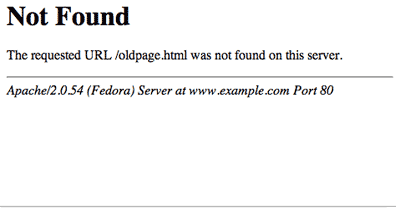
Does this page look familiar? This is a 404 Error page — a user ends up on a page like this when they click on a broken link, a misspelled link, or a link that no longer exists. Users end up getting confused when they reach this page and could decide to just leave your company’s website and move on to the next.
A custom 404 page is better.
Customizing this page allows you to take control and give the visitor some direction on how to find what they are looking for. The best is to design this page to look like your website as to not confuse customers and suggest some links that you want them to visit.
The best 404 pages seem to have some fun with a little creative design, and to include a search bar to help them find what they need. Here are some tips.
Design to match your main website
Customizing your 404 Error Page allows you to show your brand and apologize for the error, as well as list ways back to other pages on the site. First, it should be customized to have the same design as your website. You’ll want it to look like your website so that the user knows they haven’t drifted away from your website completely, telling them they are just lost.
Suggest links
Second, you can list and suggest links to the pages on your website that you want clients to visit — maybe your most popular services or contact information. Of course by including the main navigation of your site with a matching design, the client can easily get to where they want, but it’s also good to suggest links you want them to go to.
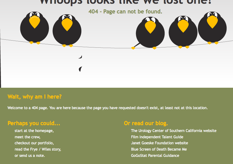
Here’s a great example from Frye / Wiles.
Lighten It Up
Third, don’t be afraid to have a little fun with it. In the Frye/Wiles example, birds sitting on a wire with a blank spot between them and the phrase “Whoops looks like we lost one!” This gives you a chance to play with your company and what you do. It also gives you the opportunity to say, for example, “Hey, it’s not your fault you’re lost, it’s ours. Here are some links that we suggest.”
Take a look at these two examples.
CSS Tricks, they have an image of some code, which is what the company is based around and is clever but is ineffective because there is no way to escape, no brand, and no links to other pages.
CSS Tricks ends up being a great example for two things.
- A great example of having a little fun with your company for a page that people reach when they’re lost in your site.
- An even better example of what NOT to do for your 404 page. There are absolutely no links back on this page, unless you hit the back button. It also isn’t given the recommended links that can draw your customers back to your site and more importantly to the pages you want them to visit.
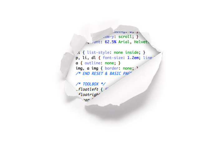
This is something that you don’t want your 404 error page to do, lead to a dead end.
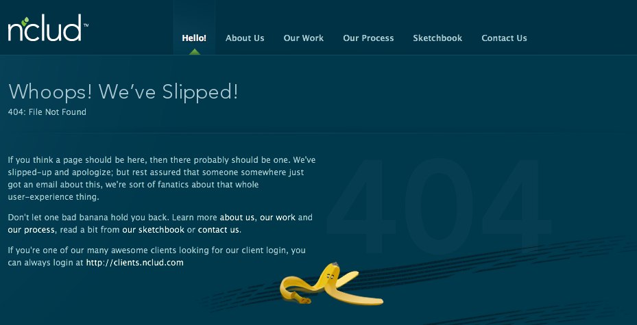
Nclud, they have a nice saying of “Whoops! We’ve slipped!” and they have a picture of a banana peel.
Nclud on the other hand kept their design the same as the rest of their website, included a little bit of humor, but also lists some links that are helpful for the user.
Include a Search Bar
And last but not least, include a search bar. What if the user doesn’t want to go to the recommended links that you specified. Instead, they had something specific of their own in mind. A search bar leaves the user to look for the link that they were trying to reach. It could give them the answer they were looking for and it could also give information that could be helpful that they weren’t looking for.
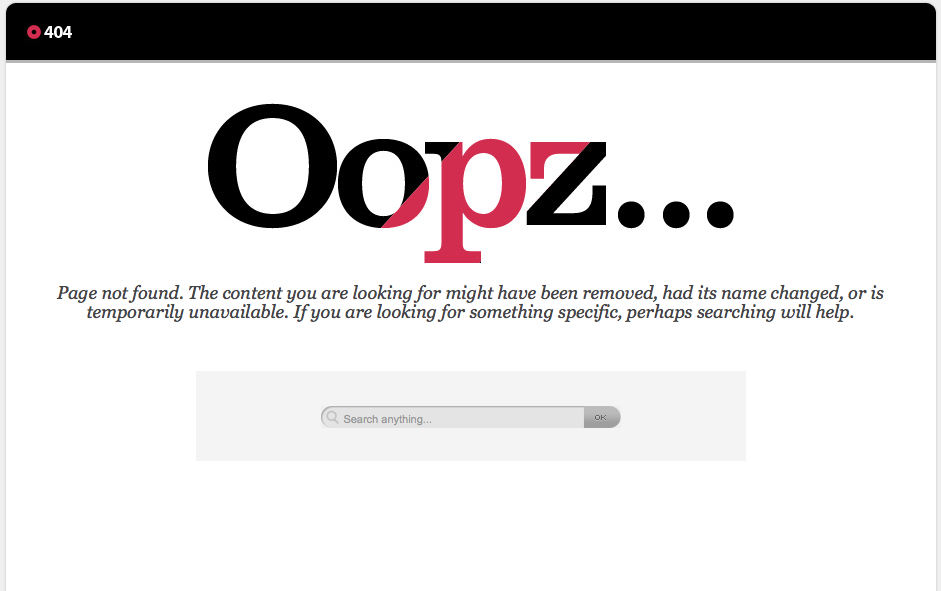
Fubiz gives a good example; no suggestive links, but some text and a search bar.
TBH Creative’s 404 page has some humor and lets you know that they would appreciate you letting them know the link you were looking for so that they can fix it. This is also great to have on your 404 page.
If you’re not sure if your 404 error page matches your website, look into it. Once you’re there think about the importance of a search bar, suggestive links, and having a creative fun feel to it.
Are you lost on where to start with a 404 page? TBH Creative can help you find your way by giving you a web consultation.
