All eye-tracking research tends to say the same thing: no users want to waste time reading through “walls of text.” Enter website header tags as a solution. They stand out on the page, making them the perfect way to break up big blobs of copy that are hard to read (and visually off-putting).
First impressions matter, even on websites. Adding appropriate subheadings on a webpage helps you present ideas more clearly. They also make it easier for your users to quickly (and effortlessly) determine if they have landed on a page with content that is relevant to them. (Plus, it doesn’t hurt that integrating the right H1s, H2s, and H3s into your text may also—indirectly—support your technical SEO benefits.)
Keep reading to learn more about using website headings to provide answers to the questions your users have.
Website headings FAQ
What are website header tags?
Website header tags are a type of HTML code that tells your browser how to format and display headings.
The easiest way to answer this is with an analogy. Just as every section in a book has subtitles introducing each new chapter, websites have main headlines to describe the content on each separate page. These primary headings are called H1s.
Some SEO tools may flag multiple H1 tags on a webpage as an issue. In 2019, Google’s John Muller revealed that they don’t penalize pages with multiple H1 elements on a page—as long as you aren’t overdoing it and your CMS allows it.
Like all website header tag decisions, though, writing for SEO shouldn’t be your only concern when you’re creating webpage content.
At least 2.2 billion people in the world have a near or distance vision impairment, according to WHO. What have you done to make sure your site is more accessible for users with visual, physical, hearing, and cognitive disabilities? One step you can take is to use website header tags because users with screen readers and other assistive technologies can jump between tagged headings to get to the information they need faster.
Should my page’s title tag and H1 be the same?
Page title tags and H1 website header tags perform different functions, though they both essentially summarize your webpage’s content. The title tag appears in search engine results pages and your web browser’s title bar to describe your web page. The H1 is the main heading that appears in the actual body of your webpage.
Search engines look at title tags and H1s, so it’s important to make sure your keyword is in both places if it’s possible. However, page title tags are more important to get right between the two, according to Moz’s findings on search engine ranking factors. That’s why being direct and fitting your keyword into the title tag should be your first goal. Also, this prioritization frees you up to write a friendlier, longer H1 that’s more helpful to your users if working in your keyword target feels unnatural.
Pro-tip: Forget about trying to fake out Google. If your title tag includes an irrelevant keyword with high search volume, but that doesn’t match up with the actual content on your webpage, you are spamming users. (See also penalties for “stuffing keywords.”)
What are some basic best practices for writing H1s, H2s, and H3s?
In addition to incorporating your keyword (or long-tail keyword) and as part of the main heading on your page, the most effective H1s also are like Goldilocks’ preferences: they aren’t too long, nor are they too short. Their ideal length is between 20 and 70 characters, and they should describe the topic of your webpage content.
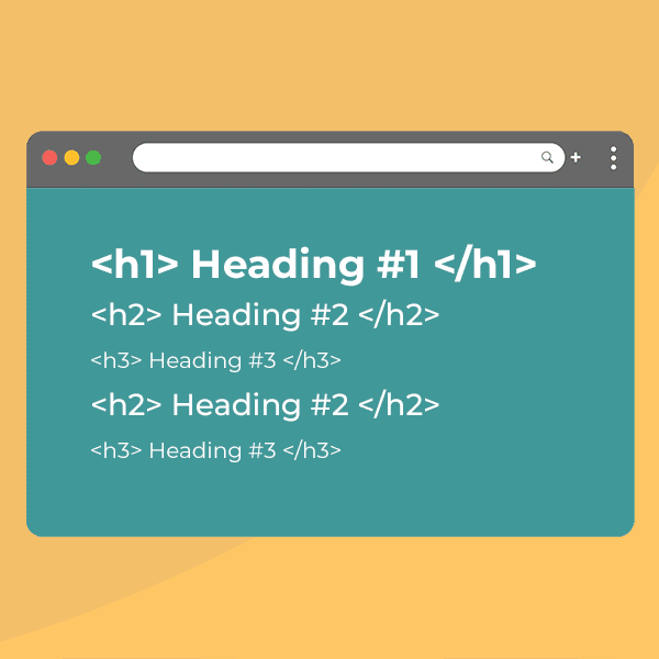
Write H2s to describe subsections within your H1s. H3s, H4s, H5s, and so forth follow suit for subsequent HTML headings that further subdivide webpage text, but you are less likely to use all of these unless you’re writing complex, dense pages over 2,000 words.
Pro-tip: Banner blindness is real. If your H1s are set in type that’s too big, users might skip right on by because they find the copy too hard to read. Make predictable human behavior work for you. If a design doesn’t feel right, you might find the right balance for your H1 by pairing it with an intro paragraph that’s also set in a larger font.
Ultimately, how you group your content to make it more scannable should be driven by what’s best for the user and what creates the cleanest hierarchy on the page.
For clean CSS and HTML, the biggest heading at the top of your page should be your H1, then H2s for the next subsections, and H3s for the following subsections. This will keep your pages tidy, but—ultimately—Google doesn’t really care about how you use headings. These days, they are pretty good at analyzing page content and figuring out what’s what. They care more about what you put into them.

Use this tool to start planning a new website that will drive long-term digital marketing success.
How do you write a good website heading?
Unsure where to start? Get started by thinking about your user’s intent to craft a website header tag that actually helps your target audience find what they need. Pair that insight with what you know about how they talk about your product or service (e.g., which words or phrases would they put into Google to find information?).
Sometimes, you may have to rewrite your text and add transitions to make new helpful headings make sense on the page.
Pro-tip: Don’t overdo it. Headings shouldn’t be added just to add interest to your page with typographical styling. That’s what CSS is for. Make sure any website header tag that you’ve added to your text makes sense. Website headers should provide structure.
Why You Should Improve Your Website Headings
When it comes to building websites, coding standards, technologies, design trends, and Google ranking factors are always changing. Online user behavior, however, stays pretty much the same year after year. Your users will always be busy, so ensuring your web pages help them find what they need—without much effort—is essential.
As you get started making tweaks to improve your website header tags to make your pages more readable, remember: you can’t go wrong when you create content for your users first. This is more important than any other change you might make.
HTML header tags should be added to make unwieldy webpage text easier to scan by accurately describing what every chunk of copy on a webpage is about (and touting its distinct benefits).
If you need a hand, get help optimizing your website header tags
It can be a struggle to get your webpage text just right. Sometimes it helps to work with an experienced outsider. They can do a thorough assessment of your site’s text, including its website header tags, and make recommendations that will improve your copy’s effectiveness.
Here at TBH Creative, we partner with clients across the country and help them improve the clarity and readability of their existing web page text. We even help people during website redesign projects write fresh content that is engaging and structured based on usability best practices. How can we help you?

