For many people doing social media marketing, a large part of their budget is spent creating the text to share on your account when it’s the images that get users to stop and engage with your posts. That’s why developing engaging Facebook graphics and videos need to be a priority to ensure your investment in social media generates new leads and delights your current customers.
In this blog post, we talk about how to improve the odds that your Facebook visuals resonate. Plus, we’ll help you uncover when to use stock photos versus custom graphics to steal your audience’s valuable attention.
Stock image vs. custom art
To figure out which type of Facebook graphics you should add to your posts, you need to know the differences between stock images and custom graphics.
Stock images
Stock images are precisely what they sound like. They’re royalty-free and public domain photos and graphics that anyone can use.
Stock images come with no exclusivity. Meaning that the pumpkin photo you choose to use with your company’s Halloween post might be the same image that your competitor could pick to accompany their post.
Here are some examples.

The glasses and landscape photos are great examples of choosing stock photos for Facebook graphics. These are used to help create an image when reading the actual Facebook post. Think of it as the cherry on top of the ice cream. You don’t necessarily need it for it to be great, but it definitely helps. The main focus is what the post is saying, but the images will draw attention.
Pro tip: photos without text and graphics should be saved as JPGs, and custom graphics with text and graphics should be saved as PNGs.
You can find stock images for your company’s Facebook graphics from many different sources, including providers as Shutterstock, Unsplash, iStock, and Adobe Stock.
Custom graphics
Custom graphics, although still images, are the ones we add a bit of flair to or create entirely for Facebook graphics.
When adding “flair,” this doesn’t always mean we’re adding a bunch of text to the image. It could simply be adding your company logo or adding a templated background to a basic image you’re using.
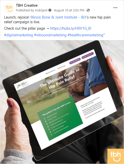
Here’s an example.

This example shows how we often add our logo to a stock image to showcase our work with clients. We don’t add in extra text or added effects but let the picture speak for itself while tying our brand into it.
You may want to create a set of flexible templates to streamline the process of creating custom images to serve as your Facebook graphics. Your social media templates don’t need a lot going on. Create simple designs customized with your company’s brand colors, fonts, and logo to elevate what you share and give it a customized look.
Here’s an example.

This past post from TBH Creative was created using our branded template to showcase a client’s testimonial. This simple custom image helps draw in users because it has a unique look and matches the look of all the other marketing we do—online and in print.
How to pick the best images to use for Facebook graphics
Now that you know the difference between custom graphics and stock images, you might be wondering how you can know when to use which as a Facebook graphic.
If the answer isn’t obvious, ask yourself these questions to guide your decisionmaking process:
- What kind of post are you making? If you’re making a simple organic post, deciding which to use will be up to the context of the verbiage you’re using in the post copy. If you’re honing in on something your business has done or something your business has worked on with someone else, using a custom graphic to help show off your brand is probably the best choice. If you’re sharing a blog post, then a stock image will most likely be best.
- What message are you trying to convey? When asking this question, picture you’re the audience visiting your businesses page. What do you want to take away from the post? If you simply want the “cherry on top” effect, then using a stock image for your Facebook graphic is probably the best choice.
- Does your graphic really need text added to it? Except for the occasional exceptional infographic, users often skip by posts that look like a wall of copy. If your Facebook graphic features lots of text and you write too much for the accompanying blurb, your post will overwhelm users.
Remember, the graphic you choose will ultimately help tell the story. If you’re struggling to create Facebook graphics that elevate your posts, you don’t have to go it alone.
TBH Creative has experience developing fresh assets that attract new customers and keep your current followers happy. How can we help you get more from your social media marketing campaigns?

