Birthday cards, fresh pies, and even websites … When something is made with love, it’s more likely to be a hit. That’s what happened with Wordle, a no-frills guessing game that’s a masterclass in great UX design.
Software engineer Josh Wardle’s impetus for the simple-yet-addictive word contest was to create a custom gift for his girlfriend Palak Shah, who is a fan of word puzzles. The two casually introduced it to their family, and the word about Wordle got around quickly. Folks were hooked.
In fact, Wordle’s popularity grew so much that the New York Times just bought it for a seven-figure sum on Monday.
User experience only works when users are involved. And, that’s why Wordle has proven to be astronomically successful. Wardle thoughtfully created every detail with its target user in mind: Shah.
Read on to find out how Wardle deployed empathetically-driven UX design principles to capture—and keep—widespread attention from Wordle users far and wide.
What is user experience design?
In the most simple terms, good UX design, sometimes abbreviated as UED or UXD, is the process of giving your users a delightful feeling whenever they interact with your system, product, or service—in-person or digitally.
It’s a bit of a squishy, controversial term. Depending on who you talk to, the multidimensional concept of UX design can involve many different disciplines, including:
- accessibility
- branding
- content marketing
- ergonomics
- information architecture
- interaction design
- graphic design/visual design
- human-computer interaction design
- persona research
- product management
- software engineering
- strategy
- usability/user advocacy
The goal of intentional UX design is to “improve customer satisfaction and loyalty through the utility, ease of use, and pleasure provided in interaction.”
—Interacting with Computers, September 2011
Five UX design takeaways from Wordle
User experience design without users is a bad idea.

UX design is just assumptions if you leave out your customers. Feedback and insights from your target audience bring focus. The likelihood that you will interface one-on-one with all of your customers is slim, but that doesn’t mean you should A/B test everything or do absolutely nothing to understand distinct user journeys.
Wordle’s original database of solutions included over 12,000 five-letter words, but many of which were obscure. To finalize the list of potential answers, Wardle enlisted help from his target audience, aka his wordsmith girlfriend.
During the development process, Shah helped Wardle narrow down Wordle’s options to remove unfamiliar words that would be impossible to guess, helping to make the runaway game more enjoyable to play—for her and future puzzle-loving users like her. Talk about a UX design win driven by valuable user feedback!
“You get more flies with honey than vinegar”

There are a lot of different proverbs with a similar sentiment, but the saying perfectly explains the difference between what succeeds and what fails: one satisfies, the other is unsatisfactory.
When it comes to UX design, “user delight refers to any positive emotional effect that a user may have when interacting with a device or interface,” according to the Nielson Norman Group.
How delight manifests can be as simple as an experience going smoothly to getting a positive feeling due to the interaction. The latter is one way in which Wordle’s UX design shines.
If you solve Wordle’s unique daily puzzle within the allotted six tries, the game cheers you on. This quick self-esteem boost creates a pleasurable experience for its users. Who doesn’t love the feeling that you’ve just outwitted a computer?
Additionally, there’s no barrier to entry with playing Wordle. No fee to pay, no long load times, no bloated app to download, no cookies tracking your every move online so that they can resell that data to the highest bidding advertiser (just ones that allow you to track your streaks for more personalized play).
Psychology, Wordle, and UX design
Few challenging yet playable games have the ludic qualities of Wordle. (I’m looking at you, Mastermind and Scrabble.) Play Wordle just once, and you’re probably going to get hooked because it was developed with psychological principles in mind (in addition to UX design best practices). Habit loops (reward-trigger-routine), nudges/stacking, scarcity, and social sharing (and social pressure) … they all work together to create a addictive, joyful experience. Even the most frustrating round of Wordle where it takes all six guesses to get the right answer delivers a dopamine reward.
Prove that you understand

UX design is about feelings and the journey where UI design—or user interface design—focuses on specific constraints related to visual styles, guidelines, and functionality. Though sometimes used interchangeably, they aren’t the same thing.
Aesthetics born of UI design can contribute to a positive user experience, but they should never get in the way of what really matters. This is where UX design comes in.
Anything that’s part of how a product, system, or service is experienced should be assessed to determine if it helps satisfy user needs. What’s good for your users is also probably good for your business.
If something detracts from user delight, it may not be needed (and if it’s disruptive, it’s not going to be appreciated by your users). Consider optimizing as part of your UX design process.
Wordle may not be the most cutting-edge-looking game out there, but its interface is reliable and usable, and the game doesn’t require a lot of effort to learn and play. There are no slow-loading pages, dense blocks of text, or error messages to distract you.
Don’t make things overly complicated

You’ll never score points with users for needless complexity. As Mad Men’s Don Draper opined, “make it simple, but significant.”
The easiest way to increase simplicity is by reducing barriers that are in the way of your user reaching their goals. In terms of UX design, one of the most common places you see unnecessary complications is contact forms. How often has a website required you to provide way too much information just to send off a quick inquiry or message?
Wordle hasn’t made this UX design mistake. Though there’s a slight learning curve to playing its game, the instructions are straight-forward, making it easy to get the hang of how to play rather quickly (and, to be fair, its slight initial challenge is part of what makes the game sticky). It provides just enough info to guide newbies on how to play without making these instructions something that prevents an enjoyable experience in seasoned players.
Wordle also incorporates subtle and smooth animations that are paced to help build anticipation with each letters reveal. Talk about sophisticated yet smart UX design.
“The main thing you need to know about instructions is that no one is going to read them—at least not until after repeated attempts at ‘muddling through’ have failed.”
—Steve Krug, Don’t Make Me Think, Revisited, 2014
Use engagement to convert regular users into promoters

Happy customers are happy to spread the word about your product, system, or service. That’s maximizing delight as part of the UX design process is so important.
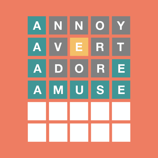
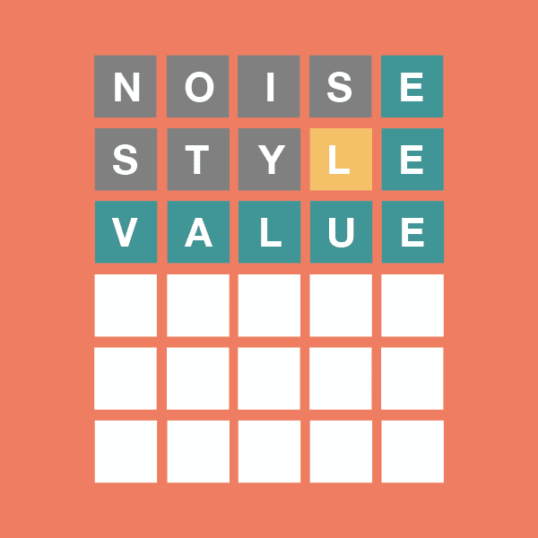
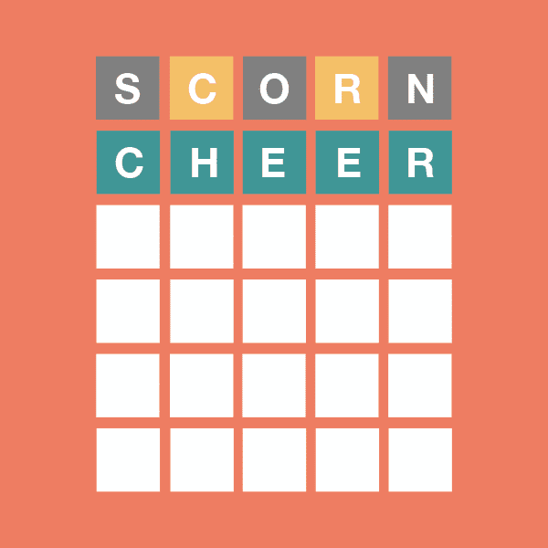
Wordle leveraged user delight to enhance its popular game and make it go even more viral. Seeing that game cheerleaders were manually typesetting a grid of square gray, yellow, and green emojis to share their scores with others, Wardle integrated a social sharing tool into the game. This seemingly simple tweak has made it easier for fans of the test to dish about their results to others—without spoiling the fun for those who haven’t played yet. Now that’s good UX design.
They call it “user-friendly” for a reason. Wardle’s responsiveness to user needs made his already happy Wordle players even happier (and more loyal) while also boosting the game’s virality. And, this meaningful upgrade would have never happened if he wasn’t invested in delighting his users.
UX design makes every touchpoint better
The most important secret when it comes to UX design is to listen to your audience.
With a little empathy and understanding, it’s easy to support—and delight—your customers, whether you’re selling birthday cards, fresh pies, or just trying to impress your partner with a clever web-based game, made with love.

