You know that feeling you get when you think you see a friend across the way, go over to see them, and then—once you get up close—you realize you were wrong so you go the opposite direction and go back to what you were doing before?
That type of mistaken identity situation is often the reason a website has a high bounce rate. One of the best ways to attract the right people to your site (and get them to stick around) is by creating a customer journey map that focuses on how your target audience uses your site and what they need.
When done well, a customer journey map can help you develop and organize content that is more relevant and directly supports those users’ goals.
Read on to learn how a website journey map helps you adopt a customer-centric perspective for a redesign project, essential for delivering a seamless experience, boosting conversions, and reaching your marketing goals.
User-centric web design
Successful website redesign projects are about much more than refreshing an outdated website. You need a strategy and clear objectives.
A customer journey map provides you with a solid foundation to reach your website marketing goals. Understanding the why behind visits is crucial to delivering design and content that help people interact effectively with your business online.
Developing a customer journey map informed by analytics and behavior flow
Website usage data can paint a comprehensive picture of what users do on your website and how. Google Analytics lets you generate user flow reports and more detailed behavior flow reports to see common paths on your site.
The reports offer additional means to see how behavior flows relate to conversion. They can show you how people use your site, and you can use segmenting tools to identify places of interaction and points of friction for different website user personas.
These visualization tools can help you turn your analytics reports into a base for your customer journey map:
- Sankey diagrams show various flows, make common paths immediately identifiable, and can help track the most popular touchpoints and endpoints for user sessions.
- Heat maps show what users typically do next, helping discover relationships between content and their next steps.
- Ridgeline plots provide a visualization of a session’s timeline to rack the content viewed and see the order of the steps specific users have taken.
Once you identify the most important contact points with analytics, use the following tips to enhance the experience you deliver with each of them:
- Make key links and information immediately accessible by adding new navigation options or moving content above the fold
- Replace text links in your navigation with CTA buttons if they are getting a lot of clicks (e.g., high-traffic links might include options such as “Request a Demo,” “Customer Login,” or “Patient Portal”)
- Use white space to draw attention to useful areas, like a search bar
- Consider adding a pop-up to greet users and direct them to popular content
Design with website personas in mind
Not all users will visit your site with the same goals in mind. The best way to understand these different goals and the different journeys that lead there is to develop personas that represent different audience segments.
Root your website personas in research and analytics. To develop detailed personas for your audiences, determine the following:
- Main goals for visiting your site
- Ideal outcome
- Familiarity with your company
- Main obstacles
- Emotions and motivations
- Actions taken to achieve their goal
- Most used touchpoints
- Familiarity with technology
Testing
Incorporate testing into your redesign to get relevant feedback and adjust components like menus, link structure, and content accordingly. You can use a variety of testing strategies.
For example, consider organizing focus groups with customers who represent different personas. Ask them to perform a specific task on your current website to identify friction points or to accomplish their objective on a wireframe version of your website redesign prototype.
Alternatively, you can go through the customer journey map yourself to assess the kind of experience that popular paths and contact points deliver. Use several types of devices and adopt the perspectives of different personas.
Examples of websites designed using customer journey maps
OrthoNebraska

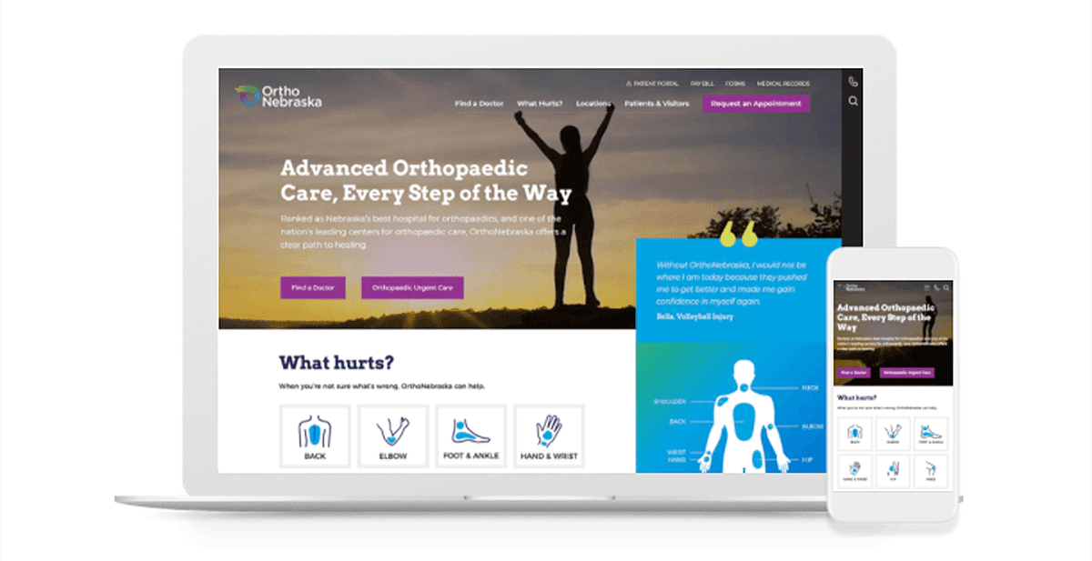
At OrthoNebraska, patients can use their website to complete common goals like requesting an appointment, contacting the staff, or accessing practical information about urgent care because the site features prominent buttons placed above the fold. These actions remain also easily accessible thanks to the sticky side menu.
As patients scroll, they can find out more about treatment options by using large tiles for different body parts or a menu that uses a diagram of the human body. This user-centric subnavigation system allows patients to find relevant content based on the symptoms they experience.
If patients keep scrolling, they will find additional content that can help them make a decision about receiving treatment, including social proof with reviews from patients, information about different services offered, and the benefits of choosing OrthoNebraska.
LEGO

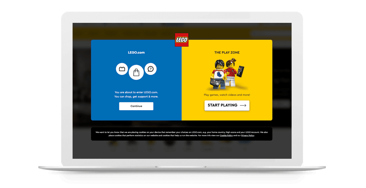
The official LEGO website immediately presents users with a colorful splash page with two clear paths. Users can visit LEGO.com to access shopping and support options or head to the Play Zone for online games. This splash page uses some strategies discussed above, including pop-ups, CTA buttons, and white space to help two specific personas, the parent and child user, get started on journeys with very different goals.
Creating a customer journey map for your website and using a visual representation of it as a reference point empowers you to adopt an evidence-based approach to your redesign project.
Our experts at TBH Creative can help you develop intuitive designs that deliver a streamlined experience and ensure users get what they need every time they visit your website.

