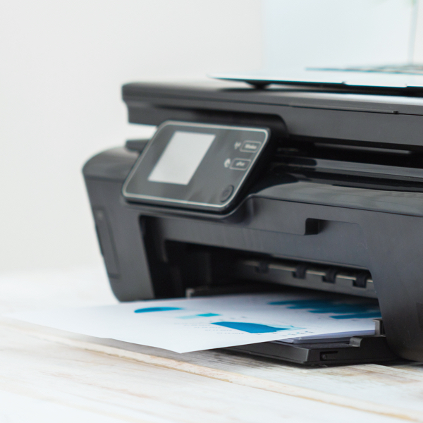
In today’s world, many of us access to the web from nearly everywhere we go. This may make the idea of printing a web page seem like a relic of the past, but that’s not necessarily true. There are still a variety of reasons users might decide making a hard-copy of a webpage is necessary.
It’s our job as web professionals to make sure our websites are accessible in as many use cases as possible, including print. No matter the situation, if a user finds it necessary to print a page on your website, it should be properly optimized.
In this article, we’ll look at why print optimization is important, how to set up a print stylesheet, and best practices for translating a website to a printed page.
Why optimize a website for printing
Think about your website and consider what pages users might have a reason to print. Here are some common examples of pages that users like to print:
- Directions or contact information
- Order details, invoices, and receipts
- Recipes
- Tickets for an event
- Educational information and resources
Regardless of the type of content, if users try to print something and they end up with multiple pages of unnecessary elements or content that is unreadable, they will likely be frustrated and unhappy with your website.
You can make sure your content is printable (and improve the user experience) by optimizing your print styles. Printed content should be both readable and as streamlined as possible, with all irrelevant clutter removed from the page.
How to set up print-specific styles
The good news is that formatting your website for printing can be done with some simple CSS. There are two main ways you can go about implementing print CSS:
Using the <link> element. If you prefer to place your print styles in a separate stylesheet, you can use the media attribute on a link element to specify that the stylesheet is for print only. Example:
<link media="print" href="print.css" />Using media queries. You can also target the print view of a page using @media print in your stylesheets. Example:
@media print {
  // Add print-specific styles here
 }
The benefit of the media query approach is that your styles will be contained in one place, which can make it easier to remember to update the print version of your styles when elements are updated. However, both approaches work just fine, so choose what works best for your workflow.
It might also be helpful to note that you can also add styles that specifically exclude print views using the screen option for media queries. Example:
@media screen {
  // Add screen-only styles here
 }
In this example, any styles within the media query would be excluded from print views.
Best practices for print styling
While the best approach to print styling for your website depends on its design and goals, here are some best practices and commonly used styles to get you started.
Remove background colors and images
Typically, backgrounds don’t translate well when they’re printed, and they also waste a lot of ink. Whenever possible, remove background colors and images then apply a white background instead.
Adjust text for readability
Making sure your text is easy-to-read is a key part of print optimization. Consider the following adjustments:
- Use high contrast between your background and text. For maximum readability, using black text on a white background works best.
- Adjust font sizing improve readability. Text that might be easy to read on a computer screen is sometimes too small or too large when you’re reading it from a printed page. As a general rule, 12 point text is a good default.
- Evaluate your font choice and if it works well when printed. Typically, serif fonts are better for body copy readability in a printed format.
Set page margins
Use the @page rule to adjust page margins if needed. You can use absolute units like mm, cm, or in when working with print styles.
For example, you might changes the margins for a page with the following snippet:
@page {
  margin: 1cm;
 }
The @page rules also has the :first, :left, and :right pseudo-classes that target the first page only, left hand pages only, or right hand pages only, respectively. For example, this snippet would change the page margins on the first printed page only:
@page :first {
  margin-top: 50%;
 }
Hide web-only functionality
There are certain types of content that won’t make sense printed. For example, navigation, videos, or forms. It’s best practice to simply hide these elements completely for print views. This can be done using display: none; to hide the desired elements.
For example, see the the web view of our blog header as compared to the printed view:
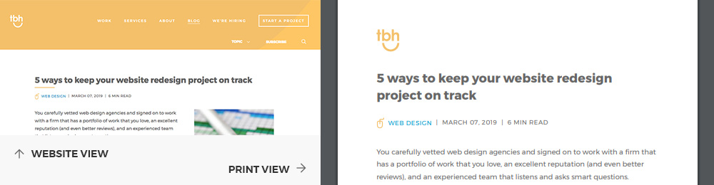
The navigation has been hidden, saving valuable space for more important content.
Optimize imagery
Imagery is often the biggest culprit for taking up unnecessary space on the printed page. When determining how to handle images for print, consider first if the image is actually needed. If it is purely a visual element, it likely can be hidden when the page is printed. If it’s adding important context to content, then it should probably stay.
For images that should remain on the page, consider the sizing and placement. For example, decrease the size of large images to avoid taking up too much real estate on the page.
Overwrite unsupported styles
There are some modern styling techniques that are not supported for print views. Flexbox and CSS grid styles both have limited support, for example. In these cases, make sure you’re implementing fallbacks to avoid layout issues when your content is printed.
Control page breaking
You can use the page-break-before, page-break-after, and page-break-inside properties to control how content breaks between pages to further optimize readability.
The most commonly used values are always, to force a break in the page, or avoid, to prevent a break in the page. Below are some examples on how these can be used.
Force top-level headings to start at the top of a new page:
h1 {
  page-break-before: always;
 }
Force the content following an element to appear on the next page:
.chapter {
  page-break-after: always;
 }
Prevent the contents of an element breaking between two pages, such as a table of data:
table {
  page-break-inside: avoid;
 }
See the difference when using page-break-inside: avoid; on an element:
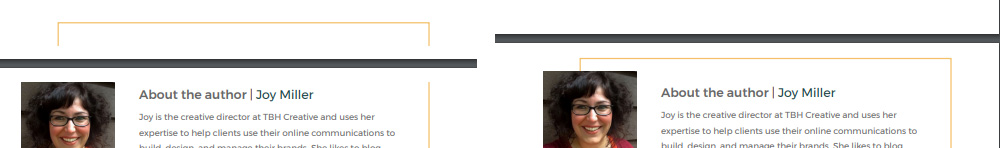
In the first image, the border is breaking between pages. In the second image where page-break-inside: avoid; is used, the border is pushed to the next page.
Note that there is now the break-before, break-after, and break-inside properties that allow additional values, but these newer properties are less supported by browsers. Learn more about these properties and their browser support on MDN:
Prevent widows and orphans
To further optimize how text displays, use the widows and orphans properties to prevent confusing breaks within text blocks.
Use the widows property to define the minimum number of lines that should break to the top of the next page. Setting it to a value higher than one will prevent printed pages with a single line of text at the top.
The orphans property is similar, but instead of defining how many lines are on the next page, it set the minimum number of lines to display at the bottom of the page. Setting it to a value higher than one will prevent single lines from displaying at the bottom of a page.
Add contextual content
Consider using CSS generated content with the :before and :after pseudo elements to add context to certain elements.
A common use case for this is links. In order to display the URL for linked text in a print view, you can use the following snippet:
a[href]:after {
  content: " (" attr(href) ")";
 }
When printed, a link will look something like this: Learn more [https://www.website.com/learn-more]. This gives users the option to still access linked information at a later time if needed.
Another example of using CSS generated content is to insert additional information at the bottom of the printed version of web pages, such as copyright info or a link to your website. Example:
#page-footer {
  content: "This information can be accessed online at blog.tbhcreative.com";
 }
Conduct proper testing
Browser support for print-specific styling varies, so how your content is printed might not be consistent among your users. Therefore, it’s necessary to test your print styles on multiple browsers and devices.
To test a print view for a web page, use your browser’s print command to generate a print preview. Or, if your browser has a print to PDF feature, you can generate a downloadable PDF for review.
If you are using Chrome, you can also mimic print styles using DevTools. Follow these instructions to access the print preview within your browser.
Final thoughts on print styles
Even though what a webpage might look like when printed isn’t always top of mind during web design development discussions, it shouldn’t be ignored completely. As long as there are users that find benefit in printing digital content, we should be optimizing for those scenarios. Overall, by integrating print styling into your workflow for creating and maintaining your website, you’ll be making your content more accessible and user-friendly.
