In October our office buzzed with the exciting news that economist Richard Thaler took home the Sveriges Riksbank Prize in Economic Sciences. His life’s work is all about irrationality, nudges (aka, choice architecture), and, in the most simple terms, examining why people do what they do when making decisions about spending money.
Even if you don’t recognize Thaler’s name, you might familiar with the founding father of behavioral economics’s writing on the intersection of psychology, economics, and decision-making. A prolific author, he often contributes to the New York Times and has written several bestsellers, including the highly-recommended Nudge: Improving Decisions About Health, Wealth, and Happiness (2008).
Or, maybe you caught Thaler using poker to explain synthetic CDOs to Selena Gomez during his cameo in the Oscar-nominated movie The Big Short (2015)?
Whether you’re familiar with Thaler’s work or just learning about him, how do you apply the tenets of behavioral science to improve your digital marketing efforts? Let’s move from theory into practice, and take a high-level look at few examples you might find familiar.
“A choice architect has the responsibility for organizing the context in which people make decisions.”—Richard Thaler

Obvious design is good design
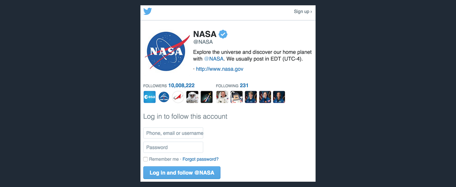
Don’t make it too hard for your customers. If you want to improve engagement, make it clear what you want your users to do. Prominent buttons and call-to-action (CTA) prompts work because they reduce the perceived effort it takes to interact with your email or website.For instance, when you view Twitter as a non-user, the social network has designed the experience so that you see a big button nudging you to take the next step: registering to use their service. Cognitive ease is a good thing.

Too much of a good thing is a bad thing
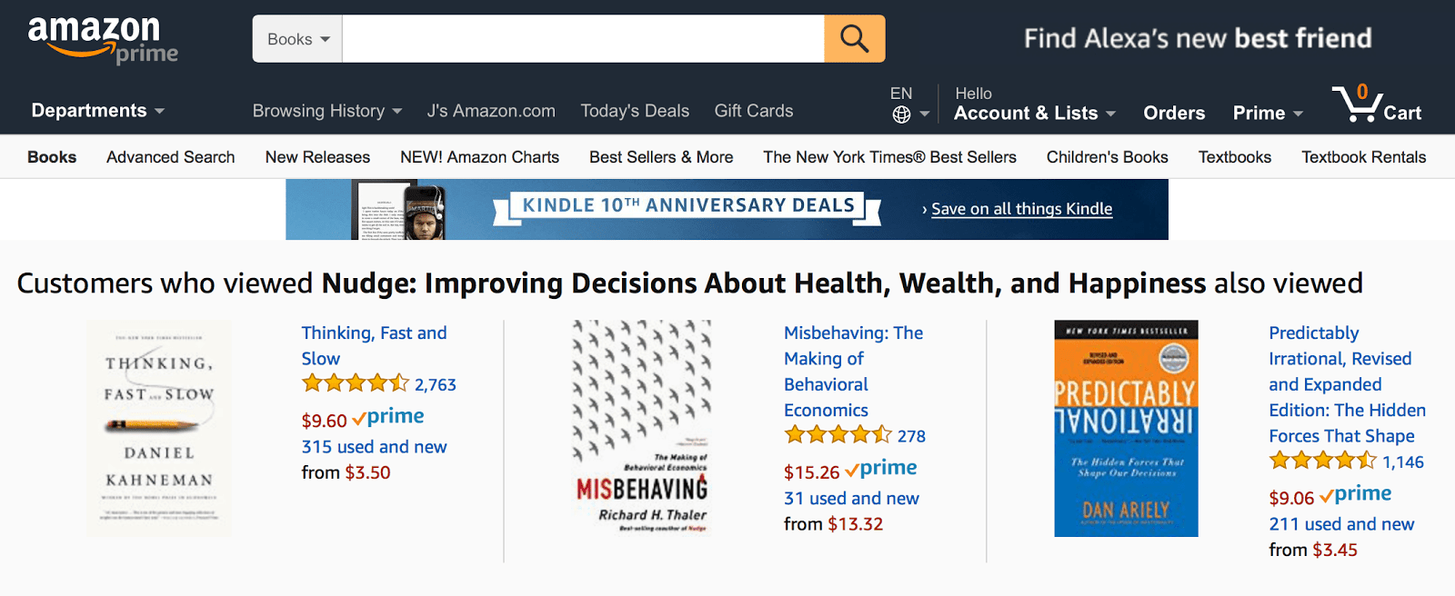
The more options you have, the harder it will be to choose. It creates a sense of choice overload.Take Amazon, for example. To improve the outcome of any e-commerce shopping situation, Amazon has built their website to show its customers a few select recommendations instead of every possible product to simplify the buying process—with the option to browse more deeply available and one click away.

FOMO is real
As Joni Mitchell once sang, “You don’t know what you got ’til it’s gone.” FOMO, or the fear of missing out, is basically what economists talk about when they talk about scarcity and loss aversion. And, because people aren’t rational, this is a strategy that digital marketers can use to trigger customer behavior.In his book Nudge, Thaler writes: “The combination of loss aversion with mindless choosing implies that if an option is designated as the ‘default,’ it will attract a large market share. Default options thus act as powerful nudges.”
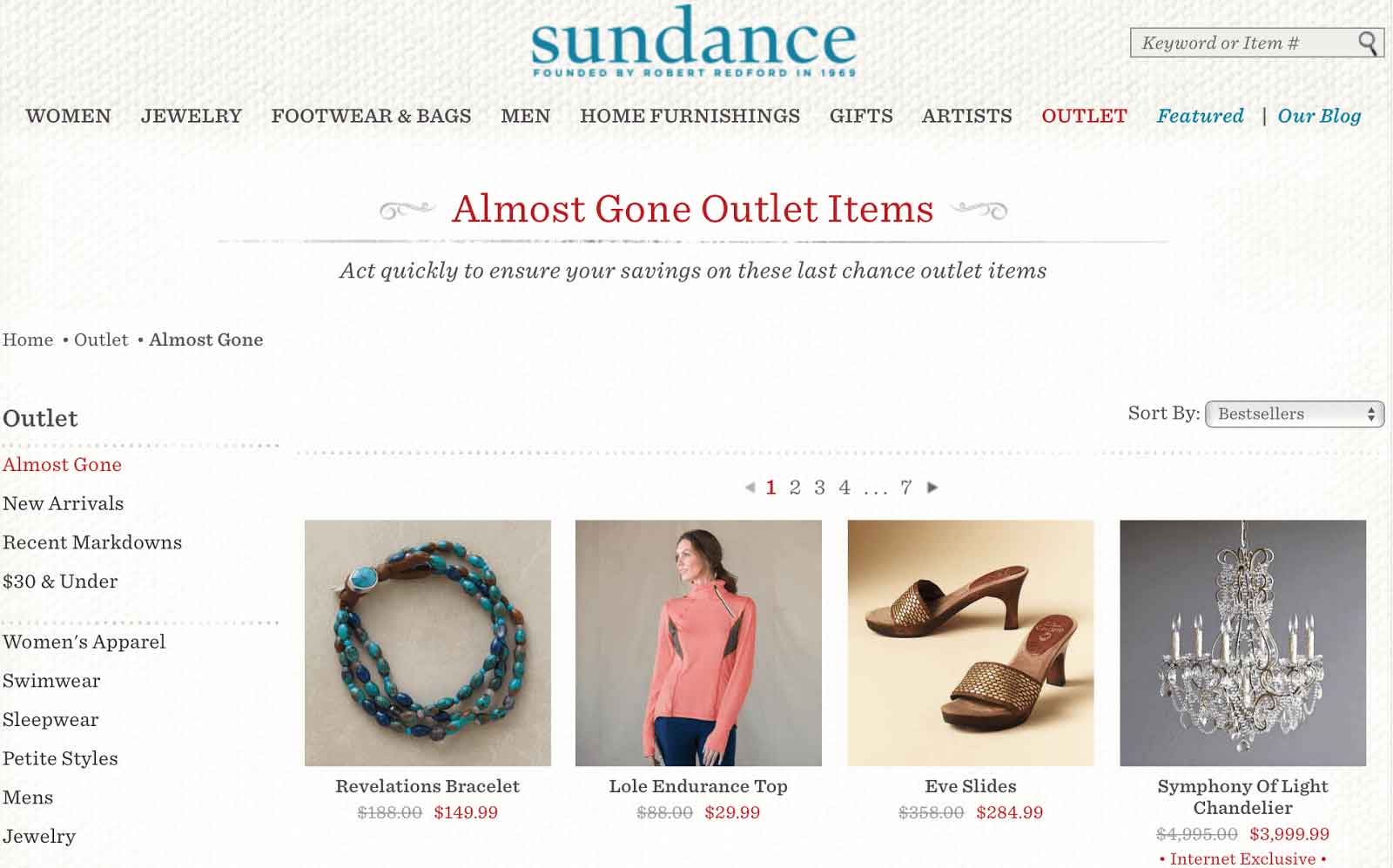
“While supplies last” sales, offer countdown clocks, limited edition promos, free shipping deals, and time-sensitive offers are all tools that digital marketers use to create a sense of urgency. For example, Sundance puts scarcity to work with a whole section on their website dedicated to showcasing their “almost gone” products.
To see an ethics checklist and dig deeper into behavioral science topics like scarcity, cognitive ease, and nudges, check out the blog at behavioralscientist.org.
Want to learn more about research and trends in digital marketing? We will help keep you in the loop.
Subscribe to our blog.
