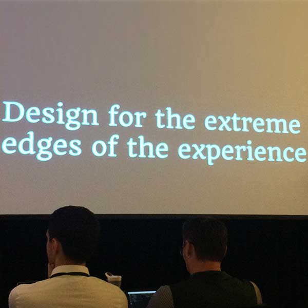
Learn what leading web design experts had to say about using UX to build better websites with this behind the scenes recap from the An Event Apart conference in Chicago, 2017.
“Give the lady what she wants!”
Department store entrepreneur Marshall Field’s famous motto was such a key part of the pioneering retailer’s selling philosophy that he had the phrase on a sign in his office to remind him—and his team—that what’s good for the customer is also good for business.
Putting your customer first remains a smart way to get and keep customers, but what does that actually mean when it comes to making a website? How do you translate the basics of good design and communication and make them work in complex, evolving real life scenarios online?
When you create a digital experience that prioritizes customer needs first, this is known as user experience, or UX.Tweet thisLast month I attended a conference focused on UX, and it felt like the industry leaders were channeling Marshall Field while making their presentations. Each took time to explain why it’s crucial to fight for your customers when developing your company’s online marketing website, social media channels, emails, and more.
Here is a rundown of three takeaways from the conference:
Make your website work for you, not against you
You don’t notice when your refrigerator is working, but you’re aware when a new carton of milk spoils because it’s too hot or when a head of lettuce freezes because it’s too cold. And, the same thing happens with a successful user experience online. When a website breaks, you notice. When things work well and are easy to find, you’re a happy camper.
Remember: Small improvements are still improvements.
Think about how to use your website to solve problems before they happen
On Apple’s website, if you’re having trouble with your iPhone you can “schedule an appointment” at the Genius Bar. This model flips what could be a moment of frustration for their customers into a positive.Apple created an online customer service experience that makes it easy to address their users’ needs head on. Through the Genius Bar schedule an appointment tool, a “help me fix this piece of crap that broke” complaint turns into a sense of “wow—an expert has made time for me and is going to help me solve my problem” satisfaction.
The world of technology changes daily, but the fundamentals of good design and communication are consistent.

Create joy with image optimization
Last fall StatCounter Global Stats released their latest figures on internet usage worldwide, and—for the first time ever—mobile web usage surpassed desktop with 51.3% of users coming to websites via their mobile and tablet devices.With so many more people accessing websites from spotty WiFi connections, effective imagery is even more crucial to creating a successful website in terms of user experience. When art isn’t handled properly, it can slow load times and frustrate your customers, which is why it’s a good idea to:
- Always compress your images. Also: Consider adding a tool, like ImageOptim, to your content development process to quickly trim down image file sizes.
- Remember your mobile users! Don’t send images larger than they need to be. Cropping and resizing is a must.
- Stay up to date with emerging formats and use them if they will create a better experience for your users by speeding up load times. Related: Are you using SVG images yet?
Side note: If your website displays a lot of large images, consider adding the “blur up” technique. By loading a blurred image for your customers while the higher resolution image downloads has been known to improve perceived load times. You may have seen this technique in action at Facebook and Instagram.
What’s your website missing? Get a free audit
