When designing a hospital website, there are a number of unique challenges to take into consideration. Hospitals cater to a wide audience with a multitude of needs, which can make it difficult to create a cohesive website that addresses as many of those needs as possible. However, there are some general guidelines you can follow to ensure your hospital website is successful. Check out the following tips and best practices to help get you started.
Keep your website focused on the patient.
A successful hospital website should be primarily patient-centered. When making choices around design, content, and functionality, consider how current patients and potential patients will be interacting with your website. Make it easy for users to quickly get to the information that applies to them and anticipate their needs. For example, you may offer services like online bill pay, appointment scheduling, or a patient portal to enhance the online experience for your patients. Keep in mind that user’s experience with your website can affect their overall opinion of your services.Create a clear, well-structured navigation.
Information should be as easy to find on your website as possible. There are a number of reasons a person might be coming to a hospital website, such as looking for quick contact information, researching a condition, or trying to find out more about their doctor. With such a wide range of goals to account for, it’s important to optimize your site architecture and use clear naming structures for the different sections of your website.Aim to have as few top-level navigation items as possible to help get the user to the right place without overwhelming them with options. A user who can’t find the information they need might look to a different hospital instead, so navigation can directly impact the success of your website.
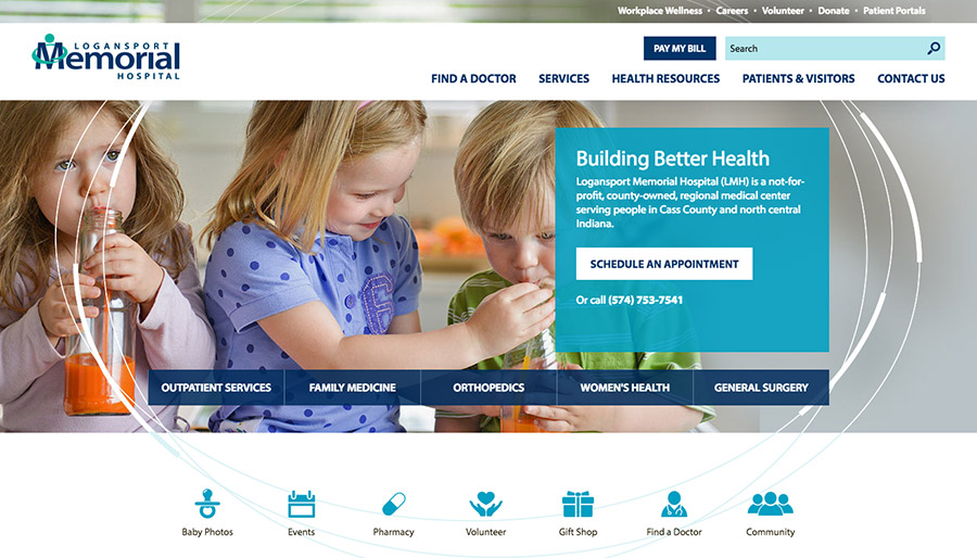
The Logansport Memorial Hospital navigation is simplified and organized into clear sections to make it easy to find information.
Develop content strategically.
A hospital’s website needs to appear trustworthy and professional to users. Content plays a large part in a user’s perception of your website, and should be given the proper time and investment to develop. Create content that aligns with your overall marketing message and the needs of your users and focus on proper content organization.When creating content, consider how it fits into your overall marketing strategy and determine what content types will work best for your audience. What will keep them coming back to your website? For example, you might offer a resource section or blog to educate your patients and serve as a valuable content resource for your community.
Include search functionality.
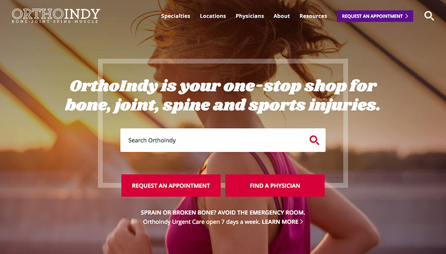
Even with clear navigation and organized content, some users will still be unsure of where to go when they visit your website. Therefore, it’s beneficial to include a search feature on your website to account for users that aren’t sure how to find what they need or just want to quickly find specific information. This is especially crucial on hospital websites with a wide variety of content and a larger number of pages. The faster a user can find what they are looking for, the more likely they are to stay on your website longer.The search feature is prominently placed on the OrthoIndy website to help users find information quickly and easily.
Prioritize information properly.
When designing the pages of your website, you should pay special attention to how you’re prioritizing content. Important elements such as contact information or a patient portal should be prominent and easily accessible on all pages. Make sure to use clear calls-to-action to guide the user through your website.When choosing which content to feature on top pages like the homepage, first determine the message you want to convey. For example, if your goals is to generate interest and set yourself apart from the competition, you might consider placing more importance on content that represents the hospital’s accomplishments and latest news.
Use appropriate and effective imagery.
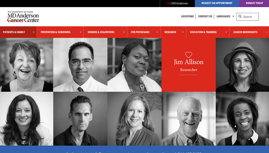
Imagery plays a huge part in the overall feeling your website conveys. One of the best ways to connect with your audience is to show real images of your doctors, staff, and facilities instead of relying on stock photography. Stock photos can come across as impersonal or cheesey, whereas using real photos can help put patients at ease and add a valuable humanizing touch to your website. Make sure any photos used are high-quality images in order to keep a professional appearance across your pages.The MD Anderson Cancer Center homepage prominently features photos and stories of real staff and patients to connect with its audience.
Optimize for mobile-use.
Ensure that your website is properly optimized for all devices and sizes to avoid losing mobile users. At the least, your website should be accessible and functional on mobile devices. However, take into consideration how mobile users are using your website and optimize their experience as much as possible. For example, on-the-go users might use their mobile device to look up directions to your facilities or find contact information in a hurry, so making that information more prominent for those users would be a valuable investment.Engage your audience.
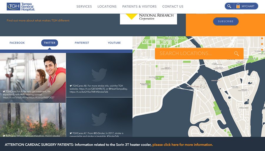
You don’t want to simply focus on getting users to your website, but also on further engaging those users. One way to do that is by incorporate social media into your overall website strategy. Utilize functionality like social sharing and social feeds to add interactivity and dynamic content to your website. Social media integration helps to engage your community and increase trust in your brand.The Tampa General Hospital website homepage features social feeds from its various social accounts to engage users.
Ready to revamp your website? Start here


