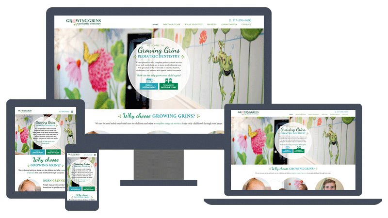
Redefined brand and improved user-functionality
Growing Grins Pediatric Dentistry came to TBH Creative because they wanted an improved website. The website they had was built in a template that did not represent the brand well and was not user-friendly; it also lacked necessary functionality. Dr. Diana Kozlowski and her team knew there was an opportunity to improve their digital footprint to better reach and serve their customers.
Their wish list included design elements that incorporated the whimsical nature of their branding but more professional. With a focus on user-experience, Dr. Diana also wanted to add interactive functionality for pertinent client information, records, and updates on the website. This upgrade would help customers for convenience and help their office in efficiency.

Brand upgrade
The first task was to update the Growing Grins Pediatric Dentistry logo. Using color and styling inspiration provided by the client, our design team crafted vibrant, “growing” brand elements through the use of flower petals and leaves. Brand colors incorporated gentle shades of green and blue with energetic splashes of pink. We really enjoyed working with the Dancing Script font for website page titles, which we balanced out with the very sturdy Crimson Text for complementary titling.
See the complete evolution of a logo.
Website features
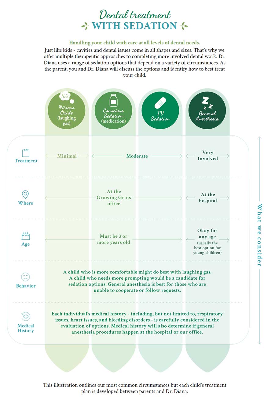
Custom infographicWith a main focus of the website to inform and educate parents about what to expect for pediatric dental care at Growing Grins, the sedation illustration infographic was an important page for our design team.

Integrating interactive forms
One of the necessary elements for the new site was the ability to accept patient records and updates through online forms that were both user-friendly and secure. We were able to design and integrate patient forms for the website that are HIPAA-compliant and capture digital signatures. The results? Reduced paperwork and postage costs for the high volume of forms.
Content Management System control
Using TBH Creative’s content management system, the Growing Grins team has the ability to keep their site up-to-date with any new imagery, services, or other website changes.
The website designs were created around the inviting feel of their office. We knew immediately after the first meeting that obtaining photos of the office to use in the design was important. Our team went onsite to capture the essence of the garden office. The web design features a variety of office photos that showcase the welcoming style of Growing Grins and their team.
Looking ahead
The website was the first key step in improving their digital presence. Through strategic digital and inbound marketing efforts across the next year, we look forward to driving more traffic and leads to help grow their business.
Growing Grins Pediatric Dentistry, founded by Dr. Diana Kozlowski, is a team of motivated individuals dedicated to providing the highest quality pediatric dental services to children, adolescents and patients with special health care needs.
What did the customer think of the project and their new website?
TBH has helped me create the brand I always envisioned for my company. They were the perfect mix of intellectual and artistic. I would recommend them highly!And after only 45 days since launch, the client sent us this good news: “People are really responding to the website. We have had a significant increase in the number of appointment requests!”
~Dr. Diana Kozlowski, Founder
Looking ahead
The website was the first key step in improving their digital presence. Through strategic digital and inbound marketing efforts across the next year, we look forward to driving more traffic and leads to help grow their business.
About Growing Grins Pediatric Dentistry

Download the Website Vendor Comparison Tool. Use this checklist to simplify the process of evaluating your top web company choices—plus questions to ask.
Download now
Download now

