One way to maximize accessibility across a variety of devices and email clients is to make the switch to responsive email design. We’ve previously discussed the fundamentals of responsive email design, and now we’re going to take a closer look at some examples and helpful resources to help further optimize your emails for mobile devices.
Examples of best practices
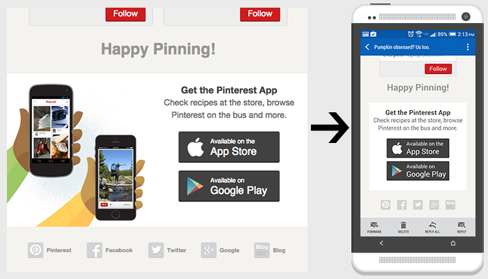
Make your message clear and concise. On mobile devices, you have a very limited amount of space to capture the reader’s attention.
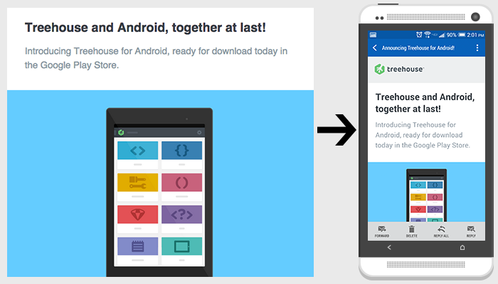
Minimize content. Include only the most important information so that it more easily adapts to small screens with less scrolling required.
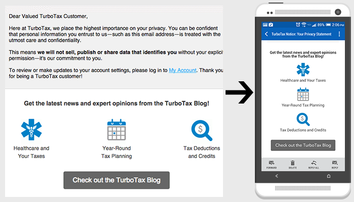
Pay special attention to text size for those smaller screens. Make sure all content is large enough to read on mobile devices.
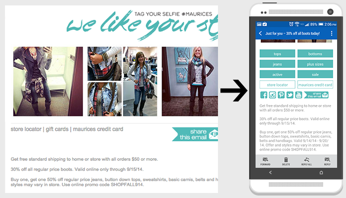
Create call-to-actions large enough to easily click for smaller screens.
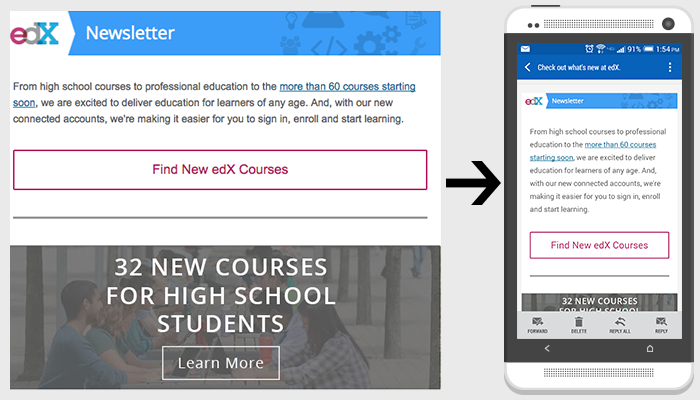
Use one-column layouts to ensure your content is easily read on mobile.
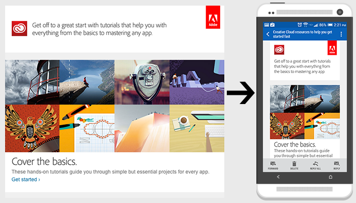
Hide unnecessary content for smaller screens.
Tools and resources
- Litmus, a tool for testing emails on all devices and email clients
- Responsive Email Design Guide by Campaign Monitor
- Responsive Email Reference by MailChimp
- Responsive email templates by Antwort
