Typography is an important part of any web design, and choosing the right combination of fonts can be tricky. The seemingly endless amount of options and overwhelming variety of styles can make it a daunting task. But don’t worry! You can make the process easier with the following guidelines to help point you in the right direction.
Web type guidelines
Limit the number of fonts.
While there is no set rule for how many fonts to use on a website, generally you don’t want to use more than two or three fonts. Having too many fonts in your design can confuse users and distract from your content. Focus on quality over quantity, and how the fonts you choose work together.
Choose fonts that compliment your website’s personality.
Just like other design elements, fonts can be used to inspire different feelings. Consider the message your website is trying to convey, and make sure that each font you choose that will support that. For example, if you want your website to come across as serious and professional, don’t choose a playful typeface that would clash with that desired message.
Assign roles for your fonts.
When pairing fonts, determine what font will be used for what purpose. You should combine fonts that will account for all types of content on your website. For example, you might have one font that works great for body copy, but may lose its impact at a large size. Therefore, you should pair it with a font that will work for large headings. Assigning roles to your fonts will also keep your content consistent across your website.
FontSquirrel.com provides a preview of fonts at different sizes and weights to help you visualize them in different contexts.
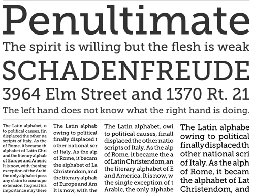
Pair fonts with similar qualities.
Combining fonts with similar qualities will create better harmony amongst your content. Choose fonts that have matching elements such as height, shape, or width. One way to ensure a successful pairing is to choose fonts within the same family. Font families offer fonts that are created to work well together and have similar qualities, making it easy to ensure that your font combinations will be successful. For a better understanding of the font qualities to take into consideration when pairing fonts, check out the Anatomy of Type or this glossary of typography terms.
Use contrast to your advantage.
While you want to pair fonts that have similar qualities, you don’t want to choose fonts that look too similar. Make sure your combination contrasts enough that you don’t cause conflict in your design. Choosing two fonts within the same style can be problematic, such as pairing a serif font with another serif font. Instead, try combining different styles for successful contrast, such as a serif with a sans-serif.
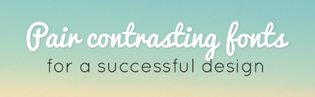
Combining fonts that are too similar can cause visual conflict.
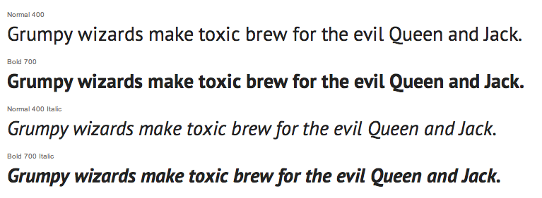
Look for variety.
It’s best to choose a font that offers a range of styles. Look for fonts that include different weight options, as well as italics. The more options you have, the more dynamic your content will be.
Google Fonts shows the different styles available for each font.
Web type examples
Want some inspiration for great font combinations? Check out the TBH Creative Pinterest page for ideas, or visit any of the following helpful guides:
- 25 Fresh Examples of Beautiful Typeface Combinations in Web Design
- ifontyou.com
- 20 Amazing Free Font Pairings
Let us help!
Looking for some help choosing the right font combination? Find out how TBH Creative can help you with all of your typography needs, or check out our other web design services.