No matter what action you want your users to take, if your web forms aren’t designed to get the job done you aren’t going to see results. Here are eight strategies to follow to help you increase the amount of users filling out your web forms.
1. Use proper placement.
Place your form prominently on your website. If your form is important, don’t place it in the footer of your website or on a separate page. Include it on every page in a location that users can’t miss it. The more it stands out, the more likely users are to fill it out.
2. Design to stand out.
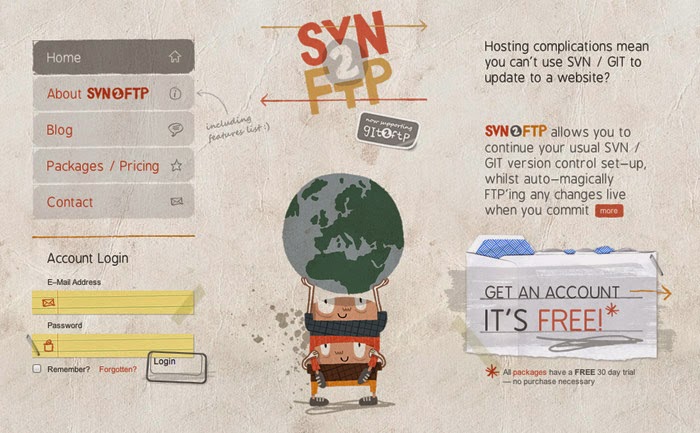
Use good design principles to help your form attract attention. Make sure the form stands out from the rest of your content while still matching your website’s overall aesthetic. Pay close attention to details and style each element of your form, such as the buttons and input fields. Use a straightforward layout that won’t confuse users. Also, take mobile users into consideration, and make sure buttons and fields are large enough for smaller devices.


