Think of your website as the lobby of your office. How are things looking in there? A little dusty? Are the magazines all out of date? Is your receptionist cheerful and capable?
If you’ve been ignoring your website content and design, it’s just as bad as asking your customers to walk into a dingy, dirty lobby for a meeting.
How do you know it’s time for a website redesign? Here are five questions to ask yourself:
If you’ve been ignoring your website content and design, it’s just as bad as asking your customers to walk into a dingy, dirty lobby for a meeting.
How do you know it’s time for a website redesign? Here are five questions to ask yourself:
1. Is your website responsive?
Is it easy to read and fully functional on tablets, mobile & desktop? If you don’t know, now is the time to pull it up on a variety of devices and test it out. If your website doesn’t work well across platforms, it’s time for an upgrade.

2. Has it been more than three years since the last update?
There’s nothing worse than pulling up a website that is using obsolete technology or outdated design ideas. It screams “no one is paying attention” and that’s certainly not an impression you want to give your clients and prospects. Even if you love your design, if it’s been three years – it’s time to freshen it up.3. Is your message clear with strong calls to action?
Have you looked at traffic reports lately to see what pages your users are reading and how much time they are spending on them? One of the strengths of a website is the ability to easily and cost effectively shift your message and call to action to address today’s needs and focus. It can be all too easy to forget the big picture when you’re adding a page of content here and there. Spend some time really reading your website. If it isn’t directing people clearly, it’s time for revisions.
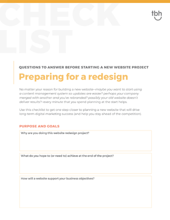
Download the Website Planning Checklist. Use this nine step checklist to get one step closer to planning a new website that will drive long-term digital marketing success.
Download now
Download now
4. Have you introduced new products or services?
Have you shifted focus to a different revenue stream? Your website needs to keep up with your sales activity. A good benchmark here is to ask your sales staff how often they refer people to the website for more information. If they’re not then it’s time to step back and redesign the website to meet your goals and support your sales team.5. Does it just feel old?
Does it use Flash? Does it look like someone wearing bell bottom pants? Things change on the Internet quickly. What was trendy last year, is often old news today. Take a look at your competitor’s websites, review industry websites and make some comparisons to your own. You want to make sure that your website portrays your company’s image accurately but also in a way that feels up-to-date and well-maintained. If your site doesn’t stand up to the competition, it’s definitely time for a redesign.
Image credit: Derek Davalos, shared via CC by 2.0
And one bonus question… are you embarrassed to tell people to go to your website?
This happens more often than you might think. It’s an all too common problem: invest time, money and energy in a website and then realize a few years later than no one is paying attention to it and it doesn’t portray your company well at all. If you’re not excited to have people look at your website then it’s time for a redesign.If this article has convinced you that it’s time to upgrade your website, talk to TBH Creative. Whether you want to add a few new tools to make your website more useful or are looking at rebuilding from the ground up, we can help you strategically review your website’s performance and make smart recommendations for a redesign.
Let’s start talking
You might also like:
