Sometimes it is hard to distinguish what makes a website the “best” because much of it is subjective. Other aspects are more fair to judge such as usability, use of space, site architecture, and content. After searching the Internet for law firm websites, I quickly was able to find some that did all of the above well. Some of it may still be personal preference and even colors. Specifically for law firms and lawyers, a professional appearance is necessary.
Below, I have reviewed three of my favorite law firm websites as well as two of my least favorite.
Best Law Firm Websites
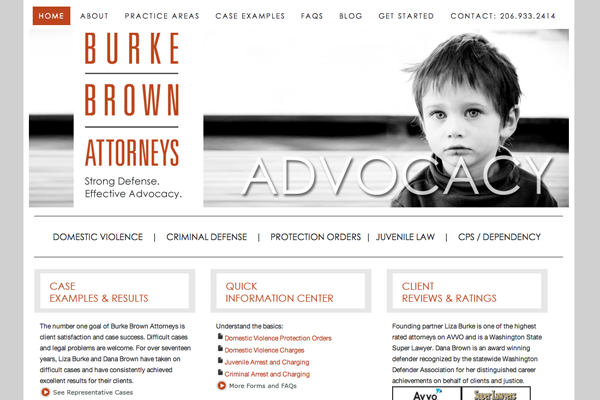
Burke Brown Attorneys‘ website is very attractive and easy to navigate. The interior pages could use a little work, but the homepage definitely gives you a good first impression. The color scheme is very simple and doesn’t distract the user. The hint of orange splashed throughout the site helps to liven it up.
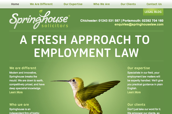
Springhouse Solicitors‘ website is colorful and is easy to navigate. The green color is very inviting and not too overpowering. I also like the simplicity in their website. The user is not flooded with crowded drop-down menus as they hover over the navigation. In addition, each interior page is simple and informative.
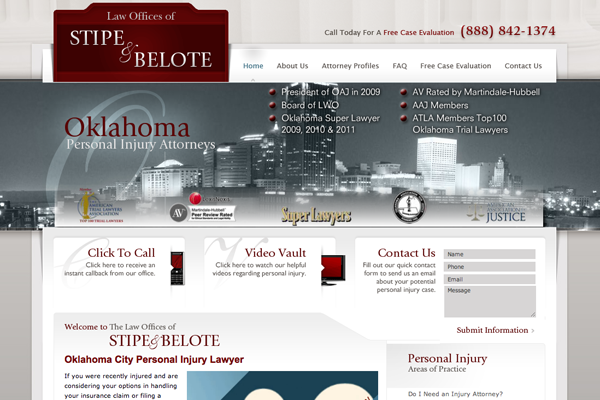
The Law Offices of Stipe & Belote‘s website has a professional appearance. The colors help create a professional look. The Flash animation is almost a bit much, but it is not too overpowering. They definitely shouldn’t add anything else animated on the website.
Worst Law Firm Websites
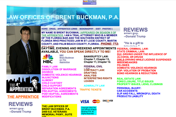
Brent Buckman’s website, which is no longer in use, is very colorful, but not in a good way. I had no idea where to look first on this website. That blinding lime green paragraph? The scrolling title? The counter at the top? The highlighted paragraphs at the bottom? This website could use some professional help and clean up. I was shocked his website still looked like this after appearing on Season 5 of The Apprentice.
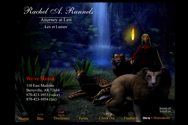
Rachel A. Runnel’s website, also no longer in use, is very interesting, to say the least. When I first opened up this website, I immediately thought I went to the wrong URL. It looks like the introduction to an online game. After looking in the top left corner, I realized I was at the correct URL (unfortunately). What a lion, tiger, and cheetah have to do with an attorney? The world may never know.
Law Firm Websites Designed by TBH Creative
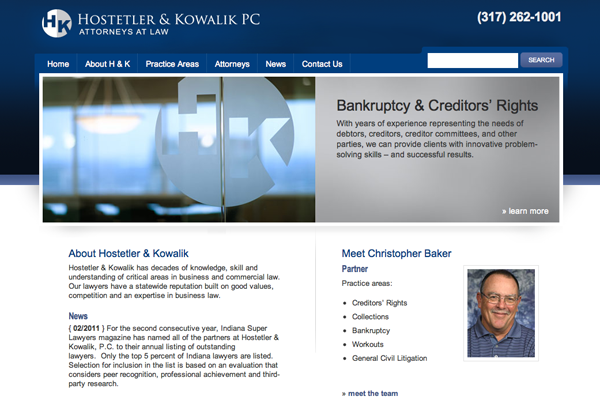
Hostetler & Kowalik PC Attorneys at Law
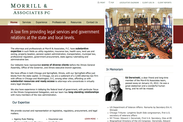
Morrill & Associates PC
Takeaways
Make sure your website gives a great first impression. Some users check websites before even going to the business’ location. Website first impressions are very important. If you do not know how to create a website, your business is too important to try and guess. Hire a professional.
Do you think your law firm’s website would make the “bad” list? TBH Creative specializes in professional web design and development for law firms and other professional services. Let us create a great first impression for your business!