In honor of the Oscars this year, I decided to give out awards for my favorite designs of 2011. Some of the websites could go into many categories, but I picked out their best feature that they succeeded in creating.

Creative Design
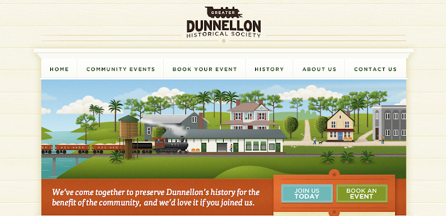
Greater Dunnellon Historical Society made their web design look like a home, which is appropriate because they focus on keeping Dunnellon a historic area. Not to mention their color scheme is really nice and their illustration for their header is amazing. All in all the site is really simple and clean, which I’m a huge fan of. They receive the “Creative Design” award for their designing as a home.
Intriguing Theme
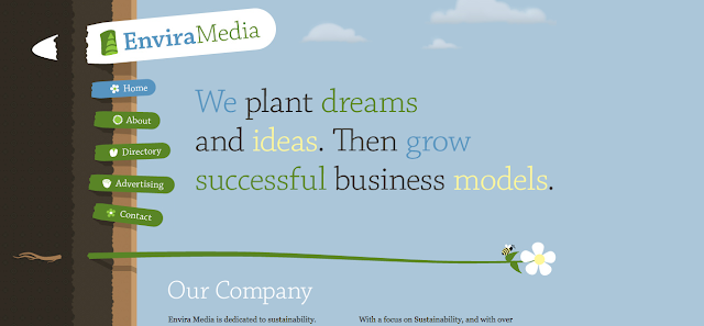
Envira Media picked a statement about their business and developed a theme around it. “We plant dreams and ideas. Then grow successful business models.” What Envira Media did was take this concept and create an underground theme that grows their navigation, logo, and information out from the ground. Their color scheme is also aesthetically pleasing, but what stands out the most is their creative theme. This is why I have given them the “Intriguing Theme” award.
Fantastic Color
Gerren Lamson puts together a beautiful website full of color. On his home page he has used, pretty much, all of the colors of a spectrum and has done a fantastic job. He has kept his website simple and to the point and uses his white space wisely. He also has some great typography on each page as the header, but he is in this post for his “Fantastic Color” scheme.
Tasty Slideshow
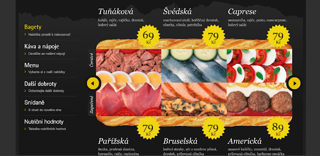
Bageterie Boulevard has a simple color scheme going on that works very well together. They sell sandwiches and what is selling their sandwiches on their website is this delicious slideshow. Every slideshow is different with every site, I found this one to be very original and creative. An easy way to skim through and actually see what each sandwich contains. This slideshow makes me want to eat sandwiches, so I awarded them the “Tasty Slideshow”.
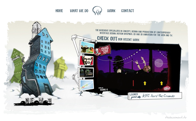
Flashy
The Basement Design + Motion creates some great games, interactive marketing and online advertisements using Flash. So as it should be, their website is made with Flash and it is made well. Unlike many Flash sites, which are usually crazy interaction and sometimes confusing, The Basement has a solid website featuring only small, enhancing effects for their website. Check out their site to see their website and their work. In my book, their award is called “Flashy”. The Basement Design + Motion is also TBH Creative’s interactive/Flash partner.

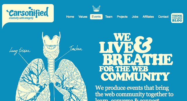
Unique Pages
Carsonified is an extremely inspiring website to me. Not only is every page different with a brilliant color, but it’s kept clean and crisp with a two tone color scheme. Though both of those are great qualities in a website, Carsonified is receiving the award for “Unique Pages”. Creating a different feel for each page makes a great experience for the user.
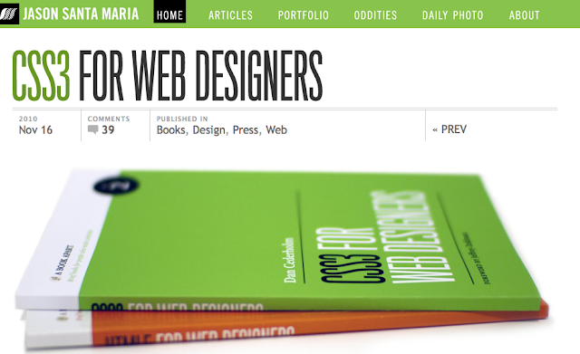
Best Typography
Jason Santa Maria is a graphic artist, web designer, and blogger (which is featured on the home page). When you visit this site, click through his blog posts with the “Prev” button and you’ll see a completely different layout and typography used for each blog post. These layouts follow the theme of the blog topic and they flow beautifully. The ability to match the typography with the layout on each blog awards Jason the “Best Typography” award.
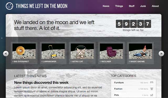
CSS3 Mania
Things We Left On The Moon is a site created by SimpleBits to show how versatile CSS3 can be. Everything on this page is created with CSS3, there are no jQuery tricks here. To view all of the CSS3 tricks on this site, it’s best to view it in Safari. If you don’t have Safari, FireFox allows most of the tricks. There are also no Photoshopped files of text either. This site is best explained by simply looking at it, you’ll notice why it’s awarded “CSS3 Mania”.
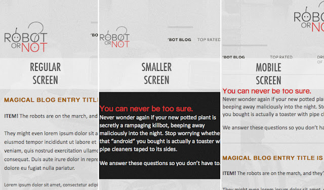
Best Adapted Design
Robot or Not? is a website that was created by Ethan Marcotte to show how one website can be used for different screen sizes, but simply change CSS depending on the width of the screen. To view how this works you’ll have to shrink your browser to different sizes, it even compensates for mobile phones. It rearranges the text so that it’s not cluttered and shows only what is necessary for the user, especially if it’s a mobile phone. I’ve created an image below to help explain, but you’ll really have to view it for yourself. This site has been awarded “Best Adapted Design”.
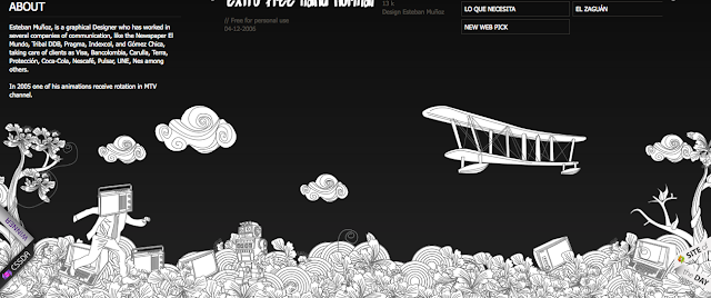
Inventive Footer
Esteban Muñoz website seems like a basic, nicely styled black and white website. Once you drift to the footer of the site there is a beautiful surprise waiting for you. When the mouse is over the footer and you move it around, all of the images move at a different pace creating a 3D layered illustration. This site has been awarded the “Inventive Footer” and it is definitely one of my favorite footers that I have seen in awhile.
TBH Creative is a website design company in Indianapolis, Indiana. We create effective and advanced websites for businesses with a focus on user-friendly web design and intuitive information architecture.