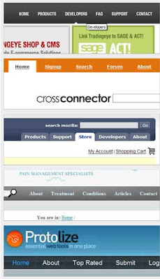
Web site navigation is unmistakeably one of the most important elements on your web site and will likely influence the success of your site and your user’s experience. According to Web usability expert, Jakob Nielsen, a good navigation system should answer three questions:
Use these basic elements to develop an effective navigation system (or correct one that is not effective):
- Keep the navigation style and placement consistent on each page. Users will get confused and frustrated if links appear and disappear unpredictably.
- Use appropriate text inside links. Don’t make your visitors guess where a link is going to take them. Visitors should be able to anticipate a link’s destination by reading the text in the link or on the navigation button. This isn’t the time to be cute or obscure – visitors don’t have the time or patience for it.
- Use CSS to emphasize text links. Some designers dislike underlined text links inside page content because it makes bodies of text more difficult to read. The problem is that visitors expect links to underlined so there needs to be an obvious cue to users that these are links if they are not underlined. The “hover” state can help do the trick and a good designer will use CSS to create a different and consistent visual technique as an indicator (e.g. background color, different font, or text color).
- Add a text-based site map. Large or complex sites should always have a text-based site map in addition to text links. Every page should contain a text link to the site map. Lost visitors will use it to find their way, while search engines spiders will have reliable access to all your pages.
- Include a button for “home page” inside your primary navigation system. This will help if visitors enter your site from a search engine and do not enter at the starting page. This will allow them to click back to your home page if desired.
- Site logo links to home page. Most sites include their logo somewhere at the top of every page – generally in the top, left-hand corner. Make this link back to home because that is what your user will expect.
Check out TBH Creative’s portfolio for samples of effective navigation. The primary navigation should be obvious, consistent and easy for the user. Contact us today for more web site services information.

