
Remember when Harlan Hogan warned you that “there are no second chances for a first impression”? This old expression rings true today, even in the digital age. On Facebook, your first impression consists of your profile photo and cover image, which should reflect your overall branding.
As of September 2014, 71% of online adults use Facebook (Pew Research). Your cover photo is basically a Facebook welcome message, offering a look and feel that complements your brand and messaging across the board. These images might convey that your team is bright, creative, and energetic or that your products are stylish, functional, and high-end.
As of September 2014, 71% of online adults use Facebook (Pew Research). Your cover photo is basically a Facebook welcome message, offering a look and feel that complements your brand and messaging across the board. These images might convey that your team is bright, creative, and energetic or that your products are stylish, functional, and high-end.
The Basics – Dimensions and Resolution
Profile photo dimensions
Facebook profile photo dimensions must be at least 180×180 pixels and must be cropped to fit in a square. As the user views your page on desktop, tablet, and mobile, the profile image dimensions will adjust automatically.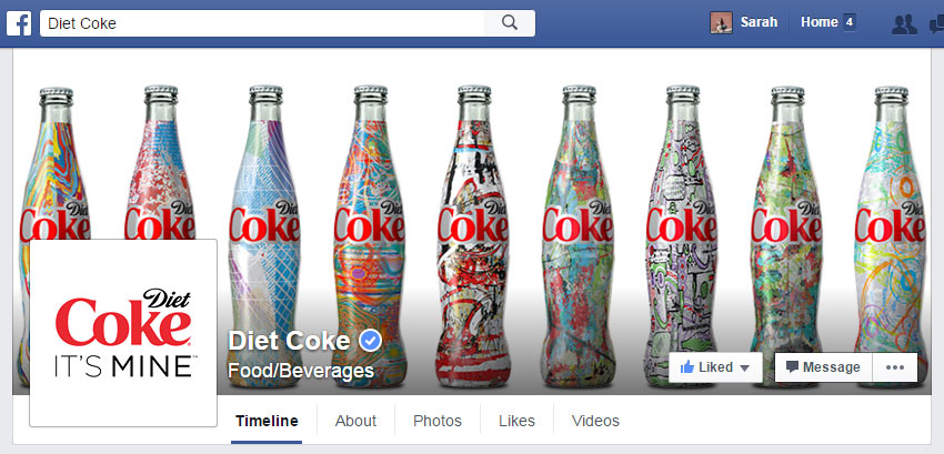 |
| Diet Coke’s Facebook Page conveys fun, energetic, playful vibes in their cover photo. Pairing that with an understated and assertive (branded!) profile picture, the user is greeted with a cohesive message that compliments their website. |
Cover photo dimensions
On the other hand, cover photo displays vary based on the size of the screen. However, the cover photo dimensions don’t change. For fastest loading speed, create a JPG cover image that is 851x315px, with a file size less than 100 kbs. Facebook does note that images containing logos or text will display better as PNG files.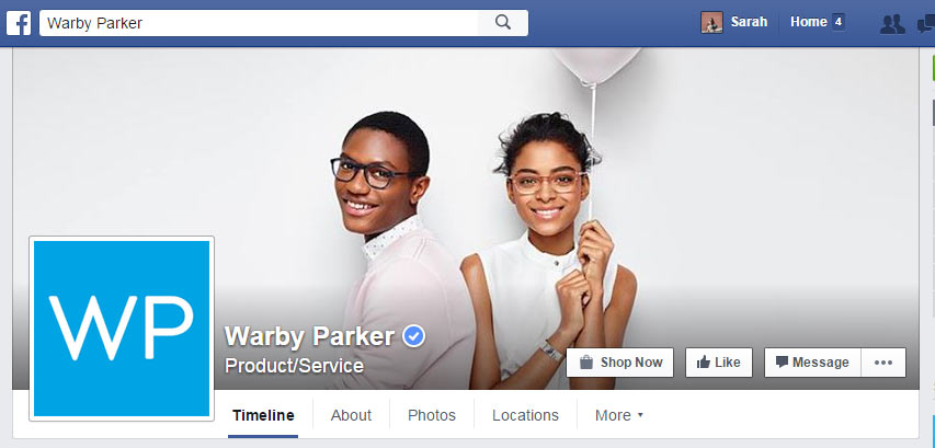 |
| In the Warby Parker cover photo, two smiling face bearing stylish glasses are front and center. In the mobile view, their profile picture partially covers the edge of his face. It is important to check your profiles in multiple views to fix any spacing issues. Pro tip: Test multiple views for any odd spacing that may cover text or faces. Tweet this |
How to edit image size and resolution
A photo editing software, as high-tech as PhotoShop or as free as PicMonkey, will allow you to re-size an image and change its resolution to meet these criteria. Be sure to note that Facebook updates the cover photo guidelines occasionally. You can always find the most up-to-date profile picture & cover photo dimensions and requirements in the Facebook Help Center.Optimizing your cover photo
Now that you have the basics, let’s consider how to use your cover photo as a welcome message for your page visitors. Armed with the knowledge that Facebook has 802 million daily active users (Social Media Slant), a branded Facebook page is a smart platform for displaying your message to the public eye.How does a business brand their Facebook page?
Start by using colors, fonts, and images that are in sync with your brand “to deliver a consistent, unified user experience regardless of where the experience begins, continues, and ends,” according to the web geeks at 24 Ways.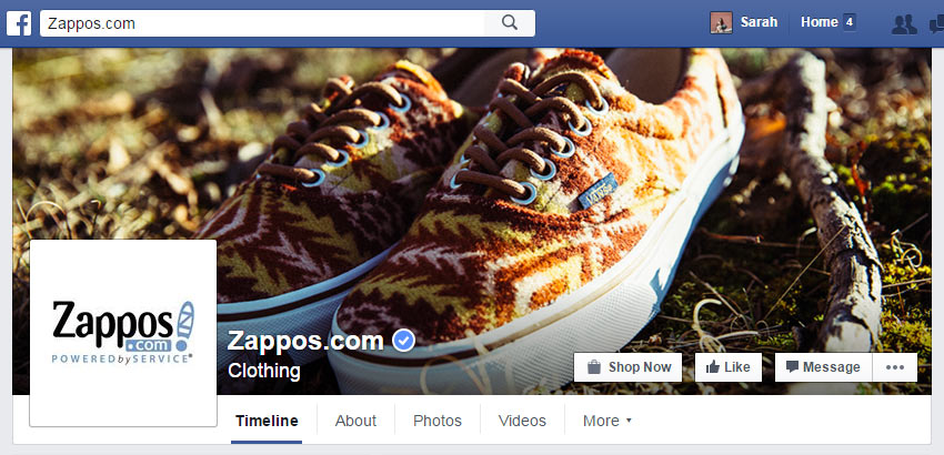 |
| Zappos uses a color-rich photo that makes the Shop Now call to action very visible. Brush up on this Page feature in the Facebook for Business News section. |
Use Facebook Call to Action buttons
A great Facebook cover photo will also emphasize the new-ish Call to Action (CTA) Button feature. About a year ago, Facebook updated Business Pages with the ability to add CTAs in the cover section, next to the standard Like and Message buttons. Depending on your social media strategy and goals, this feature may be a good fit for your page.“Over the course of a three-week test, the Sign Up call-to-action button delivered a 2.5x higher conversion rate versus other comparable social placements aimed to drive new user acquisition.” — Brian Kim, Director of Acquisition, Dollar Shave Club
Stay current with Facebook policies
In addition to these new elements, it is important to note that Facebook no longer includes the “less than 20% text on a cover image” rule in page guidelines. Page administrators are free to include any number of text elements in their cover images, but good design practices still encourage discretion.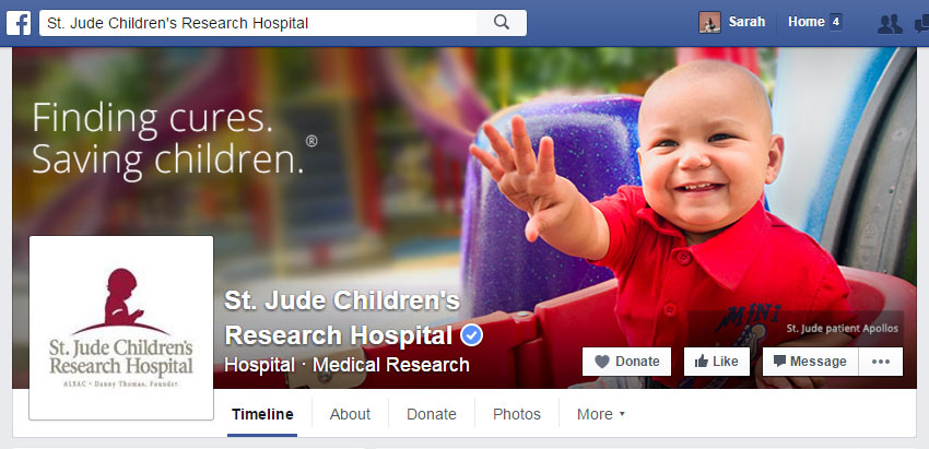 |
| A well-placed caption, logo, or text element on your cover photo can help emphasize important messaging for page visitors. St. Jude Children’s Research Hospital uses clean white text to remind users of their principle work. |
What’s the verdict?
A great Facebook cover photo has the correct dimensions and resolution, is well-placed on all screen sizes, and is branded to integrate a consistent user experience. Taking the time to craft a first impression that instantly conveys your brand to new page visitors has the potential for big returns in 2016.How do you plan to leverage the power of social media to supercharge your digital marketing? If you’re looking for help creating an online marketing strategy, TBH Creative is here for you. With our wide range of services and years of expertise, we can help you develop a plan to make this year a successful one for your company.
Let’s talk about the latest trends in social media & digital marketing
