One of our first steps in a new website design project is to ask our clients about websites they generally like. The website doesn’t have to be in their industry or related to their work in any way.
As we begin thinking about translating the fresh, new web copy into wireframes and high-fidelity design, we ask our clients to help us give the design team some direction.
Getting an idea of the types of websites or styles you prefer gives us some foundational design elements to play with and think about when we’re creating your site’s new custom look and feel.
Read on to see examples of different website design aesthetics, including some of the elements that make up those designs.
When you are specific about what you like or dislike aesthetically, your web designer will have a better idea of what to do when exploring options for your website’s layout.As we begin thinking about translating the fresh, new web copy into wireframes and high-fidelity design, we ask our clients to help us give the design team some direction.
Getting an idea of the types of websites or styles you prefer gives us some foundational design elements to play with and think about when we’re creating your site’s new custom look and feel.
Read on to see examples of different website design aesthetics, including some of the elements that make up those designs.
Start by thinking about what you like best about your favorite websites
“I like websites that are clean and simple.”
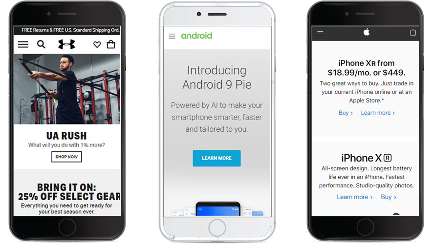
We hear this design preference all the time from clients.For websites that have a straight-forward and uncluttered look, designers use headings and background styles to indicate different sections on the website, instead of busy images, ornamental borders, and elaborately distinct panels.
Simple websites tend to have very specific calls-to-action that they can present to the user quickly and without a lot of context. For example, when a user lands on the Apple.com website, they are typically familiar with Apple’s products and reputation. Its website design uses Apple’s no-nonsense brand aesthetic to share product and service information. The site doesn’t need to spend a lot of time conveying the who or the why. It can skip right ahead to the what.
Some examples of clean, simple websites:

Under Armour | Android | Apple
Common design elements:
- Whitespace
- Mobile-first experience
- Simple, bold font choices
- 2-3 colors or shades of color on a page
- Minimal, crisp photography
Unique and branded
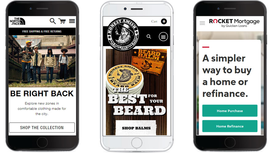
While all strategic websites are branded, certain design styles reflect a unique sense of style at first glance. Websites like this tend to adjust standard elements, like headline size or logo placement, in creative and eye-catching ways.When clients prefer unique website design styles, this tells our designers that we have more creative freedom to compose the page in original ways rather than sticking to the tried-and-true design styles that are more popular across the web.
Some examples of unique, branded websites:

The North Face | Honest Amish Beard Balm | Rocket Mortgage
Common design elements:
- Larger or variations on logo placement
- Large, branded headline messages
- Custom imagery that represents a look and feel for the company
- A balance of whitespace and full-width images
- Overlapping elements and other thoughtful placements
Playful and Whimsical
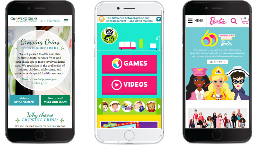
In contrast to a muted, white-space website that is clean and simple, some users prefer colorful, engaging designs and elements that represent a playful brand to users by leaning into the bold, colorful, over-sized designs elements you see below. These types of designs tend to have specific audience targets, such as children, and are in contrast to the simple, clean styles that have grown popular.Websites like these stand out, and—if they are coherent with your brand and audience—you can have a lot of fun playing with color palettes, button styles, images and illustrations, and more.
Examples of playful, whimsical websites:

Growing Grins Pediatric Dentistry | PBS Kids | Barbie
Common design elements:
- Use of bold colors and color palette
- More entry points on the page, such as button options and scrolling
- Fills the page with color, imagery, and content
- Font selections are unique
Sleek and photo-driven
Another popular design style is photo-driven website design.
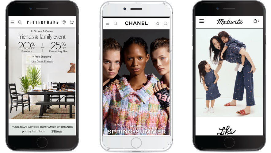
These websites rely heavily on professional, high-resolution, custom photography. These could be photos of people, products, customers, buildings and locations, products, or anything else you might like to include on the website.
These websites rely heavily on professional, high-resolution, custom photography. These could be photos of people, products, customers, buildings and locations, products, or anything else you might like to include on the website.
Because photos are essential to these website designs, you should have plenty of custom photography on hand before choosing a website design so reliant on branded images like these.
With great photos, a designer can plan some interesting elements and play with text positions using overlays and floating images in panels.
With great photos, a designer can plan some interesting elements and play with text positions using overlays and floating images in panels.
Some examples of sleek, photo-driven websites:

Pottery Barn | Chanel | Madewell
Common design elements:
- Professional, custom photography
- Colors shown through photos rather than text, buttons, etc.
- Minimal text content
- Unique font choices
Beyond basic usability functions, consider if you prefer bolder colors, whimsical fonts, clean whitespace, or any other elements of design that will give your web designer specific foundational direction to create a website that you’ll love.
We design custom websites. Let’s talk
You might also like:
