
As a website designer, sometimes you have to take a step back and think to yourself, what would make this website stand out? What would make it special or unique? You could either decide that you’ve gone in the wrong direction and start from scratch or you could use techniques to create subtle changes to the design that really make a big difference.
Business owners with a website are in the same boat. Should you scrap it and start again or hire a talented web design company to make subtle and effective changes?
A good web designer knows she could add changes to the background, special text treatment, use jQuery, or add custom buttons that will can a big impact.
Background
Adding subtle changes to the background could include a number of techniques. I’m going to provide some tutorials for the most common techniques that I see used on websites. Here is a tutorial, Basic Web Page Background Techniques with CSS, from Line25 that has a few of the techniques I’m going to discuss into detail below.
Gradients
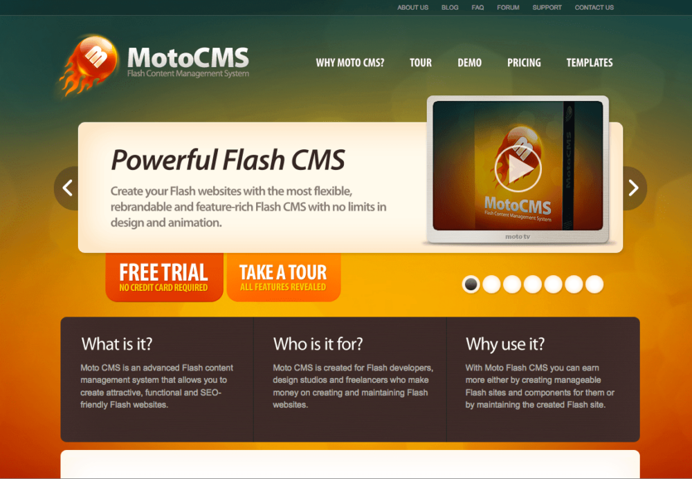
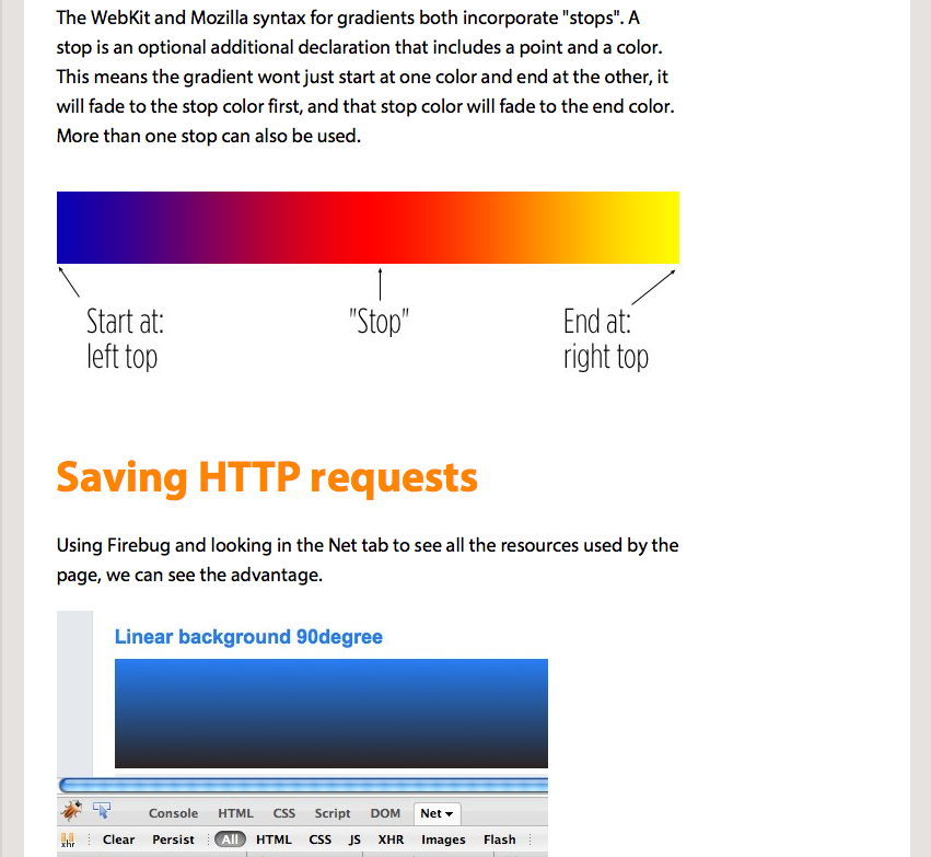
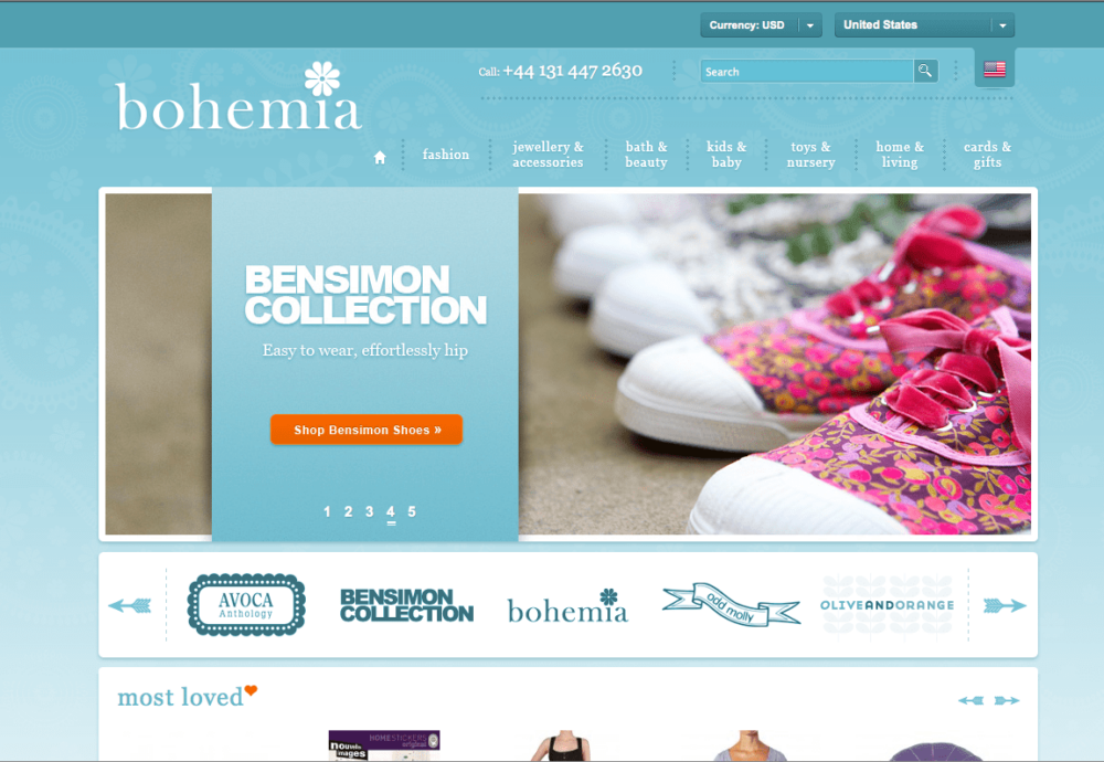
Using a gradient for the background shouldn’t be too tricky. The most effective and subtle way to use them would be to create the gradient with two colors that are somewhat close to each other. This way when users are looking at the website, their eyes don’t become distracted by the gradient (taken them away from the content), but the background won’t seem flat. They will notice that something nice is going on behind the content that is almost soothing. Gradients are one of those design elements that when you see a good one, it’s relaxing. If you are going to use more than two colors, just make sure that it doesn’t look tacky/crazy and that the colors flow from one to another. Here is an example of a multiple colored gradient background that looks nice.
Another great thing about gradients is that you can either create a repeating background image OR you can create a gradient with CSS3. Here are some tutorials for gradients.
CSS Tricks – Speed Up With CSS3 Gradients
Bjango – Gradients
Texture
Adding a texture to the background is probably the most common way to add a subtle change to your design. I mostly add textures to my web designs with Photoshop brushes. Brushking, My Photoshop Brushes, and Brusheezy are probably the most popular sites to download brushes from. Here are some of my favorites to use.

Patterns
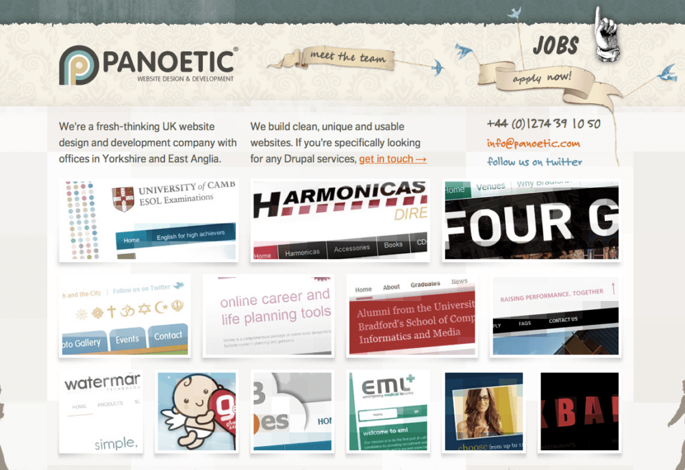
Now patterns can get complicated depending on how detailed the pattern is. Patterns can either be used for the background or they could be used for small detail. I’m going to give an example of this one because it’s kind of hard to describe. You can also find patterns at My Photoshop Brushes and Brusheezy. This website uses multiple patterns for different sections of their page. Though there are three different patterns being used, they are blended in well with the background colors making them very subtle.
Panoetic
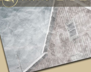
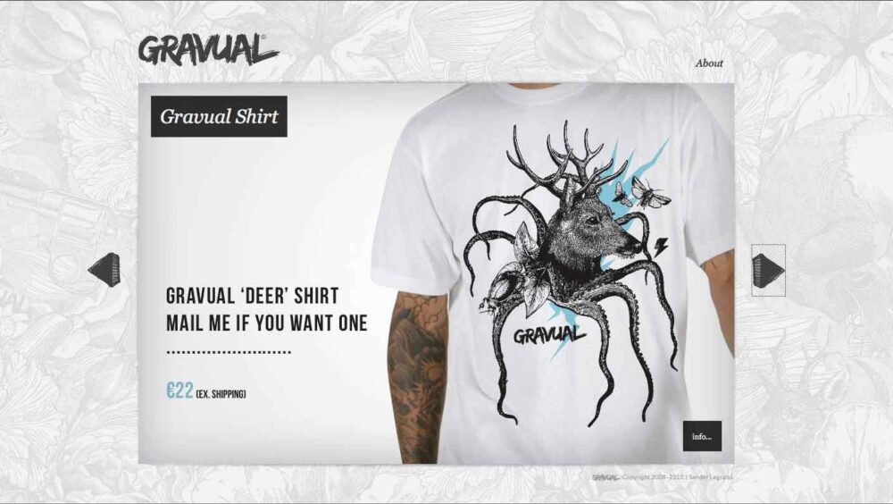
The next example of a patterned background is a bigger and more detailed pattern. The pattern is big enough to seem almost like noise to the background color. It’s not too noticeable, but once you start concentrating on it you can see that it is very large.
Gravual
Lighting
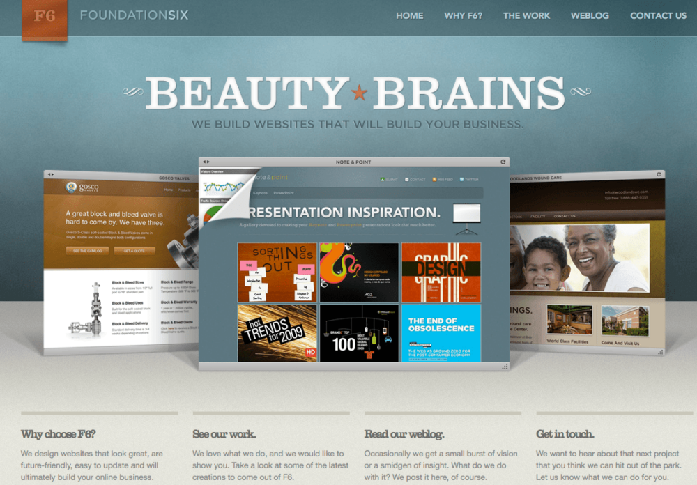
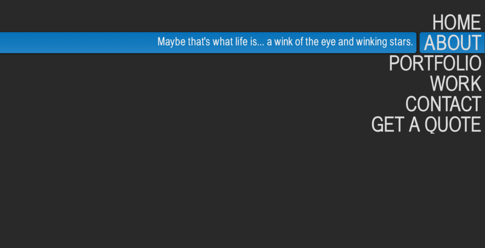
This is something that a designer can easily add either behind their logo or behind their content boxes. Usually it should be used to make a certain area stick out. If your background color is a lighter color you could darken their area behind your Logo or behind a Call to Action section, distinguishing it from the rest of the content. Or if the background is a darker color you could lighten the areas behind those sections. In this example the area behind Beauty Brains is highlighted to make it stand out.
Headers
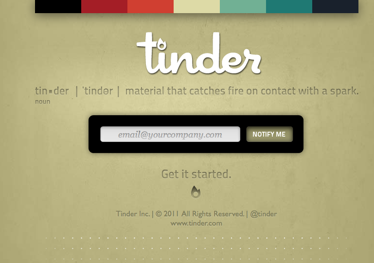
This section isn’t about making subtle changes to your header design, we’re still in the background section. A trend that I have been noticing a lot more is a design that is behind the header/beginning of the content box. This design remains at the top and the rest of the background fades into a single color.
Special Text Treatment
There are many things that you could do with text as I have mentioned in other blog posts. Of course you can enhance a header or a call to action with a different text than your body. This can be done by using a Photoshop font with a graphic or a web safe font (which has expanded with Typekit and Google Web Fonts). A few other ways that I’m going to list are dropshadows and the sunken effect. There are many other effects that you could use, but these are the most subtle and easiest to create in my opinion.
DropShadow
Whether you’re creating a dropshadow with Photoshop or with CSS3 (which depends if you’re using a web safe font or not), dropshadows are one of the easiest techniques to add to your site to give it some extra umph. I have a few examples, but I’m sure most of us know what a dropshadow looks like. First here is a tutorial of how to create a dropshadow with CSS from CSS Tricks.
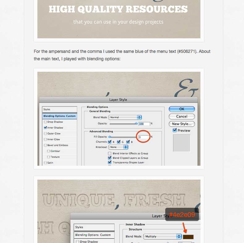
Sunken Text
This is a technique that I continue to see more and more. I really like this effect. I think that the dropshadow has been a default to fall on when trying to added a certain something to a website. I’m not saying that dropshadows aren’t tasteful, but this is something that is new that you could play around with. The example that is below is from a tutorial on how to make a layout for a website, but I am focusing on Step 4: Adding the Tagline. It explains step by step how to create this intriguing text effect.
JQuery
I have discussed jQuery numerous times in my previous blogs, so I won’t take too long on it. I’m actually going to link to the 6 Secret Weapon JQuery Tips blog. I’ll still list a new example, but jQuery is something that you can add to your navigation and a slideshow to make them more interactive and interesting. Here is an interesting one.
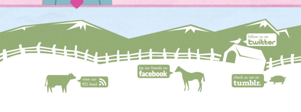
Custom Buttons
Social media buttons and buttons for navigation for the most part always look the same. Yes, there are may different buttons out there, but sometimes we create buttons purely because we liked the way that someone else did it. We look at it and twist it a little to make it our own. I want to encourage designers to create their own buttons, especially because it is easier to match the theme of your website. I’m going to provide some good examples, but don’t try to steal them! :]
Occasions by Elizabeth

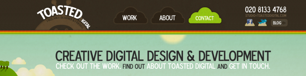
Toasted Digital
Pink Turkey
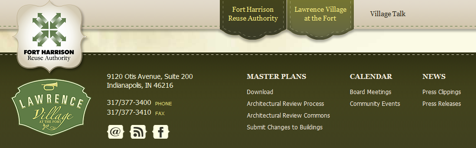
Fort Harrison Reuse Authority (New Site Coming Soon)
Summary
Even though subtle changes are what they are [subtle], they truly help a website stand out. These techniques help clean up the design from looking flat to looking fabulous. Remember to use them wisely, use them in the areas of your site that you want to stick out the most and draw your customers to. Also feel free to share some subtle changes that you like to use or one of your favorite tutorials for enhancing a website.
Redoing your website probably sounds like a huge project — doing it right is! Consider some of these subtle changes in design to add value and interest on your web pages. TBH Creative specializes in web design for businesses and can help you evaluate your web strategy options.