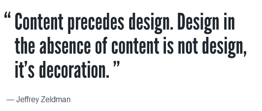
When people are ready to update or create a website, they often want to jump straight to the design. Colors, logos, pictures, layout – those are the fun parts of website design. (We think so too!) Here at TBH Creative we recommend a different approach. One that pushes the design further back into the process but ultimately makes that design stronger. When we start a website design project we start with content – specifically Site Architecture and Wireframes.

Site Architecture is the map of your website. Literally.
Content planning. Information Architecture. Site Map. No matter what you call it – the site architecture is the backbone of a good website. At this stage you are not thinking about design or copy. Instead, you are carefully considering your goals for the website and what type of content you’ll need to meet those goals. There is software out there to help you create a site map, but you don’t need any technology for this stage. In fact, a lot of people like to use index cards or large flow charts for brainstorming.
Here are some great tips for site organization from Smashing Magazine:
- Organize content according to user needs, not an organizational chart or company structure.
- Give pages clear and succinct names.
- Be sympathetic. Think of your typical users, your audience personas, and imagine them navigating the website. What would they be looking for?
- Consider creating auxiliary way-finding pages. These pages would lie beyond the main navigation of your website and structure various pages according to specific user needs.
- If you can’t succinctly explain why a page would be useful to someone, omit it.
- Plan the architecture around the content. Don’t write content to fit the architecture.
- Keep everyone on point with constant reminders of the true goals of the website.
- Not everything has to be a page. Use your hierarchy of content as a guide. Some items might work better as an FAQ entry or as sidebar content. Make sure your architecture-planning method does not blind you to this.
Read the rest of this article on site architecture.
Now lay out the content in a wireframe.
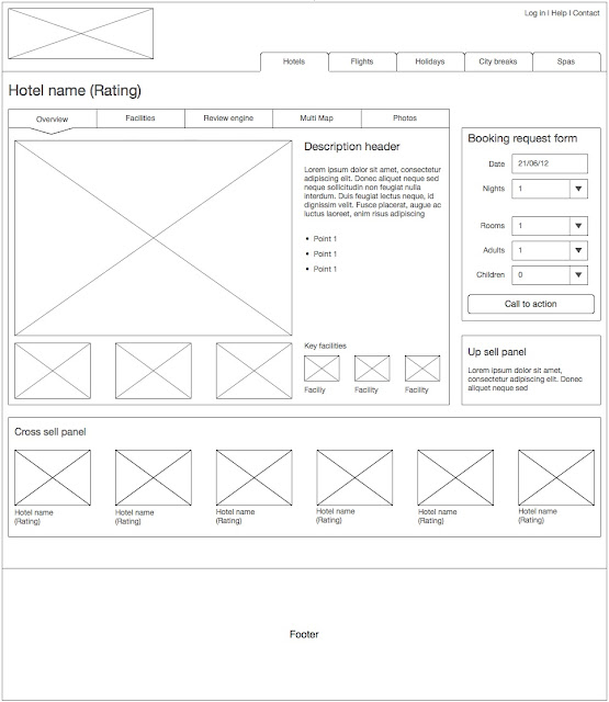
A wireframe is not a design layout. A wireframe does however let you take all that carefully considered site architecture and put it into the basic framework of a website. It helps you start to consider the flow for your user. It helps you assign appropriate prominence to content. A well-designed wireframe will become the guide for the design and content phases to follow. And while it may seem counterintuitive, taking the time to create wireframes will save you time in the development process.
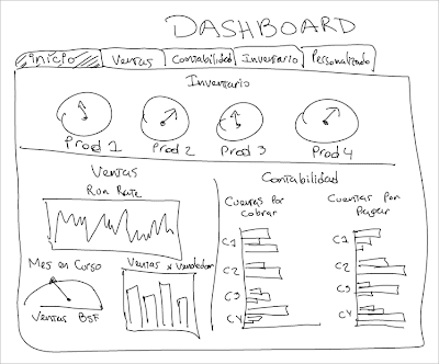
You and your design team might create wireframes with pen and paper:

More likely, you’ll use software to come up with something that meets your needs:

Creating wireframes are a bit of an art and a bit of a scientific process. Each designer does them differently but the goal is to create a site that meets your objectives and provides a structure for your architecture. Read one web designer’s process on The Fine Art of Wireframing for a more in-depth perspective on the design process.
Want to learn more about Wireframes? Check out this article: Ten Simple Ways to Make Wireframes More Useful.
TBH Creative guides clients through this important planning for each of our web design projects. Learn more about our Design Services and Process. Or get in touch to find out how we can address your specific needs.
TBH Creative is a website strategy company—located in Carmel, Indiana—that serves Indianapolis and the greater central Indiana area, as well as other locations remotely. Learn more about TBH Creative.
