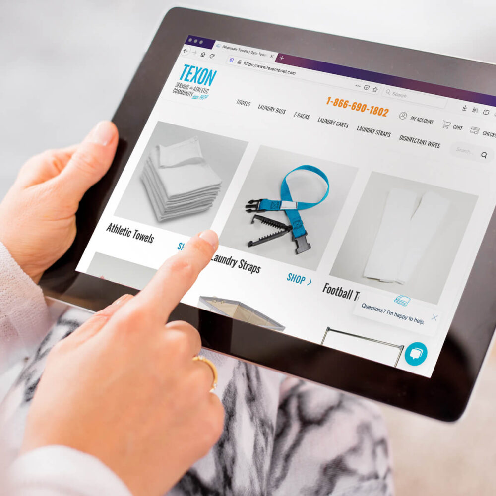
The best ecommerce websites go above and beyond to create a user-friendly experience for buying goods. They attract new customers, make good first impressions, feature content relevant to their users’ needs, and prioritize purchasing convenience.
Looking to expand into new markets and increase sales to existing customers, Texon came to TBH Creative for help with their recent ecommerce website refresh project.
Texon’s primary goals for their updated ecommerce website included:
- Rethinking the navigation for more customer-centric browsing and remove the confusing double menu on mobile views
- Designing new templates and design elements to de-clutter the website and introduce the new brand elements created in 2019
- Recoding all site templates to remove a clunky template, improve site speed, and simplify ongoing maintenance
- Making spot content refinements to select product pages to improve SEO and user-experience
The solution—
TBH Creative’s modern ecommerce website redesign work for Texon included:
- Website planning and prioritization of tasks
- Website architecture
- Website redesign of key pages and universal styles
- Web development
- Website hosting migration
- Integration of lead generation mini-campaigns on key products
Launch date: May 2020
Q&A
TBH Creative chatted via email about Texon’s ecommerce website refresh project with Wayne Kotulic Jr., vice president of sales. His responses—below—have been condensed.
Why did Texon decide to redesign its website?
Wayne: It was time for a new look on our site. Since it had been several years, the Texon site needed a fresh face and we had some functionality things that we knew needed to be addressed.
TBH Creative [whom we’d been partnering with on other digital marketing work] brought to light even more issues that needed to be fixed (such as usability on mobile devices and slow site speed).
We know that we have more work yet to do, but we are doing this in phases and TBH has been able to create a strategy that addresses pressing needs and breaks up all the work we need to do into manageable yearly projects so we can budget properly for this website marketing investment.
Why did you pick TBH Creative to be your ecommerce website refresh project partner?
Wayne: Tatum serves on the board of a local nonprofit alongside Jen Havely from our team. Jen had been very impressed with Tatum and her creativity and work-ethic while volunteering together, so she referred the TBH team.
Our initial work with TBH Creative included optimizing our use of HubSpot (including developing a custom API that connects HubSpot with our sales/accounting software Brightpearl).
What makes TBH Creative different from other marketing agencies in Indianapolis?
I’ve worked with several companies over the last 15 years in the SEO, PPC, and web design space, but I haven’t found anyone that could put everyone in the same room to help us think big picture about everything we need to do.
With the TBH Creative team, they have the right players and you get what you pay for. In the past year, I have really enjoyed working with TBH Creative for not only what they bring to the table, but also because they are really genuine, good people!
How did TBH Creative do? Anything you are particularly proud of and glad we did?
Wayne: TBH Creative did a great job upgrading our website. Since they did not build the original website, it was not their canvas to build on. However, over the next couple of years, we hope to make it that.
I’d say the biggest thing that they give us—other than a nice site—is access to actionable data. Every business person knows that if you can’t measure it, you can’t manage it!
With help from TBH Creative, we were able to get the data we needed to course-correct after finding we were wasting big money on PPC [paid advertising]. This is just one example of how having data about our digital marketing is helping us to actually focus on advertising efforts that actually make money.
Would you recommend TBH Creative to other small businesses looking for strategic website and marketing help?
Wayne: I’d like to be selfish and say “no,” so we don’t have to share their time and talent—kidding, of course. We would absolutely encourage any small business to make the “investment” of working with TBH Creative. Good websites are an investment, but they are very necessary.
The power of our new website has allowed us to continue to grow and succeed.
Anything else you’d like to add?
Wayne: One of the coolest marketing projects that we have worked on with TBH Creative over the last 12 months besides the website was the redesign of our tradeshow booths backdrops. Our customers—and even other athletic supply vendors!—have told us that they love our new look and refreshed logo.
Our modern set-up is also easily convertible to fit multiple types of spaces so we didn’t have to invest in multiple tradeshow booth backdrops.
I love that TBH Creative’s team has the expertise to help us handle any type of marketing project (and do it well). You can get more than just a great website.

