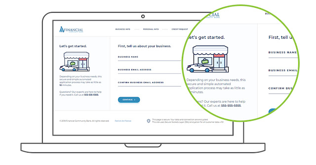
A client since 2016, Baker Hill has worked with TBH Creative on everything from website design to a complete company rebranding initiative.
That’s why, when it was time to design a new, cutting-edge user interface and a better online form experience for their original online lending application, the team at Baker Hill was confident TBH Creative would deliver something both they—and their clients—would love, and that would:
- Streamline the customization process (It took Baker Hill’s team, who developed the original application, a significant amount of time to modify the base product for each client’s specific usage needs)
- Look modern and improve the outdated web form user experience (The previous application did not have a defined strategic UX. When clients asked the Baker Hill development team for UX advice, they weren’t able to confidently respond to those questions. With the new system, the Baker Hill team can now offer rationale for understanding how things are set up and what the best practices are)
- Refine content labeling and organization (The original application lacked easy-to-follow and helpful messages to guide users throughout the online loan application process)
The solution—
Looking for help to rework the app in order to better serve their clients and grow the lending software side of their business, Baker Hill hired TBH Creative to do work to fix the tool’s user experience and user interface problems, which included:
- Updating the application to be highly adaptable and easy to install
- Identifying what was needed to solve software UX issues and making those fixes
- Writing new concise, conversational, helpful text throughout
- Improving the basic user flow with navigation bar refinements, sequence adjustments, and content reorganization
- Creating a percentage complete indicator
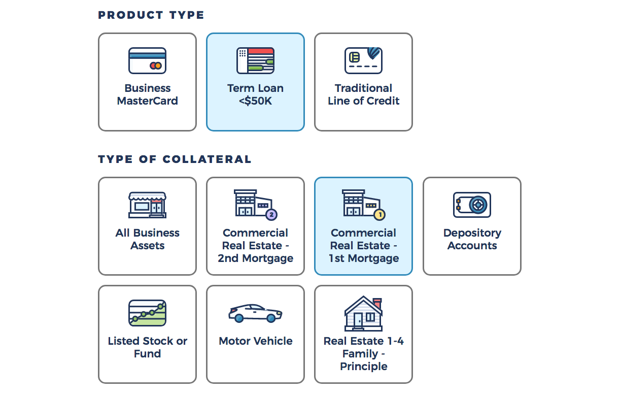
- Designing a light and clean user interface based on a rationale, unified logic to achieve a cohesive customer experience
- Developing the front-end code and styles then executing the new markup around the original application to ensure a seamless hand-off to Baker Hill’s back-end developers
Launch date: Spring 2018

Q&A
TBH Creative chatted via email about the project with Deidra Colvin, Baker Hill’s chief marketing officer; Rusty Garner, Baker Hill’s lead developer; and TBH Creative project lead Tatum Hindman. Their responses—below—have been condensed and edited.
What made this project unique?
Tatum Hindman: Baker Hill’s in-house developers created the original application, and we collaborated with their team—working around existing application code cautiously and maintaining the underlying logic and database—to completely overhaul the front-end, making practical improvements in the app’s design and messaging.

What worked well in this project?
Tatum Hindman: Baker Hill gave us complete creative control to make strategic design and organization recommendations to improve the web form user experience. The resulting solution is radically different from the starting point. The improvements we made strengthen Baker Hill’s small bank software solution offerings, and indirectly enhances their strategic partnerships.
Deidra Colvin: We were very pleased with TBH Creative’s work and have gotten good feedback from clients on how much better it looks and on the user experience.
“We have had lots of demos, and people are really liking the new look and feel that TBH Creative designed.”
What did TBH do to meet the goals of this software ux redesign?
Tatum Hindman: We focused on the application’s end-user—small business owners applying for loans—and their needs: What do business owners need? What information do they have? What would make the loan application process less painful for them?
Based on our research of similar applications, we mapped out a new process flow to significantly enhance the software UX while still giving banks the information they need to process the loan applications. When we delivered the product back to Baker Hill, it only needed a few final tweaks after their first review, and the finished application required very minimal time to implement on the client side.
What’s next?

Primary fields are also organized from top to bottom in a single column design to create a cleaner look that makes it easier for users to fill out quickly, whether they’re on a desktop computer or mobile device.
Rusty Garner: We have had lots of demos, and people are really liking the new look and feel that TBH Creative designed.
Tatum Hindman: We equipped Baker Hill with a fully-functional demonstration package to use in their sales meetings. The demo allows them to show prospective customers the application and how the solution could look when customized around their needs.
We are excited for phase two of this UI/UX project, which is slated to include adding a portal product for loan applicants to use to log in and see the status of their loan in real-time. Along with this improvement, we will integrate a username/password system to make it easy for applicants to come back later.

