Throughout the next few weeks, TBH Creative is going to be running a series of blog posts highlighting our favorite websites of 2012, identified by industry. Each post will also include a list of important must-haves elements for websites within each industry.
Last week we examined plastic surgery websites. This week, we’re focusing on sports medicine websites. We chose these three websites for their exemplary layout and organization, color schemes, and content.
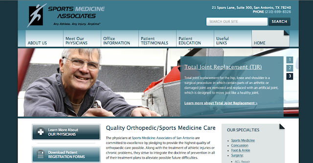
Sports Medicine Associates of San Antonio
Sports Medicine Associates of San Antonio’s website is strategically organized to put the patients first. The navigation prominently features content areas of most interest to existing and potential patients. The muted but appealing color scheme and authentic photo choices convey both authority and approachability.

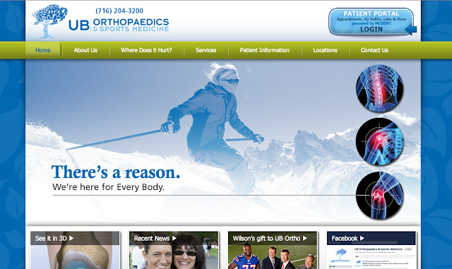
UB Orthopaedics & Sports Medicine
UB Orthopaedics & sports medicine’s website has a unique layout that incorporates both active sports photography and hi-tech medical illustrations. The bright, vibrant color scheme sets it apart from most of its sports medicine competition. On each page, call to actions are easy to spot.
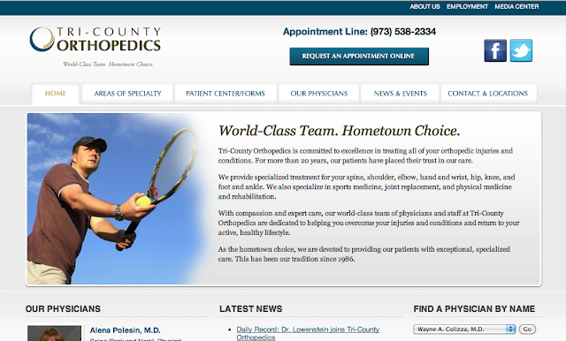
Tri-County Orthopedics
Tri-County Orthopedics’ website has a clean look and its straight-forward navigation makes it easy to browse for more information. Their direct copy clearly explains to existing and potential customers exactly which sports medicine services the practice offers. To aid browsing for a physician, the designers placed the dropdown search prominently as a package in the bottom right area of the landing page’s layout.
Top 5 must-haves for sports medicine websites
- Services: Clearly explain which services your practice offers.
- News, tips, or events: How do you stretch properly? Should you stretch before a workout, after, or both? Show you’re an authority. Use your website to answer important questions and give patients tips on how to reduce injury. If you offer any workshops or training sessions, be sure to post it in your events section.
- Schedule an appointment: Make it easy for patients to schedule an appointment. Display your phone number in an easy to find location or create a web form.
- Forms: Having patient forms available online can help speed up the process when they come into the office.
- Physicians and staff list: Make sure it’s convenient for existing and potential patients to find more information about their doctor and others who make up the healthcare team.
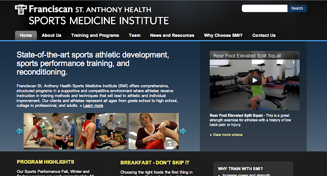
TBH Creative’s example of best medical website
Franciscan St. Anthony Health Sports Medicine Institute by TBH Creative

Does your sports medicine website need a facelift? TBH Creative is a web development company located in Indianapolis, Indiana. Specializing in online strategy, web design, social media, and search engine optimization: let us help you with your office’s web development needs.


