For most companies, websites make the first impression to potential clients. No matter the industry, a contemporary and useful website is an important marketing tool. Over the last few weeks, I wrote a series of posts on the best websites of 2012. Specifically, I focused on several industries: dermatology, education, internal medicine, pediatric, plastic surgery, and sports medicine. Here’s a recap.
1. Dermatology
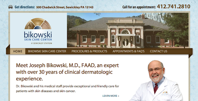
Bikowski Skin Center has an easy-to-use and professional website. The subtle texture in the background adds style to the website and matches their brand.
2. Educational
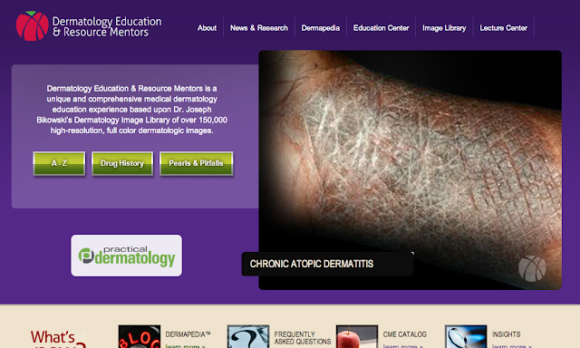
Dermatology Education & Resource Mentors has a well-thought out and organized website. The large images and bright colors draw users in and makes them want to learn more.
3. Internal Medicine
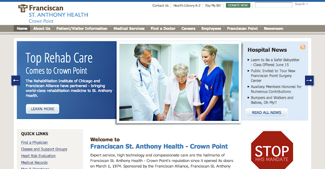
Franciscan St. Anthony Health of Crown Point presents a lot of information in a clear and thoughtful manner. The highly organized structure works perfectly for this website.
4. Pediatrics
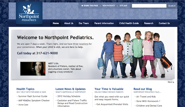
Northpoint Pediatrics presents a lot of useful information for its patients in a very easy-to-follow manner. Also, the use of a patterned background adds style and visual interest to the website.
5. Plastic Surgery
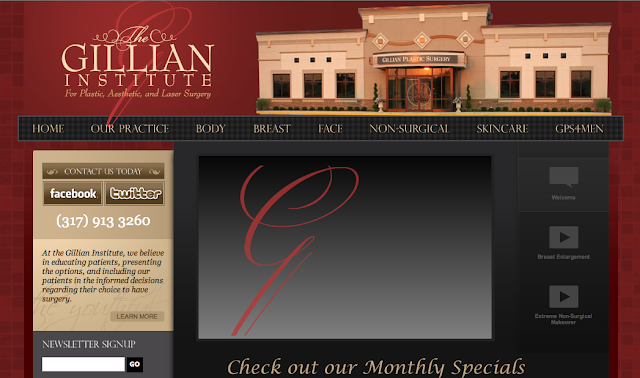
The Gillian Institute for Plastic, Aesthetic, and Laser Surgery is an elegant website. The styling and colors go together very well, and the brand elements are incorporated thoughtfully.
6. Sports Medicine
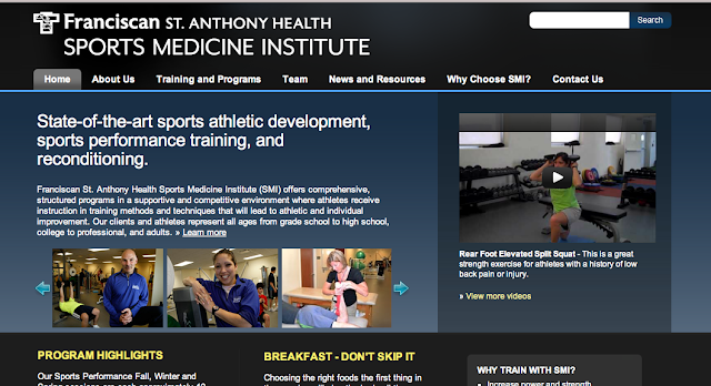
Franciscan St. Anthony Health’s Sports Medicine Institute uses a different—yet complimentary—template than the one used for the main hospital’s website. This deliberate distinction in design signals to patients though they’re at a different website they are still within Franciscan St. Anthony Health family of healthcare services.
We build beautiful, user-focused websites. TBH Creative is a full service website company located in Indianapolis, Indiana. It is our goal to design and build user-friendly websites that exceed your expectations.
