Throughout the next few weeks, TBH Creative is going to be running a series of blog posts highlighting our favorite websites of 2012, identified by industry. Each post will also include a list of important must haves elements for websites within each industry.
Last week we examined dermatology websites. This week, we’re focusing on internal medicine websites. We chose these three websites for their exemplary layout and organization, color schemes, and content.
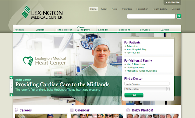
Lexington Medical Center’s website has a clean, professional color scheme with a thoughtful use of purple as a spot color for things like call to action prompts. The search box is easy to find if while browsing you can’t find exactly what you’re looking for. The home page is organized thoughtfully even though it presents a lot of information.
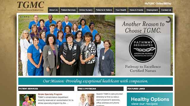
Terrebonne General Medical Center
Terrebonne General Medical Center’s website incorporates a textured background makes the website seem less “flat.” Additionally, their navigation tabs are very clearly marked and help users find what they are looking for quickly and easily.
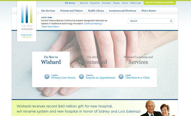
Wishard Health Services
Wishard Health Services’ website in organized into three main sections that makes it easy for busy users to scan and find the information they’re looking for. They also have a Spanish language option for users. Though most browsers can translate into different languages, Wishard went the extra step to make a bilingual website for their users.

Top 5 Must Haves for Internal Medicine Websites
- Patient & visitor sections: Where should visitors park? Who can patients call if they need to reschedule their appointment? A patient and visitor section helps users with frequently asked questions.
- Accurate contact information: Most hospitals have several phone numbers; usually different numbers for different departments. Make sure the phone numbers are accurate and easy to find.
- Find a doctor/list of physicians: Users often go to hospital websites to find a physician or specialist. Make the job easier by incorporating an “Find a Doctor” tool as part of the navigation.
- Careers/employees page: Make sure finding job opportunities available at the hospital is easy to locate.
- Latest news: Every hospital should have some sort of news. Internal Medicine websites should inform their audiences of important medical news as well as achievements by the doctors on staff.
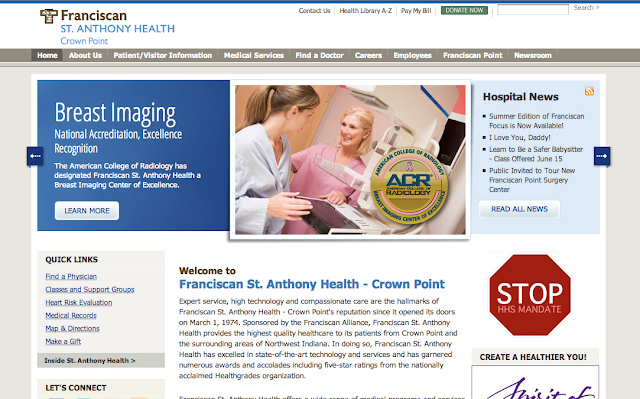
TBH Creative Example Website
Franciscan St. Anthony Health — Crown Point by TBH Creative

Does your internal medicine website need a change? The Web changes constantly—in terms of design trends, technology, and standards. You simply cannot afford to not make changes. Experts say a redesign should be implemented every 2-4 years just to keep up.


