Check out a newer version of this post! For more recent examples, head over to our latest hospital web design showcase.
Sometimes it is hard to distinguish what makes a website the “best” because much of it is subjective. Other aspects are fairer to judge such as usability, use of space, site architecture, and content. After searching the Internet for hospital websites, I quickly was able to find some that did all of the above well. Some of it may still be personal preference and even colors.
Last year, we created a post on the Best Healthcare Websites and Must Haves. It’s interesting to see what similarities and differences there are within a year.
Below, I have reviewed three of my favorite hospital websites as well as two of my least favorite.
Best Hospital Websites
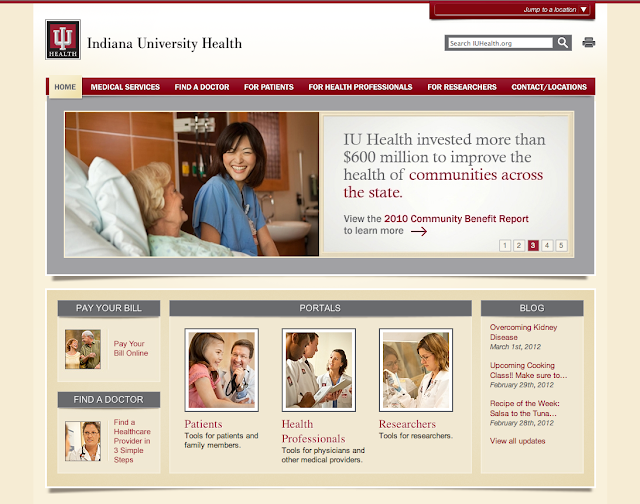
IU Health
IU Health’s website has good organization and use of space. Indiana University’s colors are red and white. They softened up these colors with a neutral tan and gray. The slideshow on top gives a nice preview of recent news, honors, and events. I also like how they do not overload you with information on the homepage.
The brand to integrate all hospitals under one umbrella is very well thought. They are clearly a combined group of healthcare providers and facilities. When you navigate at the main/corporate level, you can easily jump into a particular facility near you and get more detailed information; at the same time, you can jump back to the main corporate level without confusion.
The navigation experience is nice. The main choices are straight-forward to ‘to the point’. The left navigation offers a very nice option to open/close additional ‘sub-level’ pages. It is clear to see the big picture and find what you need with ease.
IU Health also offers a very clean and organized mobile version of their website for finding a facility/location, find a physician, and medical services. In my mind, perfect and exactly what a user would want from a mobile device. One negative thing about the mobile site: it doesn’t automatically redirect the user to the mobile version from a mobile device. The “mobile site” link is at the bottom in the footer which is how we know it is nice, but they really need to make it automatic for mobile devices. See our post on mobile web design tips and tricks.
What needs improvement?
- The design elements are “boxy” and in my opinion harsh/masculine. Compassion and caring emotions around desired healthcare might be better communicated by softening some of the elements (e.g., softer color tones, rounded corners). On some pages (such as patients), the boxes and graphics are overwhelming and do not help the user experience. Simpler might be better.
- One small hospital website design suggestion is to make the “jump to a location” section at the top easier to read. Italics for an entire phrase makes it difficult to read at such a small font.
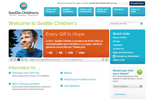
Seattle Children’s Hospital
Seattle Children’s Hospital’s website has a lot of color, which is expected from a children’s hospital. The colors are not overpowering and add a bit of character to the website. The white background color makes the website look very clean and also brings your attention to the content rather than the background.
Navigation is easy to navigate and find what you’re looking for. If you can’t find it, you can search for it with their search widget. Their navigation is very unique; I’m not sure I’ve seen anything like it before. When you hover over a button, it shows the entire menu. This makes it even easier to find what you are looking for. The menu also has a little interactivity. It is just enough to look professional and informative, yet not enough to distract the user.
I also like how they have their address and phone number very clear at the top. They make it very easy to pick up the phone and give them a call. They have other locations besides the main campus, so they have included a Locations page just for that.
What needs improvement?
- Mobile optimization is essential, and their navigation doesn’t work properly on a mobile device. There is no way to hover on a mobile device, so clicking on the menu item takes you to that specific page. It doesn’t show you the other options on the main menu.
- Maybe a smaller, shorter homepage? Without mobile optimization, it makes scrolling and finding things on a mobile device much harder. The homepage seems to go on forever on a mobile browser.
Massachusetts General Hospital
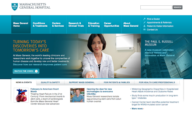
Massachusetts General Hospital’s website also has great organization. They have the main navigation at the top, quick links on the side, and tabs near the bottom. There are plenty of shortcuts and easy ways to get around the website.
The yellow-orange color goes very well with the blue. It calls for your attention but doesn’t demand it.
They also have mega drop-down menus that work very well. They have a lot of information on the site and have organized it well. If you can’t find what you are looking for, they also have a search widget.
What needs improvement?
- Again, mobile optimization is essential. (Can you tell mobile optimization is necessary yet?) They made a few small changes to help their site be a little more mobile friendly (getting rid of Flash animations and making the website width a little smaller, but it still isn’t 100% there yet).
- On internal pages, the darker blue background (where the large images are) turns black. It is very harsh compared to the white background and lighter blue navigation. They should have had the same theme throughout. The homepage obviously needs to be a little different from the interior pages, but it’s almost too much of a dramatic change. The black might work if they made the “large image” area smaller for internal pages.
Not So Great Hospital Websites
Cottage Hospital
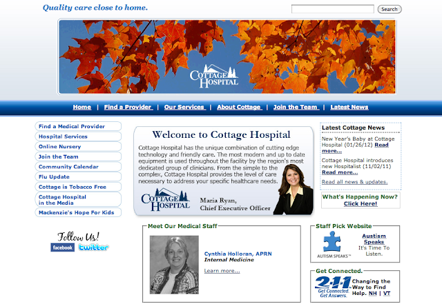
Cottage Hospital’s website isn’t too terrible visually, but it just isn’t organized very well hindering the usability. The header includes a slideshow with various images. Most of the images have the logo on the right side. The screenshot below has the logo in the middle of the picture. Your business’ logo should be in one spot and one spot only.
The navigation is also confusing. The links in the main navigation match some of the links in the side navigation. Two main sections of navigation seems very repetitive. They could have highlighted the extra side links on the homepage or even in the main navigation. The services page could have been organized a little better too.
This website’s main issue is lack or organization. Revising the site architecture would greatly improve the end-users response and the site’s overall effectiveness.
What can we learn from this website?
- Too many non-strategic duplicates in navigation take up extra room and confuse the user.
- Make your logo easy to find. A general web design rule is that your business’ logo be in the top left corner of the website.
Aiseikei Hospital
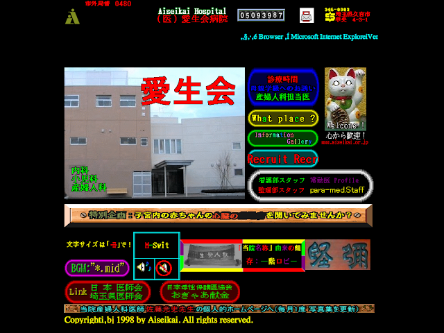
Aiseikei Hospital’s website is a very interesting comparison to the above examples. Their hospital is located in Japan (hence why you can’t understand most of the text on the website). I usually try to stay within the United States when comparing websites, but this one came in search results and was worth showing as a bad example. I first thought, “Oh, they must have made it in 1998 and forgot it was still on the Internet.” But then it hit me, someone is actually paying for the domain and hosting.
I don’t know where to begin on improvements for this website. A lighter, softer background and less intense graphics would definitely help, but it is probably best to start over from the beginning with discovery and research.
What can we learn from this website?
- GIFs are so 1990s. Obnoxious GIFs should not be used on any website. If you absolutely need to include an animated GIF on your website, make sure it is appropriate for your business’ message.
- Bright colors on top of a dark background are hard to read.
- If you use too many colors, the user can get confused and not know where to look first.
TBH Creative Examples
We have worked on many healthcare websites over the years and are continually gaining new insights from statistics and visitor trends to help further increase effectiveness. Below are a few recent projects we helped with in the healthcare industry. We also work with Northpoint Pediatrics and are currently updating Internal Medicine Associates in Merrillville, Indiana.
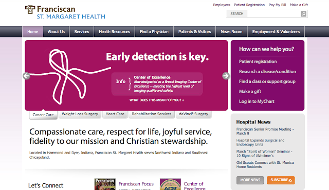
Franciscan St. Margaret Health by TBH Creative
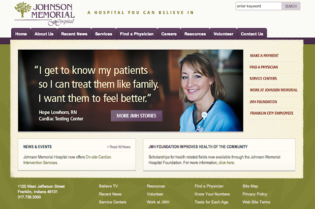
Johnson Memorial Hospital by TBH Creative via subcontract with Williams Randall Marketing
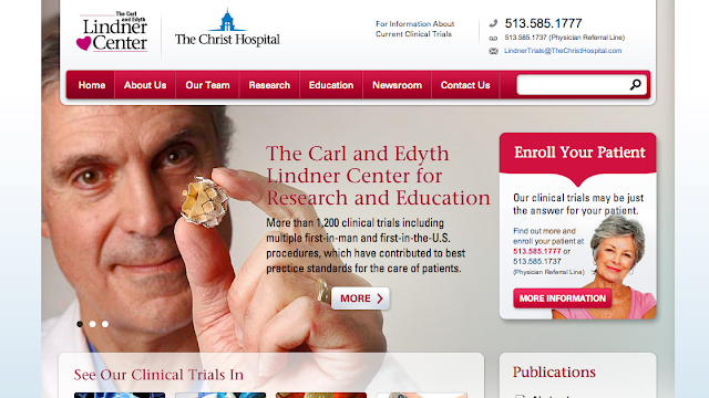
Lindner Research Center of The Christ Hospital by TBH Creative
Does your hospital website need improvements? TBH Creative specializes in professional hospital web design and development, and we have extensive experience in healthcare and professional services. We understand your audience and how to make improvements that are effective. Contact us today for more information our hospital website design services.
