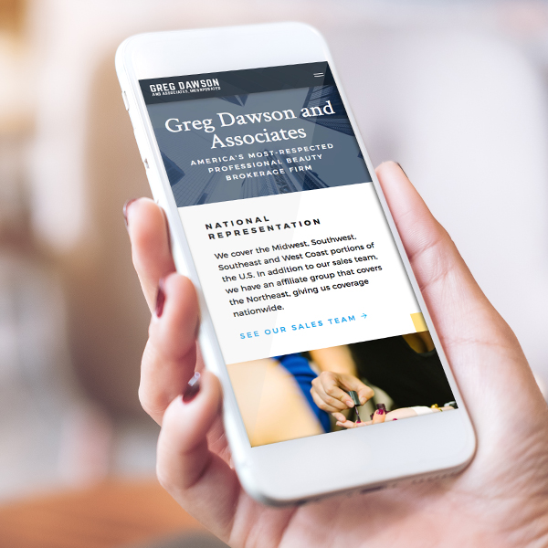
Greg Dawson and Associates, Inc. is a beauty broker headquartered in Indianapolis. With over 40 years in business and a strong reputation within the industry, the Greg Dawson team wanted to refresh their out-of-date website that was built using old coding technology (Flash with music), difficult for users to navigate and challenging for their internal team to update without technical assistance.
Greg Dawson’s leadership team approached TBH Creative to build a new website that:
- Tells the story of the company’s role as a leader in the beauty industry
- Modernizes their visual brand assets to better matches the company’s professionalism
- Features a revamped sitemap that makes it easier for product manufacturers and distributors find their regional salesperson
- Streamlines the process of adding new content and doing updates easy with the integration of a content management system
- Incorporates online forms for submitting—and processing—customer requests
Launch date: Fall 2017
Q&A
We chatted about the web redesign project with TBH Creative project lead, Tatum Hindman. Her responses—below—have been condensed and edited.
Who are the primary users of the Greg Dawson website, and what is important to them?
Tatum: Greg Dawson’s target audience included distributors, potential and current manufacturers, and its internal sales team. Unlike many companies that are trying to grow their online audience, the Greg Dawson staff’s top priority with their redesign was to build a website that functions as an easy-to-use tool for their partners and sales team.
Why was Greg Dawson and Associates, Inc. looking for help?
Tatum: Their old website was outdated and difficult and time-consuming to manage and update. Their team came to TBH Creative because they wanted a complete redesign of their website—as well as a refresh of their logo—to give the company a more professional, modern online presence.

Specifically, Greg Dawson and Associates needed:
- Design upgrades to better represent the brand essence by the implementation of a more modern color palette and responsive grid layout
- Functionality to meet the needs of distributors and manufacturers
- Intuitive content reorganization and improved navigation with easy access to the sales representation map and submission forms
- Easy maintenance using a flexible content management system so that the marketing team can easily keep the website’s content fresh and up-to-date moving forward
What did TBH do to meet the goals of the website redesign project?
Tatum: Our primary task was to upgrade the website’s visual design by incorporating more modern graphics and styles, while still including the block elements already established as part of the brand and its color scheme.
We used form technology and strategically placed calls to action links throughout the website to make it easier for distributors and manufacturers to submit requests online.
- Create a custom map region on the sales team page to help users select the appropriate salesperson for their territory quickly and easily
- Set-up and modularize page templates to ensure easy updates with our robust content management system (CMS)
So far, the results have been impressive. Two months after launch, their website traffic boomed with a 40% growth in organic search and eight times as many visitors.
Check out the more details of the Greg Dawson and Associates website project in our portfolio.
Compared to other projects, what worked well on this website redesign project?
Tatum: The Greg Dawson team was great to work with. They were responsive and communicated clearly, providing feedback when we requested it but also giving us the creative freedom to solve design challenges on the new website based on their creative brief.
For example, their old website featured a Partridge Family-inspired design that consisted of blocks and vibrant colors. For visual brand consistency, they wanted to keep the geometric theme but make it more contemporary. They also wanted to have a design solution that did more feature their company namesake, Greg Dawson, as part of the website as a way to showcase his experience and passions both inside the office and out.
To achieve this, we crafted a robust About section that strategically intertwines brand messaging with storytelling to better tell the story of both the company and its leader, Greg Dawson.

