We are doing a series of 2012 web design trends, and our fifth prediction for web design trends in 2012 is large high quality photograph backgrounds.
Large, high quality photograph backgrounds can add a lot to a company’s website. It is important that they are high quality images. You do not want a large, pixelated background; it is not enjoyable for the user. Just a tip from graphic and web designers everywhere: never enlarge a photograph. Be sure to only size images down. If your picture is not large enough to use as a background for a webpage, then don’t use it. Below are a few websites that use the large, high quality photograph technique for their backgrounds:
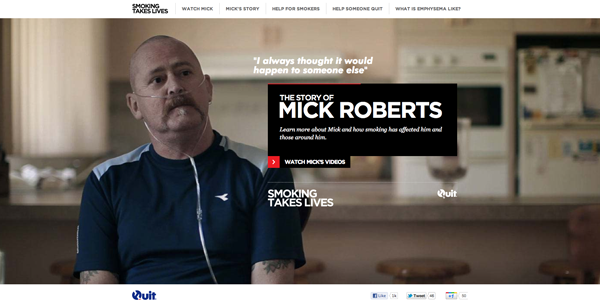
Smoking Takes Lives features a story of Mick Roberts (whose life was changed by smoking). This large photograph will help to grab the user and have them watch the video before accessing any other part of the website.

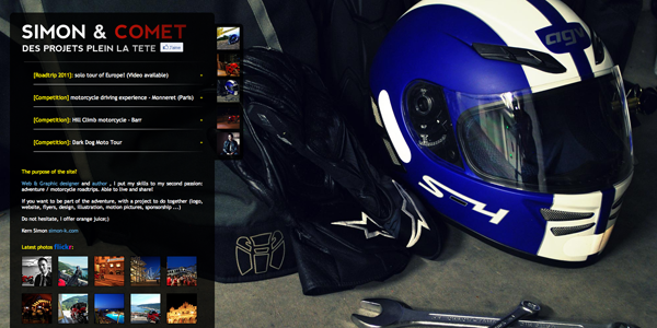
Simon & Comet’s website features his motorsport photography. After translating the webpage to English, I noticed that he also is a web designer. He has a passion for motorsports. It is a great way to combine the two things he is passionate about.

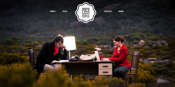
Poco People‘s homepage has a very nice “pop” of color. Your eyes are immediately drawn to Travis and Kelly (the owners) in the middle. Just a simple red scarf and red jacket are all they needed to attract the user.

Just remember, not every website will look great with a large photograph background. When in doubt, ask a web or graphic designer. A company that sells kitchen knives will probably lose customers if there is a very large butcher knife pictured on their homepage. What looks great to you might not look great to the user.
Interested in adding a large, high quality photograph background to your website? TBH Creative is located in Indianapolis, Indiana. We strive to make sure your website top-notch and up-to-date with design styles.
