
The locations page on a website is usually one of the popular pages. If you’re a consulting business, it might be a list of all of your offices. If you’re a retail store, it might show where people can find your shops. If you’re a non-profit, it might all the places people can go to volunteer.
No matter what your company or organization does, if you have multiple locations, your users will navigate to your website’s locations page with the hope of finding out which location closest to them or to determine which location might be the best fit for their needs.
An effective locations webpage will be designed and written with the goals of their specific users in mind. They should make it easy for website visitors to visualize locations in a map view, get contact details about specific locations, and filter search results in ways that make sense if there are many locations.
To get inspiration to improve your website, check out these six stand-out examples of locations webpage designs.
Starbucks
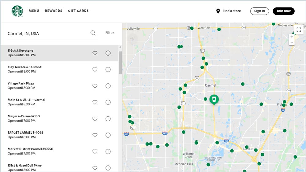
What makes it work: Starbucks’ helpful “Store Locator” keeps things simple—and, its straight-forwardness works. The locations webpage design is focused on maximum functionality. There is nothing added to distract users from quickly finding a cafe close to them. Users can also sort their search results by zip code, set favorite locations, and even get more information (e.g., hours, services, and phone number) about any location by clicking the “i” information icon.
Visit the website: starbucks.com/store-locator
Greg Dawson
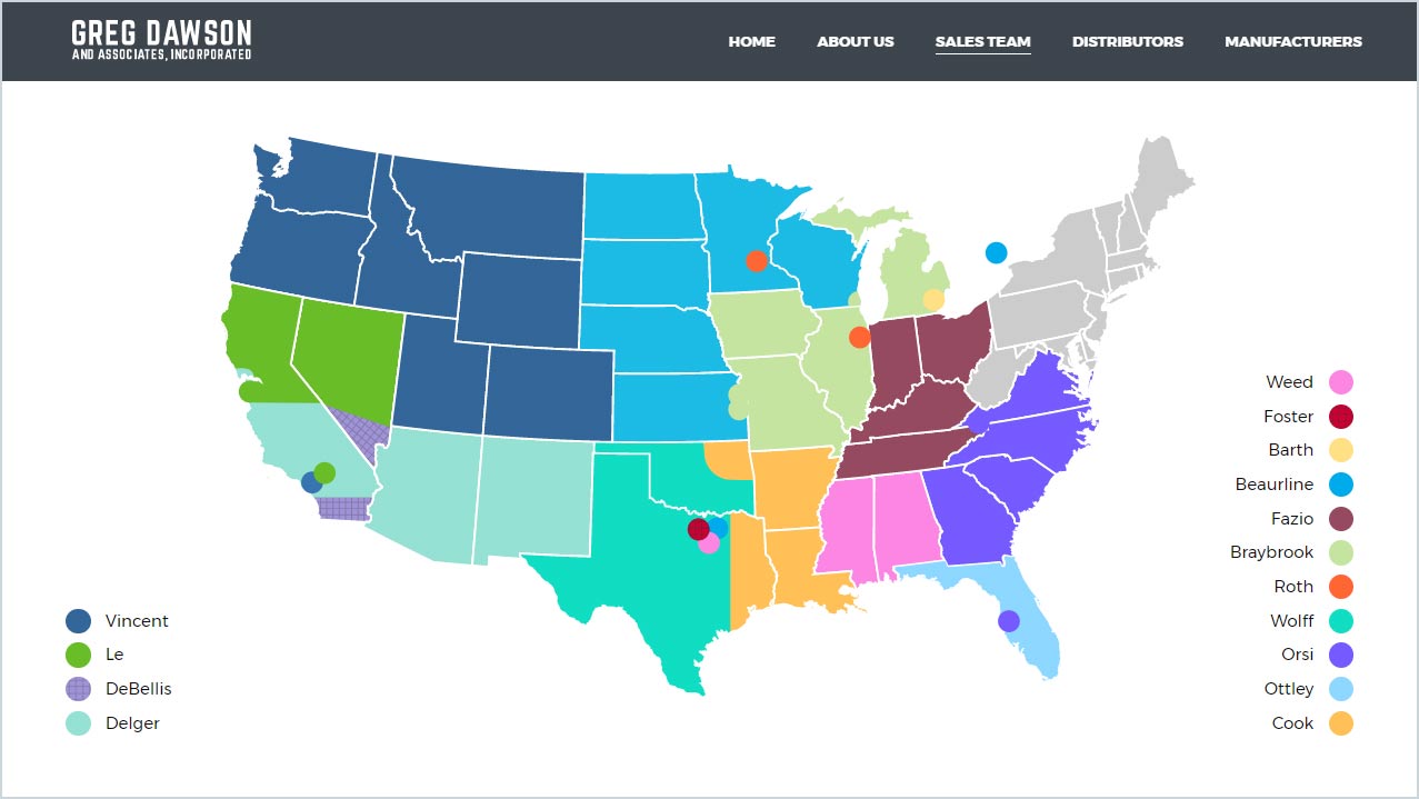
What makes it work: With a nation-wide sales team, Greg Dawson’s flexible locations webpage design makes it easy for users to get the information they need by selecting by location or clicking a salesperson’s last name. Clicking a region opens a contact form for users to get in touch while clicking a salesperson opens that person’s profile and contact information.
Visit the website: gregdawson.com/sales-team
OrthoIndy
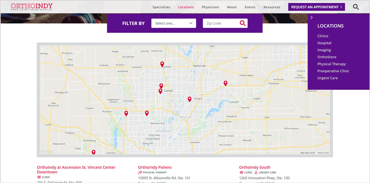
What makes it work: OrthoIndy is an orthopedic practice with locations throughout central Indiana. Their comprehensive locations webpage gives patients a few different, easy ways to find location information. The map provides a visual overview of everywhere they have offices. The locations filtering functionality allows users to search by specific services or zip codes to find the best match. Plus, for those users who aren’t quite ready to choose a location, the right sidebar provides user support by including helpful details about which types of services are available ad the different locations.
Visit the website: orthoindy.com/location-list
Methodist Sports Medicine
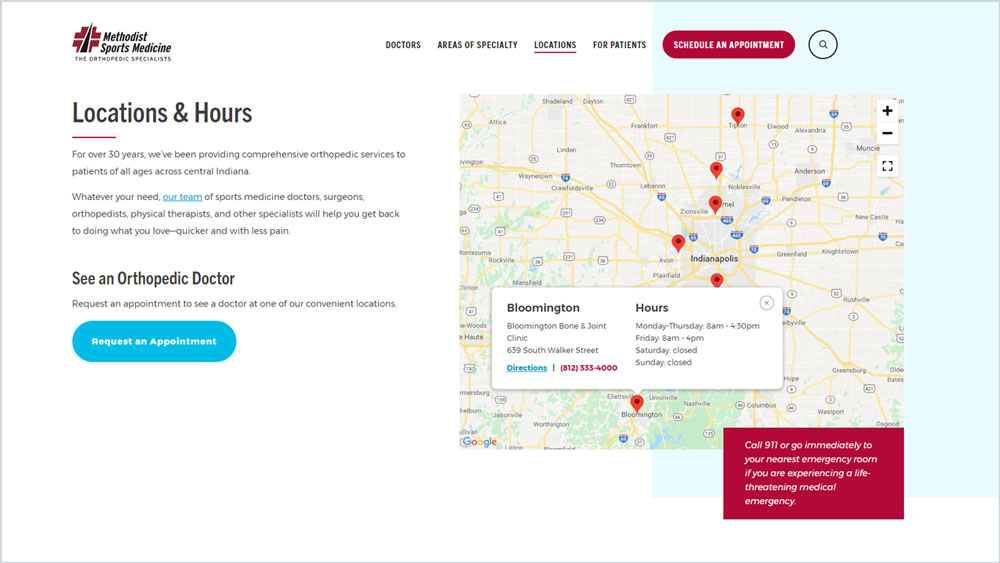
What makes it work: Methodist Sports Medicine’s locations webpage design also uses a map to present all locations. When a user starts to scroll, they can browse all locations’ information which is presented alphabetic order with details like hours, phone numbers, and directions links to location detail webpages. Users can also interact with the map by clicking on a pin. This action opens a location detail window.
Visit the website: methodistsports.com/locations
OrthoNebraska
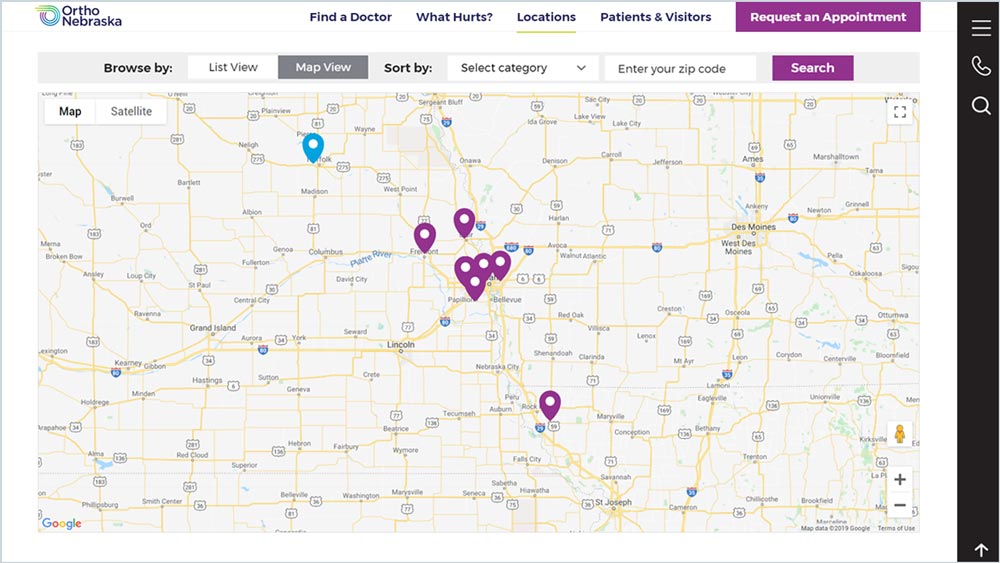
What makes it work: OrthoNebraska uses a search bar as a sticky element across the top of their locations webpage so that users can easily search and filter locations whenever they want. Their locations page provides users with the option to toggle between the list view and map view.
Visit the website: orthonebraska.com/locations
Chase Bank
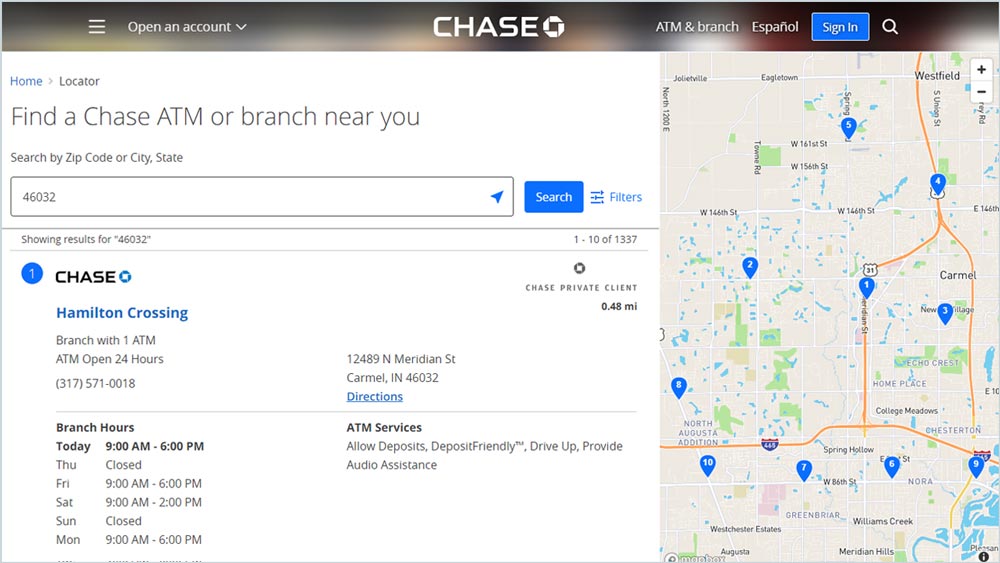
What makes it work: Knowing what users are typically looking for, Chase Bank’s locations webpage includes branch hours, branch services, and ATM services for locations presented within the list view before a user ever has to click or choose a location. Also, by default, Chase Bank displays locations closest to the user to save them a step.
Visit the website: locator.chase.com
Ready to upgrade your website design? Let’s talk
You might also like:
