Throughout the next few weeks, TBH Creative is going to be running a series of blog posts highlighting our favorite websites of 2012, identified by industry. Each post will also include a list of important must haves elements for websites within each industry.
This first week we’re looking at dermatology websites. We chose these three websites for their exemplary layout and organization, color schemes, and content.
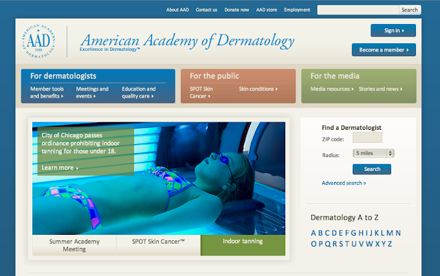
American Academy of Dermatology
The American Academy of Dermatology’s website is thoughtfully organized and features a vibrant, engaging color scheme that is both professional and appealing. AAD divides their website into three easy to browse sections: for dermatologists, for the public, and for the media. Their helpful search feature is incorporated prominently to make navigating the dense website using keywords easier.
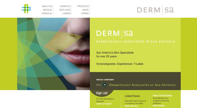
Dermatology Associates of San Antonio
The Dermatology Associates of San Antonio’s website uses a very clean and contemporary design. The bright, unique color scheme sets it apart from most of its dermatological competition. Many other dermatology websites go with darker and more neutral professional color palettes. This branding through color and layout helps DERM | SA stand out as a cutting-edge leader.
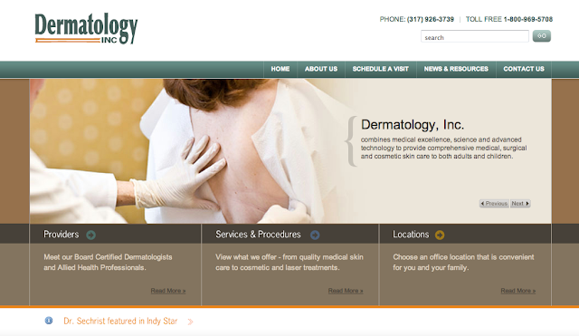
Dermatology, Inc.
Dermatology, Inc’s website takes advantage of a neutral professional color scheme that lets its photography and copy shine. On each page, call to actions are easy to spot. Though the Dermatology, Inc. website has a lot of content, it’s organized very logically. To aid browsing even further for users, the designers placed the website’s search field prominently as a package with the primary navigation.
Top 5 Must Haves for Dermatology Websites
- Service/Procedure descriptions: Be clear. Make sure your website tells existing and potential customers exactly what services your dermatology firm offers. By adding all of your services and procedures to your website, your search engine optimization will also increase.
- Product lists: Sell products in addition to services? It’s important to let your customers know what you have available.
- Easy Appointment Scheduling: Make it easy for customers to schedule an appointment. Include a phone number, email address, and/or contact form on your website. Make sure information about making an appointment is easy to find and prominent.
- Before & After Galleries: Slideshows showing the effectiveness of your practice is a nice touch for any dermatology website. Show customers what you can do for them.
- Map & Directions: Where are you located? How do customers get there? Always include your address with a map and directions.
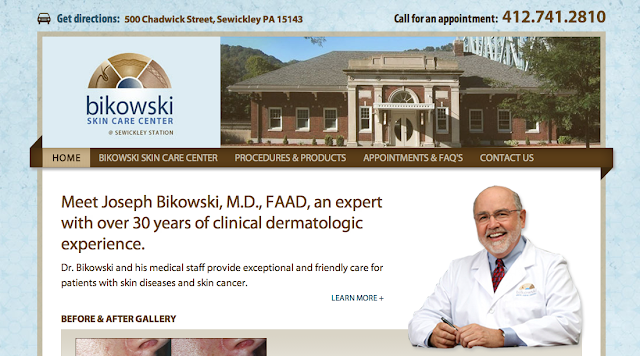
TBH Creative Example Website
Bikowski Skin Care Center by TBH Creative
Does your dermatology website need an online strategy? TBH Creative is a web development company located in Indianapolis, Indiana. Specializing in online strategy, web design, social media, and search engine optimization: let us help you with your company’s Internet needs.


