Mobile web browsing is on the rise. More people are using their smart phones to browse the Internet on the go, which is the reason why your website needs to have mobile compatibility too. Any smart phone can pull up almost every website, however, it could have the user constantly zooming in and out to find what they need. Mobile devices include phones and tablets.
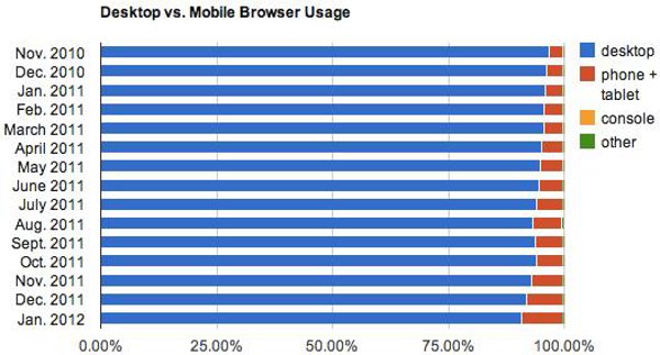
Some have even predicted that in less than 5 years, mobile browsing will be more popular than desktop browsing. Knowing how fast technology is moving, I don’t doubt their predictions.
Below is my list of mobile web design do’s and don’ts:
1. Screen Resolution
Screen resolution is important when making your website mobile device compatible. Uxbooth.com created this easy to read chart for the various mobile screen dimensions. You will probably need more than one mobile stylesheet for the website.
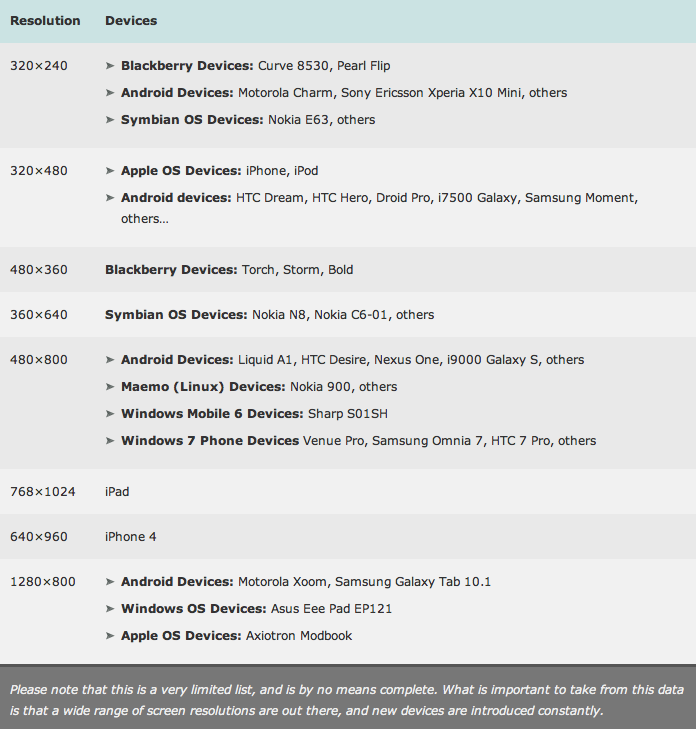
As Uxbooth.com noted, there are new devices that come into the market constantly. This list will change year to year.
2. Keep It Simple
You are more limited with space on mobile devices. Don’t clutter up the screen with too many links or graphics. Make sure the interface is not confusing to the user. The simpler the better. If you don’t have many links (or you want the photographs to be in the spotlight), you can focus on images. Subaru has a very nice example of this:

If you have a lot of subcategories in your navigation, simplify them and only include the necessary links on the mobile site. This brings us into the next topic.
3. Options
Some users may want to view the full site on their phone. Maybe they can’t find what they are looking for or they don’t like the layout of the mobile site. Giving them the option to view the full site really helps usability. If the user has a tablet, it may be easier for them to navigate around the full site they’re used to instead of using the mobile site. This link is usually towards the bottom of the website design.
4. Navigation & Links
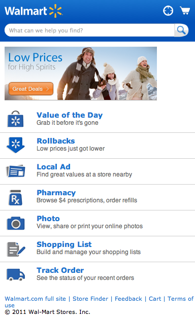
Only include the necessary links and keep buttons simple. If you have a lot of navigation links, narrow it down or lay it out in a different format. For example, Walmart & Amazon have a lot of navigation and sub navigation on their full website. They simplified it as much as possible so the user would not get lost.

5. User Text Entry
Keep user text entry to a minimum. Make use of checkboxes and drop down menus when possible. The shorter the URL, the better. Remember, these users most likely do not have access to a traditional keyboard and mouse. Some tablet users attach keyboards, however, this is a very small percentage of users.
6. Pop-Ups
This is a definite no-no. On mobile devices, a user can get lost very easily if there are pop up windows and some will not work properly.
7. Flash
Another thing to keep in mind is the fact that Apple mobile devices cannot view Flash based animations or movement. It appears as an icon and big empty space. Many Flash movies can be recreated using HTML5 and Javascript to deliver the same effect while also working on your mobile view. If you can, simplify slideshows and only include one strong image instead of five. Images will drastically affect the website load time.
TBH Creative Client Examples
TBH Creative recommends to develop a mobile version of your website and can help you through the options and process. We recently completed a mobile design project for Wheaton World Wide Moving (under contract by Williams Randall Marketing). The mobile site design has easy to use navigation, minimized text, more spacing between links and buttons for fingers to easily click, and a simple, sleek design. If the full website was viewed on a mobile device, the user could easily get confused. See the difference:


Is your website ready for use on mobile devices? TBH Creative can help you keep up with technology, as well as mobile web design or the newest social media trends. We are an Indianapolis web design company and would be happy to discuss an online strategy for your business.
