We are doing a series of 2012 web design trends, and our fourth prediction for web design trends in 2012 is typography.
Typography is probably my favorite trend in web design (if I had to choose just one). I could spend hours looking at beautiful typography on the Internet. There are several examples out there; Google gave me 31,200,000 results for “typography web design”. I found it incredibly difficult to only pick three websites to showcase.
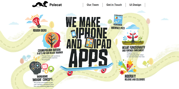
Polecat has a very playful theme for their website. The whimsical typography works well with the design.
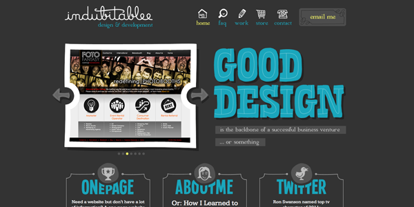
Indubitablee has custom and beautiful typography on her website. While I was clicking around through her site, I noticed there are no “common” fonts to be found. She used unique fonts throughout her website and it all blends together perfectly!
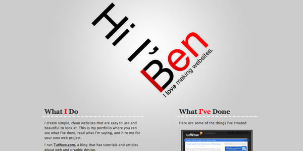
Typography doesn’t necessarily have to be fancy, custom fonts. Ben Lind‘s website is an example of very simple, elegant typography. He used a common san serif font and made it his own.
How can I include typography on my website?
Six Revisions posted a wonderful article called “A Basic Look at Typography in Web Design“. They explain the different aspects of typography as well as common mistakes web designers make. One important thing is to make sure the typography “matches” your website theme. If you have a very professional theme with a whimsical font, it could confuse the user and/or your potential customers.
Interested in adding beautiful typography to your website? TBH Creative can help! We specialize in web design, graphic design, and much more! Contact us today to schedule a web consultation.